In the luxury market, design is not about saying more, it’s about t saying less with greater impact. Whether you’re selling handcrafted leather bags, designer apparel, luxury watches, or premium lifestyle products, your website becomes an extension of your brand identity. Every visual choice communicates value, craftsmanship, exclusivity, and sophistication.
This is where Luxury Brand UI differs from conventional web design. Instead of maximizing information density, luxury interfaces embrace elegance, restraint, and intentionality. The strategic use of typography for luxury brands and the judicious use of whitespace in web design create an atmosphere that feels refined, exclusive, and timeless. Just as luxury boutiques carefully curate physical spaces, premium digital experiences rely on carefully balanced layouts, sophisticated typography, and generous negative space to guide users through a seamless journey.
In this article, we’ll explore how luxury brands can leverage editorial-style UI design to create memorable online experiences that elevate perception and drive conversions.
Why Luxury Requires Space
Luxury has always been associated with rarity. A crowded store feels inexpensive. A cluttered website feels overwhelming. Premium brands understand that exclusivity often comes from what is intentionally left out. In digital design, whitespace serves the same purpose as open floor space in a luxury showroom. It creates breathing room around products, content, and calls to action, allowing each element to command attention.
Consumers shopping for luxury products are not typically in a rush. They expect an experience that mirrors the care and craftsmanship that go into the product itself.
Characteristics of Luxury Brand UI
Luxury websites often feature:
- Minimal navigation systems
- Large, immersive imagery
- Editorial-style layouts
- Elegant typography
- Slower visual pacing
- Generous whitespace
- Focused product storytelling
Rather than overwhelming users with promotions, banners, and discounts, luxury brands let their products speak for themselves. The result is a digital environment that feels calm, premium, and trustworthy.
Typography for Luxury: More Than Just Choosing a Beautiful Font
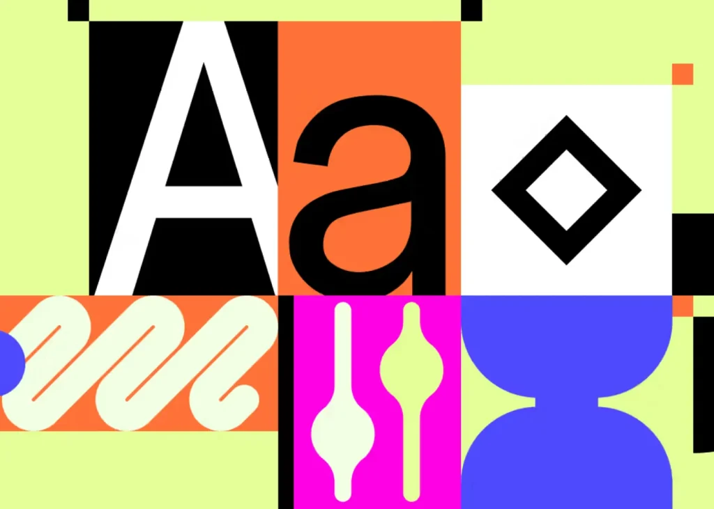
Typography is often the most influential element of luxury web design. Luxury consumers subconsciously associate certain typographic styles with prestige, heritage, and quality. The right font choices can instantly elevate a brand’s perceived value.
A luxury website’s typography should communicate:
- Craftsmanship
- Sophistication
- Confidence
- Timelessness
- Attention to detail
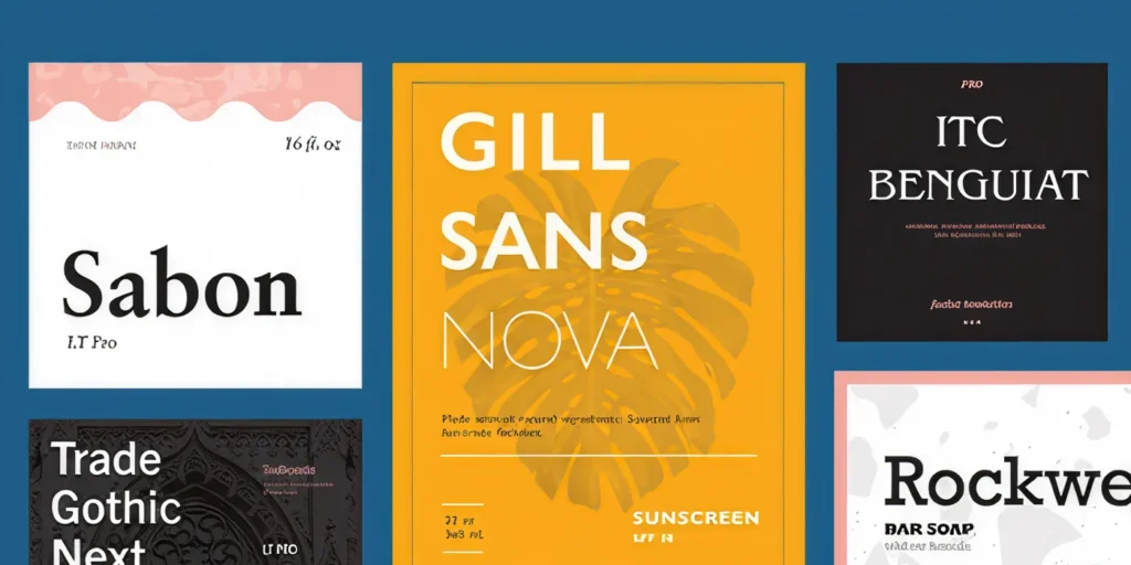
Why Serif Fonts Remain a Luxury Favorite
Many luxury brands rely on serif fonts because they evoke tradition, heritage, and refinement. Historically associated with high-end publishing, fashion magazines, and luxury print advertising, serif typefaces naturally align with premium positioning.
Examples include:
- Didot
- Bodoni
- Cormorant Garamond
- Playfair Display
- Canela
- Editorial New
These fonts often feature elegant contrast, refined curves, and sophisticated proportions that reinforce a sense of luxury. Fashion houses frequently combine a dramatic serif headline with a clean sans-serif body font to create visual balance.
Pairing Serif and Sans-Serif Fonts
One of the most effective approaches in luxury brand UI is combining two contrasting type systems.
Example Structure
Headlines
- Elegant serif font
- Large scale
- High contrast
Body Text
- Minimal sans-serif font
- Excellent readability
- Clean appearance
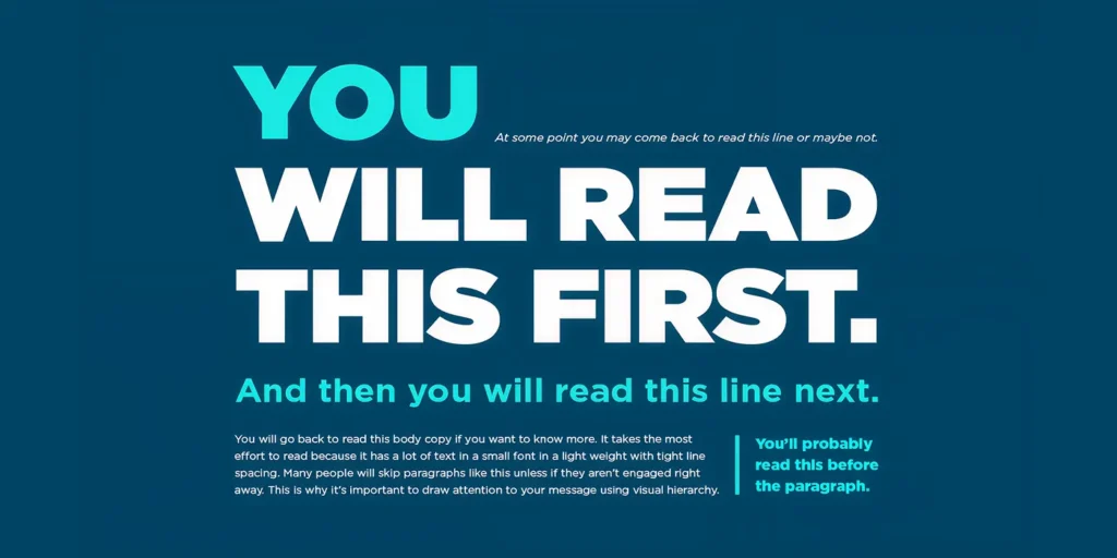
This combination creates an editorial feel similar to premium fashion publications. The contrast helps establish hierarchy while maintaining a sophisticated visual identity.
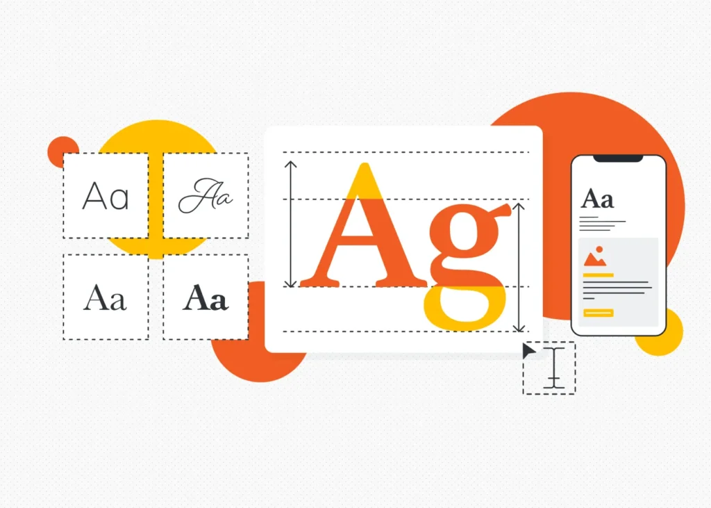
The Importance of Kerning and Letter Spacing
Luxury design is often found in the details. Kerning refers to the spacing between individual letters. Proper kerning can dramatically improve perceived quality.
Luxury brands frequently use:
- Increased letter spacing
- Refined character alignment
- Balanced typography proportions
- Carefully controlled line heights
Typography as Brand Storytelling
The most successful luxury brands use typography as part of their narrative. A heritage leather brand may choose classic serif typography that reflects decades of craftsmanship. A modern luxury apparel company may opt for minimalist sans-serif typography to communicate contemporary sophistication. Every typographic decision should reinforce the brand’s story. When it aligns with brand identity, visitors immediately understand what the brand represents without reading a single sentence.
Whitespace in Web Design: The Ultimate Luxury
If typography is the voice of luxury, whitespace is its silence. And silence often speaks louder. Whitespace, also called negative space, is the empty area between elements on a page. It may seem simple, but it is one of the most powerful tools available to luxury designers.
What Is Negative Space?
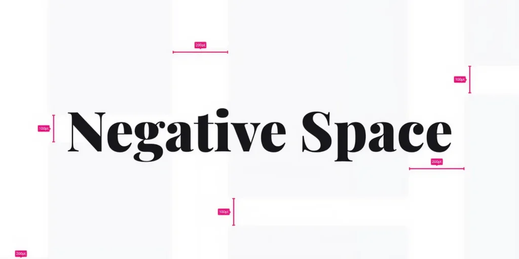
Negative space is the area surrounding:
- Text
- Images
- Buttons
- Product cards
- Navigation elements
It doesn’t have to be white. Any intentionally empty area qualifies as negative space. Luxury brands use this space strategically to create focus and visual elegance.
Why Whitespace Feels Premium
Luxury is often defined by what is intentionally left out. In digital design, whitespace creates a sense of calm, focus, and exclusivity that crowded interfaces struggle to achieve. Rather than competing for attention with numerous visual elements, luxury brands use negative space to highlight what truly matters—the product, the story, and the experience. This deliberate restraint helps create an atmosphere that feels sophisticated, high-end, and carefully curated.
Exclusivity
Luxury brands thrive on the perception of rarity and selectiveness. When a webpage contains fewer elements and more breathing room, every image, headline, and product receives greater attention. This curated presentation mirrors the experience of walking into a luxury boutique, where products are thoughtfully displayed rather than densely packed together. The abundance of space signals that each item is valuable enough to command attention on its own.
Confidence
Brands that rely on aggressive promotions, crowded layouts, and constant calls-to-action often appear eager to capture attention. Luxury brands take the opposite approach. Generous whitespace communicates confidence by allowing products and brand storytelling to stand on their own merits. The design does not need to compete for attention because it trusts the quality of what it is presenting. This sense of restraint reinforces perceptions of prestige and authority.
Focus
A clutter-free interface helps users concentrate on the most important elements of the page. Whether it’s a handcrafted leather bag, a premium watch, or a new fashion collection, whitespace naturally guides the eye toward key content without distractions. By reducing visual noise, luxury websites create a more immersive browsing experience that encourages visitors to spend more time appreciating product details, craftsmanship, and brand narratives.
Sophistication
Sophisticated design is rarely about adding more—it is about achieving balance. Whitespace introduces structure, harmony, and visual elegance that make content easier to absorb and interfaces more enjoyable to navigate. The clean, organized appearance created by negative space reflects the same attention to detail that luxury brands apply to their products. As a result, the website feels polished, refined, and intentionally crafted.
Enhanced Perceived Value
Whitespace can significantly influence how customers perceive the value of a product. When an item is surrounded by ample space, it naturally appears more important and desirable. Similar to how luxury retailers use spacious store layouts to showcase merchandise, digital whitespace elevates products by giving them room to stand out. This subtle psychological effect can make products feel more premium before visitors even engage with descriptions or pricing.
A More Relaxed Shopping Experience
Luxury shopping is often as much about the experience as it is about the product itself. Whitespace slows the pace of browsing, creating a more relaxed and enjoyable journey through the website. Visitors are not overwhelmed by competing messages or excessive information. Instead, they are guided through a carefully crafted experience that feels elegant, effortless, and aligned with the expectations of a premium brand.
Improving Product Presentation Through Space
Luxury e-commerce websites often dedicate significant screen real estate to individual products.
Instead of displaying dozens of products at once, they allow visitors to focus on one item at a time.
Benefits include:
- Better visual hierarchy
- Increased perceived value
- Enhanced product storytelling
- Reduced cognitive load
- Improved engagement
Whitespace transforms products from inventory into objects of desire.
Whitespace and User Experience
Beyond aesthetics, whitespace significantly improves usability.
Proper spacing helps users:
- Scan content faster
- Understand page hierarchy
- Focus on key information
- Navigate effortlessly
- Feel less overwhelmed
Luxury websites succeed by balancing beauty with functionality.
Whitespace supports both.
Best Fonts for Luxury Websites
Typography plays a major role in creating a premium digital experience. The right font can instantly communicate sophistication, exclusivity, and craftsmanship, helping luxury brands establish a strong visual identity.
Serif Fonts
Serif fonts are a popular choice for luxury brands because they convey heritage, elegance, and timeless appeal.
- Didot – Iconic and fashion-forward, widely used in luxury fashion branding.
- Bodoni – Elegant with strong contrast and a refined appearance.
- Playfair Display – Sophisticated, stylish, and highly readable.
- Cormorant Garamond – Classic and detailed, ideal for heritage brands.
- Canela – Modern, editorial, and increasingly popular among luxury brands.
Sans-Serif Fonts
Sans-serif fonts bring clarity and modern sophistication to luxury websites.
- Helvetica Neue – Minimal, clean, and timeless.
- Neue Haas Grotesk – Refined and contemporary with a premium feel.
- Avenir – Elegant, balanced, and versatile.
- Inter – Modern, readable, and ideal for digital experiences.
- Suisse International – A favorite among luxury fashion and lifestyle brands.
Recommended Pairing
Many luxury websites combine a sophisticated serif font for headlines with a clean sans-serif font for body text. This creates a balanced, editorial-inspired aesthetic that feels both premium and highly readable.
How to Use Whitespace in E-Commerce
Many designers understand the importance of whitespace, yet its effective implementation often remains a challenge. In luxury and premium e-commerce, whitespace is not simply empty space it is a strategic design element that improves visual hierarchy, enhances usability, and elevates the perceived value of products.
When used thoughtfully, whitespace creates a more refined shopping experience, allowing customers to focus on products and brand storytelling without unnecessary distractions. Here are some practical ways to incorporate whitespace into e-commerce design.
Use Larger Margins
One of the simplest ways to create a premium aesthetic is by increasing the space around major content sections. Generous margins help separate different areas of a page, making layouts feel more organized and sophisticated.
Rather than filling every available pixel with content, luxury brands use spacing to create a sense of openness and exclusivity. This approach gives users room to absorb information comfortably while making the overall interface feel more polished and intentional.
Limit Product Density
Displaying too many products within a single viewport can make an e-commerce website feel crowded and overwhelming. Premium brands often take the opposite approach by showcasing fewer products at a time and allowing each item to command attention.
This curated presentation helps highlight craftsmanship, quality, and product details while creating a more focused browsing experience. In luxury e-commerce, presenting products with space around them often feels more effective than maximizing the number of items displayed.
Create Breathing Room Around Headlines
Typography is a key component of luxury design, and it requires adequate space to make an impact. Headlines should not compete with surrounding content for attention.
Providing sufficient whitespace around headings helps establish hierarchy, improves readability, and allows typography to become a visual focal point. This creates a more elegant and editorial feel, particularly when using premium serif fonts and large-scale typography.
Simplify Navigation
A cluttered navigation menu can undermine an otherwise sophisticated design. Streamlined navigation supported by thoughtful spacing helps users move through the website more intuitively while maintaining a clean visual appearance.
By reducing unnecessary menu items and emphasizing key categories, brands can create a navigation experience that feels effortless and aligned with the simplicity often associated with luxury.
Increase Visual Hierarchy Through Space
Whitespace can be one of the most effective tools for directing user attention. Instead of relying heavily on borders, backgrounds, or decorative elements, designers can use spacing to establish relationships between content and guide users through the page naturally.
Strategic spacing helps distinguish primary content from secondary information, making interfaces easier to scan and understand. In many cases, whitespace alone can create a stronger visual hierarchy than additional graphic elements.
Let Products Take Center Stage
Luxury products deserve room to be appreciated. By surrounding product imagery with ample whitespace, brands can draw attention to details such as materials, craftsmanship, and design features.
This approach mirrors the presentation techniques used in luxury retail environments, where products are often displayed with generous spacing to enhance their perceived value. In digital experiences, whitespace serves the same purpose by ensuring that products remain the focal point of the page.
When implemented effectively, whitespace transforms e-commerce websites from busy storefronts into curated brand experiences. It improves usability, strengthens visual appeal, and reinforces the sense of quality and exclusivity that premium brands strive to communicate.
Applying Editorial UI to Leather Goods Websites
Luxury leather goods are often defined by craftsmanship, heritage, and attention to detail. Whether it’s a handcrafted handbag, a premium wallet, or a bespoke travel accessory, customers are investing in more than a product—they are investing in quality, artistry, and brand legacy. Editorial UI helps communicate these values by transforming a website from a simple sales platform into an immersive brand experience.
By combining compelling visuals, sophisticated typography, and thoughtful storytelling, luxury leather brands can create digital experiences that reflect the same level of care and refinement found in their products.
Large Hero Photography
High-quality photography should be the centerpiece of any luxury leather goods website. Large hero images allow visitors to appreciate the fine details that make premium leather products unique, from the material’s richness to the precision of the stitching and finishing.
Close-up imagery can highlight craftsmanship, texture, and construction techniques that are often key selling points for luxury consumers. Rather than immediately presenting product specifications, hero visuals create an emotional connection and establish a premium first impression.
Minimal Navigation
Luxury brands benefit from simplicity. A clean, uncluttered navigation structure helps maintain focus on the products and the stories behind them.
Instead of overwhelming visitors with numerous categories and promotional messages, streamlined navigation creates a more refined browsing experience. This approach mirrors the atmosphere of a luxury boutique, where every product is carefully curated and presented with intention.
Elegant Serif Headlines
Typography plays a significant role in communicating heritage and sophistication. Elegant serif headlines can evoke a sense of tradition, craftsmanship, and timeless quality that aligns naturally with luxury leather brands.
When paired with clean supporting typography, serif fonts help create an editorial aesthetic that feels polished and premium. The right typographic choices reinforce brand identity while adding character and depth to the overall design.
Generous Whitespace
Whitespace is one of the most effective ways to elevate the perception of luxury. By surrounding products, imagery, and content with ample space, brands can create a sense of exclusivity and refinement.
This breathing room allows visitors to focus on individual products without distractions, making each item feel more valuable and carefully presented. The result is a browsing experience that feels calm, sophisticated, and reminiscent of a high-end showroom.
Detailed Product Narratives
Luxury consumers often want to understand the story behind a product. Editorial UI provides the perfect framework for presenting detailed narratives that go beyond basic product descriptions.
Brands can showcase the origin of materials, the craftsmanship involved in production, the inspiration behind a collection, or the expertise of artisans who create the products. These stories add emotional value and help customers appreciate the uniqueness and quality of each piece.
Creating a Digital Luxury Showroom
The most effective leather goods websites do more than display products—they recreate the feeling of visiting a luxury showroom. Through immersive photography, refined typography, thoughtful spacing, and compelling storytelling, brands can create an experience that reflects the craftsmanship and prestige of their products.
When every design element works together to highlight quality and authenticity, the website becomes an extension of the brand itself, building trust, elevating perceived value, and creating a lasting impression on potential customers.
Applying Editorial UI to Premium Apparel Brands
Fashion has always been closely connected to editorial design. Long before digital storefronts existed, luxury apparel brands relied on fashion magazines to showcase collections, set trends, and tell stories that resonated with their audiences. Today, those same editorial principles are shaping modern luxury websites.
Editorial UI allows premium apparel brands to move beyond standard e-commerce experiences and create digital spaces that feel aspirational, immersive, and thoughtfully curated. Instead of focusing solely on selling products, these websites present a lifestyle, a vision, and a brand identity that customers want to be part of.
Magazine-Inspired Layouts
Luxury fashion websites often take inspiration from high-end editorial publications. Rather than relying on predictable product grids, they use creative layouts that blend striking imagery, carefully structured content, and sophisticated typography.
Large photographs, overlapping elements, and dynamic compositions create visual interest while guiding users through a story. This approach makes browsing feel more engaging and helps establish a stronger emotional connection with the brand.
Large Editorial Headlines
Typography is one of the most powerful tools in luxury fashion design. Bold, oversized headlines immediately capture attention and set the tone for a collection or campaign.
Instead of serving as simple labels, headlines become part of the visual experience itself. They introduce mood, personality, and narrative while reinforcing the brand’s premium aesthetic. When paired with high-quality imagery, editorial typography helps create a memorable first impression that feels both elegant and intentional.
Seasonal Storytelling
Luxury apparel brands rarely sell clothing alone—they sell inspiration, identity, and lifestyle. Editorial UI supports this by presenting collections through stories rather than simply displaying products.
A seasonal collection might be introduced through campaign photography, creative concepts, designer inspiration, or cultural influences that shaped the designs. This storytelling approach helps customers understand the vision behind a collection and creates a deeper emotional connection with the brand.
Full-Screen Visual Experiences
Fashion is highly visual, making imagery one of the most important elements of the user experience. Premium apparel websites often use full-screen photography and immersive visuals to showcase garments that feel cinematic and aspirational.
These large-scale visuals allow visitors to appreciate details such as fabric textures, tailoring, movement, and styling. They also create a stronger sense of atmosphere, helping customers imagine themselves within the world the brand has created.
Balanced Negative Space
Whitespace plays a crucial role in maintaining the elegance of a luxury fashion website. By giving content, imagery, and typography room to breathe, brands can create a more refined and sophisticated browsing experience.
Negative space helps direct attention to key elements without overwhelming visitors. It creates a sense of calm, improves readability, and reinforces the perception of quality. Much like a luxury boutique that carefully displays its products, a well-designed fashion website uses space strategically to highlight what matters most.
Creating an Experience Beyond Shopping
The most successful premium apparel websites do more than showcase products—they create experiences. Through editorial layouts, compelling storytelling, immersive visuals, and thoughtful use of space, they transform online shopping into a journey of discovery.
When a website feels more like a beautifully curated fashion publication than a traditional online store, it strengthens brand perception, increases engagement, and elevates the overall customer experience. In luxury fashion, that emotional connection is often just as valuable as the product itself.
Common Mistakes That Undermine Luxury UI
Even premium brands can weaken their positioning through poor design choices.
Avoid:
- Overcrowded layouts
- Excessive promotional banners
- Too many font styles
- Aggressive pop-ups
- Small typography
- Inconsistent spacing
- Overly complex navigation
- Poor-quality imagery
Luxury is built through consistency and restraint.
Every element should feel intentional.
Conclusion
Exceptional Luxury Brand UI is not defined by flashy animations or complex design trends. It is defined by thoughtful restraint. By carefully selecting luxury typography, refined serif fonts, precise kerning, and strategic whitespace in web design, brands can create digital experiences that reflect exclusivity and craftsmanship.
Whether designing for luxury leather goods, premium apparel, or high-end lifestyle products, editorial UI principles help transform websites into immersive brand experiences. In luxury design, every pixel matters, but the spaces between them matter even more.