Grid Systems and Gravity: Designing Digital Experiences That Command Authority

The strongest digital experiences rarely feel accidental. When users land on a high-performing B2B website, they immediately sense order, credibility, and professionalism even before reading a single word. This perception is often driven by one foundational design principle: grid systems in web design.
Much like architecture relies on structural frameworks to support buildings, websites rely on grids to create balance, hierarchy, and consistency. A well-designed grid system establishes visual gravity, guiding attention toward key messages while reinforcing trust and authority.
For businesses investing in B2B web design, mastering grid systems is one of the most effective ways to create an authoritative user experience that communicates expertise from the very first interaction.
What Are Grid Systems in Web Design?
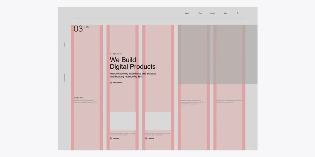
A grid system is an underlying structure that organizes content into rows, columns, and spacing relationships. While users rarely notice the grid itself, they immediately notice the clarity and confidence it creates.
Grid systems help designers:
- Maintain visual consistency
- Create predictable layouts
- Improve content hierarchy
- Enhance readability
- Scale designs across devices
Modern web designers often use CSS Grid and Flexbox to build responsive layouts that adapt seamlessly across screen sizes while maintaining structural integrity.
Without a grid, interfaces can feel chaotic and disconnected. With a grid, every element appears intentional.
Why Grid Systems Create Authority
Authority in design is not created through decoration. It is created through structure.
When elements align consistently, spacing feels deliberate, and content follows a logical hierarchy, users perceive the organization behind the website as more competent and trustworthy.
This is especially important in B2B web design, where decision-makers evaluate vendors, platforms, and service providers based on credibility. Strong grid systems help establish:
- Visual Confidence: Consistent alignment signals professionalism and attention to detail.
- Information Hierarchy: Users instantly understand what is most important because the layout guides their attention naturally.
- Cognitive Ease: Structured content reduces mental effort, making information easier to absorb.
- Brand Credibility: A disciplined layout reflects organizational maturity and expertise.
Understanding Visual Weight and Digital Gravity
Every interface contains elements competing for attention. Headlines, images, buttons, forms, charts, and testimonials all carry varying levels of visual weight. Grid systems help distribute this weight strategically.
Think of digital layouts as physical spaces influenced by gravity.
Large elements naturally attract attention. Smaller elements provide support. Grids ensure these components work together rather than pulling users in conflicting directions.
Designers use grid structures to:
- Anchor primary messages
- Balance large and small content blocks
- Prevent visual clutter
- Create predictable scanning patterns
The result is a more authoritative and cohesive user experience.
CSS Grid: The Foundation of Modern Layout Design
One of the biggest advancements in modern web development is CSS Grid, which gives designers precise control over layout structures. Unlike older approaches that relied heavily on nested containers and complex positioning, CSS Grid allows teams to define sophisticated layouts directly within the browser.
Benefits of CSS Grid include:
- Flexible column structures
- Responsive design control
- Improved layout consistency
- Faster development workflows
- Support for complex content arrangements
For organizations focused on digital experience design, CSS Grid provides the technical foundation needed to create scalable and visually disciplined interfaces.
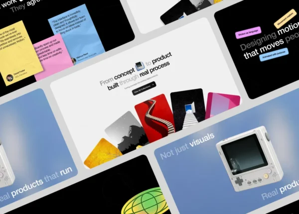
The Power of Asymmetrical Layouts
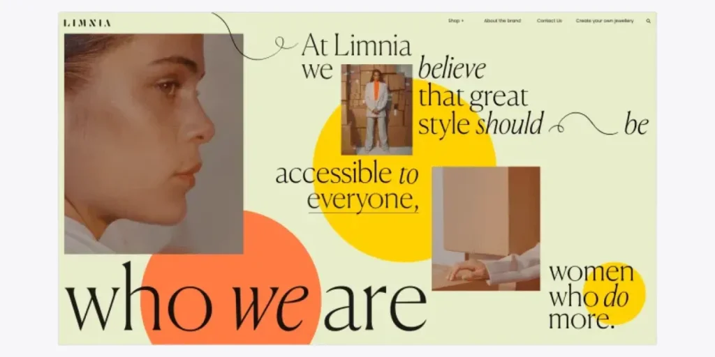
Many designers mistakenly believe authority requires perfect symmetry. In reality, some of the most compelling modern websites use asymmetrical layouts built on strong grid systems. The key distinction is that asymmetry is intentional.
When supported by an underlying grid, asymmetrical compositions can:
- Create visual interest
- Highlight important content
- Guide user attention
- Differentiate a brand from competitors
Leading technology companies frequently use asymmetrical layouts to balance creativity with professionalism, creating experiences that feel dynamic without sacrificing structure.
How to Use Grid Systems for B2B Websites
Organizations looking to strengthen their online presence should focus on strategic implementation rather than simply adding columns to a layout.
Start With Content Hierarchy
Identify the most important information before designing the grid.
The structure should support business objectives, not dictate them.
Create Consistent Spacing Rules
Spacing is just as important as alignment.
Consistent margins and padding create rhythm and improve readability.
Use Modular Design Principles
Design content blocks that can be reused across pages while maintaining alignment and consistency.
Prioritize Responsive Behavior
Grid systems should adapt smoothly across desktop, tablet, and mobile devices.
Balance Density and Simplicity
B2B websites often contain large amounts of information. A strong grid helps organize complexity without overwhelming users.
These practices are essential for anyone exploring how to use grid systems for B2B websites effectively.
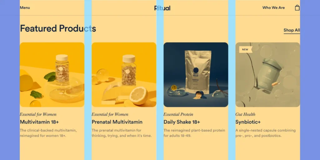
Real-World Examples of Grid Systems Done Right
Some of the most successful websites rely on strong grid systems to create experiences that feel organized, trustworthy, and easy to navigate.
Take The New York Times, for example. Its website uses a responsive grid that adapts smoothly across desktops, tablets, and smartphones. Despite publishing a huge volume of content every day, the layout remains clean and structured, helping readers focus on stories without feeling overwhelmed.
Airbnb is another great example of grid-driven design. With thousands of property listings to display, the platform uses a flexible multi-column layout that keeps information organized and visually balanced. Users can easily compare listings, browse photos, and scan key details thanks to the consistency of the underlying grid.
In the e-commerce space, Shopify demonstrates how grids can improve the shopping experience. Products are arranged in clear, predictable layouts that make browsing intuitive and efficient. By maintaining consistent spacing and alignment, Shopify helps users find what they need quickly while creating a polished and professional appearance.
Meanwhile, BBC uses a modular grid system to manage a diverse mix of content, including articles, videos, live updates, and featured stories. The grid provides a strong structural foundation that allows large amounts of information to be presented in a way that feels cohesive rather than cluttered.
What these platforms have in common is a commitment to structure. Their grid systems work behind the scenes to create clarity, improve usability, and reinforce credibility. Rather than simply organizing content, they help shape digital experiences that feel authoritative, intuitive, and engaging.
Common Grid System Mistakes
Even experienced teams can weaken authority through poor grid implementation.
Common mistakes include:
- Inconsistent spacing
- Misaligned content blocks
- Excessive column variations
- Overcrowded layouts
- Ignoring mobile responsiveness
These issues disrupt visual flow and reduce the perception of professionalism. A successful grid system should remain largely invisible while supporting every interaction on the page.
Grid Systems as a Competitive Advantage
Many organizations focus heavily on colors, animations, and visual trends while overlooking the structure beneath them. However, structure is often what separates average websites from exceptional ones.
Strong grid systems in web design create:
- Better user experiences
- Higher content clarity
- Greater brand credibility
- Improved scalability
- More authoritative interfaces
For companies competing in crowded markets, these advantages can significantly influence user perception and engagement.
Conclusion
Authority is rarely communicated through visual excess. It emerges from clarity, consistency, and structure. Grid systems provide the framework that gives digital experiences balance and direction. By controlling alignment, hierarchy, visual weight, and responsiveness, they transform websites into trustworthy, professional environments that support business goals.
Whether you’re building a corporate platform, refining a product website, or investing in advanced B2B web design, mastering grid systems in web design is one of the most effective ways to create authoritative digital experiences that inspire confidence and drive results.