Introduction
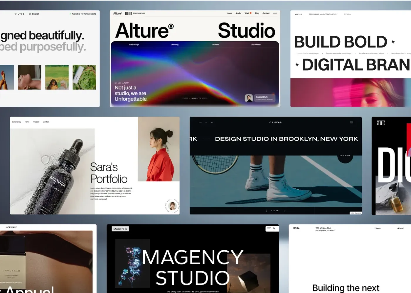
In the world of premium digital experiences, visual elegance matters. From luxury fashion brands to high-end hospitality websites, designers are using dark interfaces to communicate exclusivity, elegance, and prestige. Among these trends, Royal dark mode has emerged as a powerful design approach that combines rich dark palettes with refined aesthetics to create complete user experiences.
However, many luxury-inspired dark themes prioritize appearance over usability. Poor contrast, difficult-to-read text, and accessibility issues often undermine the user experience. The challenge for modern designers is clear: how can you create a visually stunning luxury interface while ensuring everyone can comfortably use it?
This guide explores how to design a Royal dark mode experience that balances elegance, accessibility, and performance.
What Is Royal Dark Mode?
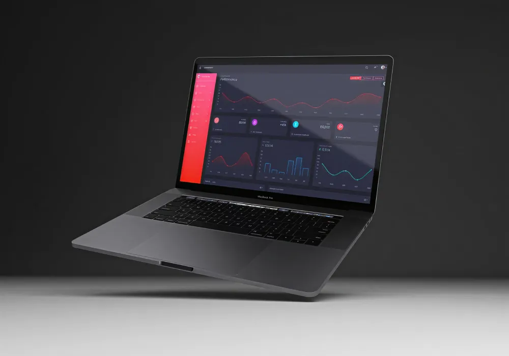
Royal dark mode is a premium interpretation of traditional dark themes. Instead of relying on flat black backgrounds and stark white text, it uses carefully selected dark tones, sophisticated color accents, and layered visual depth to evoke luxury and exclusivity.
Common characteristics include:
- Rich charcoal and midnight backgrounds
- Deep navy, emerald, burgundy, or royal purple accents
- Refined typography with generous spacing
- Subtle gradients and shadows
- Gold, silver, or platinum-inspired highlights
- Minimalist layouts focused on premium presentation
Unlike conventional dark themes, Royal dark mode emphasizes atmosphere and emotional appeal while maintaining clarity and
Why Luxury Brands Are Embracing Dark UI
Luxury products thrive on perception. Customers associate premium experiences with exclusivity, craftsmanship, and attention to detail.
A well-executed Luxury dark UI helps reinforce these qualities by:
- Creating a sophisticated visual identity
- Making imagery and products stand out
- Increasing perceived value
- Delivering a cinematic browsing experience
- Aligning with modern premium design trends
Industries increasingly adopting luxury dark themes include:
- Fashion and apparel
- Jewelry and watches
- Automotive brands
- Hospitality and travel
- Real estate
- High-end technology products
When designed correctly, dark interfaces can transform an ordinary website into a premium digital experience.
The Accessibility Pitfalls of Standard Dark Themes
Despite their popularity, many dark themes introduce usability challenges.
1: Low Contrast Text
One of the most common mistakes is using gray text on dark gray backgrounds. While visually subtle, this combination often reduces readability, particularly for users with low vision.
2: Visual Fatigue
Contrary to popular belief, dark mode does not automatically reduce eye strain. Poor typography, inadequate spacing, and excessive contrast can contribute to visual fatigue, especially during prolonged reading sessions.
3: Color Perception Issues
Deep colors can appear different depending on screen type, brightness levels, and ambient lighting conditions. Important interface elements may become difficult to identify.
4: Hidden Interactive Elements
Buttons, links, and navigation components can blend into dark backgrounds when designers prioritize aesthetics over clarity. These issues highlight why an accessible dark mode strategy is essential for luxury websites.
Achieving Luxury While Maintaining WCAG Compliance
Many designers assume accessibility and luxury aesthetics are competing priorities. In reality, they can work together to create premium digital experiences that are both elegant and inclusive. By carefully selecting high-contrast color palettes, maintaining readable typography, and ensuring clear visual hierarchy, designers can preserve a sophisticated look while meeting WCAG requirements. Thoughtful accessibility practices not only improve usability for a wider audience but also enhance the overall perception of quality, professionalism, and attention to detail.
Understand WCAG Contrast Requirements
The Web Content Accessibility Guidelines (WCAG) are a set of internationally recognized standards designed to make websites usable for everyone, including people with visual impairments and color vision deficiencies. When designing a Royal dark mode interface, contrast is one of the most important accessibility considerations.
For most body text:
- Minimum contrast ratio: 4.5:1
- Large text (18pt+ or 14pt+ bold): 3:1
- Enhanced accessibility (WCAG AAA): 7:1 or higher
In luxury UI design, it's best to use subtle gray-on-gray combinations for a sophisticated look, but insufficient contrast can make content difficult to read. Instead, use rich dark backgrounds with carefully balanced text colors that maintain both elegance and accessibility. This approach helps create a premium user experience while ensuring your design remains inclusive and compliant.
Avoid Pure Black and Pure White
Luxury interfaces rarely use absolute black (#000000) and pure white (#FFFFFF).
Instead, designers often choose:
- Near-black backgrounds
- Soft white typography
- Muted accent colors
This creates a more refined appearance while reducing harsh visual contrast.
Create Layered Depth
Rather than relying solely on color, use:
- Elevation
- Shadows
- Borders
- Spacing
- Typography hierarchy
These elements help users distinguish interface components without overwhelming the design.
Test Across Multiple Devices
Different displays render dark themes differently.
OLED screens produce true blacks, while LCD displays often soften darker shades. Consistent testing helps ensure accessibility and visual quality across environments.
Choosing the Right Colors for Royal Dark Mode
Color selection is the foundation of successful luxury dark theme web design.
1: Base Background Colors
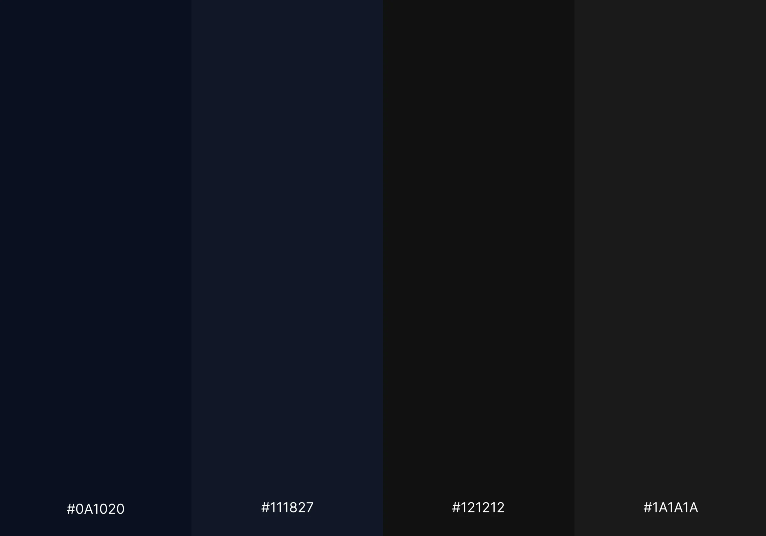
Instead of pure black, consider:
- Midnight Blue (#0A1020)
- Deep Charcoal (#121212)
- Rich Graphite (#1A1A1A)
- Dark Navy (#111827)
These shades create depth while maintaining sophistication.
2: Premium Accent Colors
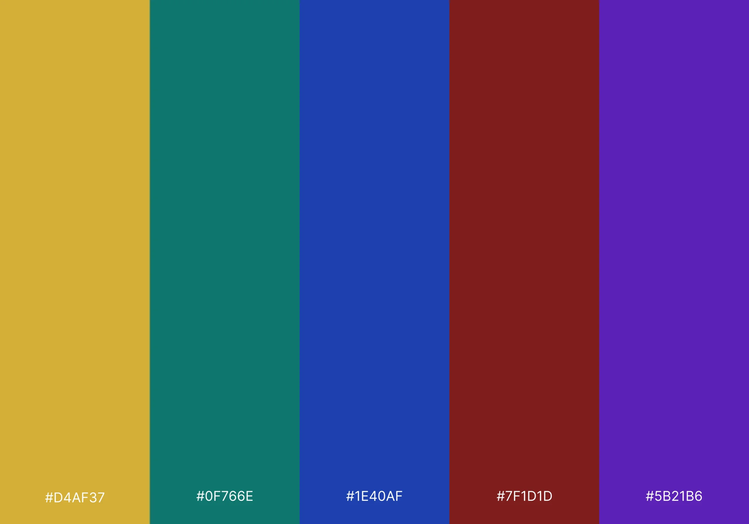
Royal aesthetics often leverage rich accent tones:
- Gold (#D4AF37)
- Emerald Green (#0F766E)
- Sapphire Blue (#1E40AF)
- Burgundy (#7F1D1D)
- Royal Purple (#5B21B6)
These accents add visual richness without overwhelming the interface.
3: Typography Colors
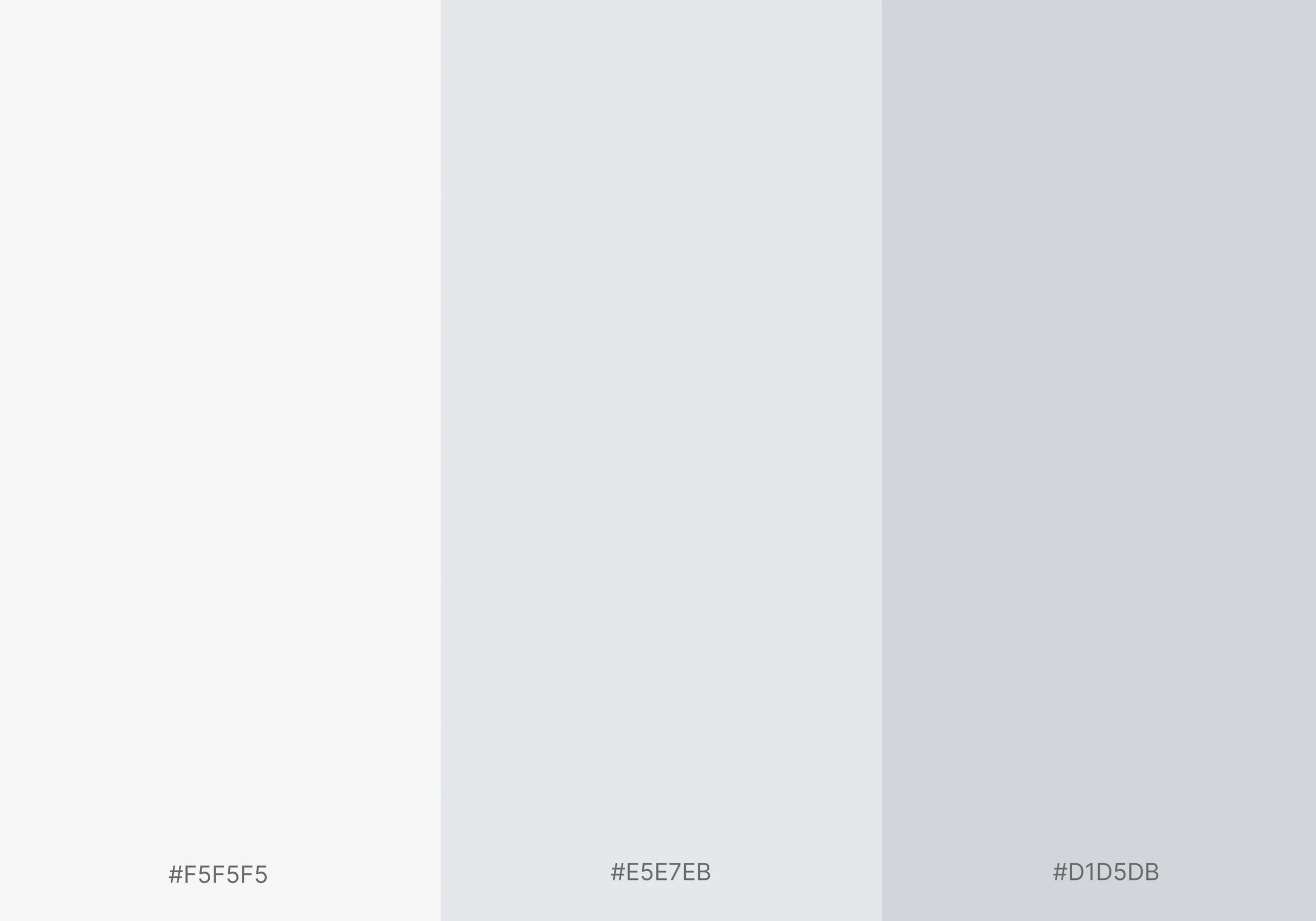
Effective combinations include:
- Soft White (#F5F5F5)
- Warm Gray (#D1D5DB)
- Silver Gray (#E5E7EB)
Avoid using low-contrast gray text solely for aesthetic purposes.
OLED Blacks and Their Role in Luxury Interfaces
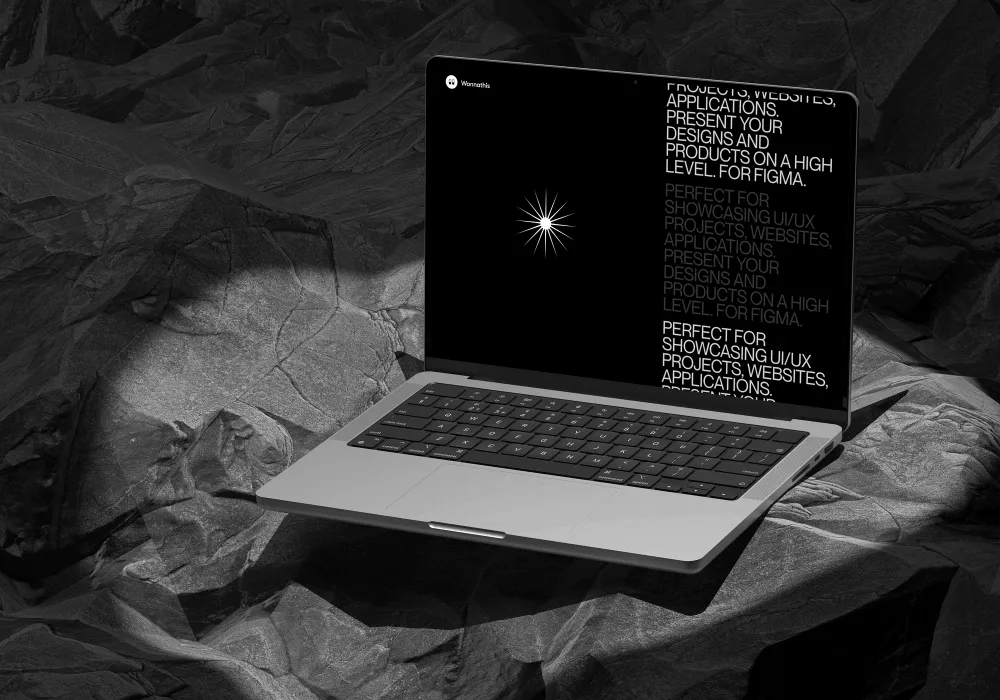
Modern smartphones increasingly use OLED displays, allowing individual pixels to turn off completely.
Benefits of OLED blacks include:
- Greater perceived contrast
- Improved battery efficiency
- Enhanced image presentation
- More immersive luxury experiences
However, designers should use OLED blacks strategically. Excessive pure black backgrounds can make content feel disconnected and difficult to scan. Introducing subtle texture or near-black tones often creates a more refined result.
How to Make Dark Mode Accessible Without Losing Elegance
Creating an accessible dark mode doesn't mean giving up the sense of luxury and sophistication that makes premium digital experiences stand out. In fact, the best dark mode designs successfully combine both. A well-designed interface should feel visually refined while remaining comfortable and easy to use for everyone.
If you're wondering how to make dark mode accessible, follow these practical principles:
1: Prioritize Readability
Elegant typography should never compromise legibility.
Focus on:
- Adequate font size
- Proper line height
- Sufficient contrast
- Clear hierarchy
2: Limit Accent Color Usage
Reserve premium colors for:
- Calls to action
- Interactive states
- Navigation highlights
- Key branding elements
Overusing accent colors can diminish their impact.
3: Design for Different Lighting Conditions
Users may interact with your website in:
- Bright outdoor environments
- Dimly lit rooms
- Mobile devices
- Large desktop monitors
Testing under varying conditions improves usability.
4: Include Focus Indicators
Keyboard users rely on visible focus states to navigate digital interfaces effectively. Focus indicators should be clear enough to identify the currently selected element while remaining consistent with the overall luxury aesthetic. Subtle outlines, glows, or contrast changes can provide necessary accessibility cues without disrupting the clean and elegant appearance of the design.
Best Practices for Designing Luxury Dark Mode Themes
When designing luxury dark mode themes, keep these guidelines in mind:
- Use deep hues instead of pure black backgrounds.
- Maintain WCAG-compliant contrast ratios.
- Establish clear visual hierarchy.
- Limit decorative effects.
- Use premium accent colors strategically.
- Optimize for OLED and LCD displays.
- Test accessibility continuously.
- Prioritize readability over visual trends.
Luxury design succeeds when sophistication enhances usability rather than competing with it.
Final Thought:
Royal dark mode represents the next evolution of luxury digital design. By combining rich color palettes, thoughtful typography, and accessibility-first principles, designers can create experiences that feel premium without sacrificing usability. The key is balance. Sophisticated visuals, carefully chosen deep hues, proper contrast ratios, and adherence to WCAG compliance standards allow luxury brands to deliver elegant interfaces that remain accessible to all users.
When executed thoughtfully, Royal dark mode becomes more than a design trend it becomes a powerful tool for creating memorable, inclusive, and truly premium digital experiences.