The Ultimate Guide to Premium UI/UX: Where Aesthetic Design Meets High-Performance Engineering

This blog explains the importance of premium UI/UX design in creating successful digital products and improving business outcomes. It points out how UX focuses on usability, user journeys, and overall experience, while UI focuses on visual elements like layout, colors, and typography. A structured design process is outlined, including defining goals, researching users, planning architecture, designing interfaces, prototyping, testing, refining, and handing off to developers. It emphasizes balancing aesthetics with performance, optimizing Core Web Vitals, and using user research to guide decisions. The guide also covers B2B and headless commerce strategies, SEO impact, mobile-first design, and accessibility. Overall, it shows that effective UI/UX improves engagement, conversions, satisfaction, and long-term business growth by creating fast, intuitive, and user-centered digital experiences.
Introduction
Think about the last website or app you enjoyed using. Chances are, you didn’t notice the design itself, you found what you needed, completed your task effortlessly, and moved on with a positive impression. That’s the power of great UI/UX design.
Users in today’s digital world have a wide range of options and rising standards. Visitors won’t stay long if the interface is confusing, slow, or frustrating, even if it draws attention. Thoughtful interface design, performance-driven functionality, and intuitive user experiences are the foundation of successful digital goods.
UI/UX design is no longer just a creative discipline; it’s a business strategy. It influences how users perceive your brand, engage with your product, and ultimately decide whether to convert, return, or recommend your business to others. From improving customer satisfaction and conversion rates to strengthening SEO performance and long-term growth, effective UI/UX design impacts every stage of the customer journey.
In this guide, we’ll explore the fundamentals of UX and UI design, the key differences between them, why they matter for business success, and the Premium UI/UX design process for creating exceptional digital experiences. You’ll also discover real-world B2B design inspiration, performance-focused UX strategies, Core Web Vitals considerations, headless commerce best practices, and common mistakes to avoid.
Whether you’re a business owner, marketer, developer, or designer, this guide will help you understand how user-centered design creates products that not only look great but also deliver measurable results.
What Is UX Design?
UX (User Experience) Design is the process of creating products, services, and digital experiences that are easy, useful, and enjoyable to use. It focuses on how users interact with a product and how they feel throughout their entire journey, from discovering a brand to completing tasks and receiving support.
Unlike UI design, which focuses on visual and interactive elements, UX design looks at the overall experience. Its primary goal is to help users achieve their objectives with as little friction as possible. A well-designed user experience feels intuitive, efficient, and effortless, allowing users to navigate and complete actions without confusion.
UX designers use research, usability testing, information architecture, and interaction design to understand user needs and create solutions that solve real problems. They also balance user expectations with business goals and technical requirements to deliver meaningful experiences that drive engagement and satisfaction. Modern UX design emphasizes accessibility, usability, and continuous improvement. By putting users at the center of the design process, businesses can create products that build trust, strengthen customer loyalty, and contribute to long-term success.
What Is UI Design?
UI (User Interface) Design is the process of creating the visual and interactive elements that users engage with on websites, mobile apps, and digital products. It focuses on how a product looks, feels, and responds, ensuring every interaction is clear, intuitive, and visually appealing.
UI designers work with elements such as typography, colors, buttons, icons, layouts, and animations to create interfaces that are both functional and engaging. Their goal is to guide users effortlessly through a product while maintaining consistency, accessibility, and strong brand identity.
A great UI goes beyond aesthetics; it helps users complete tasks efficiently, improves usability, and creates a seamless experience that feels natural and enjoyable. By combining visual design with user-centered principles, UI design plays a crucial role in the overall success of any digital product.
UX vs. UI: Understanding the Key Differences
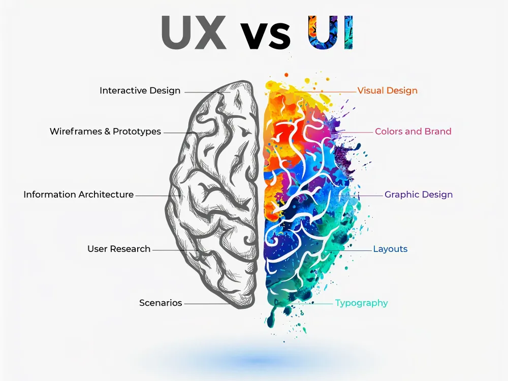
Although UX and UI are closely connected, they focus on different aspects of the user journey. UX design concerns the overall experience, while UI design focuses on the visual and interactive elements users engage with. Both are essential for creating successful digital products, but they serve distinct purposes.
| Aspect | UX Design (User Experience) | UI Design (User Interface) |
| Primary Focus | How a product works and feels for users. | How a product looks and interacts visually. |
| Goal | Create a seamless, intuitive, and satisfying user experience. | Create an attractive, engaging, and easy-to-use interface. |
| Concerned With | User needs, behaviors, journeys, and usability. | Colors, typography, buttons, icons, layouts, and visual design. |
| Key Question | “Is this product easy and enjoyable to use?” | “Is this product visually appealing and intuitive to interact with?” |
| Process | Research, user flows, wireframing, testing, and optimization. | Visual design, design systems, prototyping, and interactive elements. |
| Research Involvement | Extensive user research and usability testing. | Uses UX insights to design the interface. |
| Deliverables | User personas, journey maps, wireframes, user flows, and research reports. | High-fidelity mockups, UI kits, design systems, and prototypes. |
| Success Metrics | User satisfaction, task completion, retention, and usability. | Visual consistency, accessibility, engagement, and interaction quality. |
| Skills Required | Research, psychology, information architecture, strategy, and problem-solving. | Visual design, typography, color theory, branding, and interaction design. |
| Example | Designing a smooth checkout process that minimizes friction. | Designing the buttons, forms, colors, and layouts used in the checkout page. |
Why UI/UX Design Matters?
A great user experience does more than make a product easy to use—it directly impacts business growth, customer satisfaction, and long-term success. Here are ten reasons why UX design matters:
1. Increases User Satisfaction
User satisfaction is one of the most important outcomes of good UX design. When a product is easy to navigate and understand, users can accomplish their goals without frustration. Smooth interactions and intuitive experiences create positive impressions that encourage people to return. Satisfied users are also more likely to recommend your product to others.
2. Boosts User Engagement
An effective UX design keeps users interested and engaged throughout their journey. Clear navigation, logical content organization, and seamless interactions encourage visitors to spend more time exploring your website or application. When users can easily find what they need, they are more likely to interact with additional features and content. Higher engagement often leads to stronger customer relationships and better business outcomes.
3. Improves Conversion Rates
A well-designed user experience removes barriers that prevent users from taking action. Whether it’s making a purchase, filling out a form, or booking a service, a streamlined experience helps users move through the process smoothly. Reducing confusion and simplifying decision-making can significantly increase conversions. The easier the journey, the more likely users are to complete their intended action.
4. Creates a Competitive Advantage
In crowded markets, user experience can be a key differentiator. Customers often choose products that are easier and more enjoyable to use, even when alternatives offer similar features. A superior UX helps businesses stand out and build credibility. Providing a seamless experience can turn first-time visitors into loyal customers.
5. Reduces Development Costs
Investing in UX design early helps identify usability issues before development is complete. Fixing problems during the design phase is much faster and more cost-effective than making changes after launch. Clear user flows, wireframes, and prototypes reduce misunderstandings between designers and developers. This leads to fewer revisions, shorter development cycles, and lower overall costs.
6. Strengthens Brand Loyalty
A positive user experience helps build trust and emotional connections with customers. When users consistently have smooth and enjoyable interactions with a brand, they are more likely to return. Consistency across digital touchpoints reinforces familiarity and reliability. Over time, these positive experiences contribute to stronger customer loyalty and retention.
7. Enhances Accessibility
Accessibility ensures that digital products can be used by people with different abilities and needs. UX designers create experiences that support screen readers, keyboard navigation, readable typography, and sufficient color contrast. Inclusive design helps businesses reach a broader audience while improving usability for everyone. Making products accessible is not only beneficial but also increasingly expected by users.
8. Supports Better Decision-Making
Good UX design guides users toward informed decisions by presenting information clearly and logically. Well-structured layouts, visual cues, and intuitive navigation reduce confusion and cognitive load. Users can quickly find the information they need and confidently complete tasks. This creates a smoother experience and improves overall satisfaction.
9. Accelerates Product Development
A strong UX strategy provides a clear roadmap for designers, developers, and stakeholders. By defining user needs and workflows early, teams can avoid unnecessary revisions and delays. Well-documented UX deliverables help streamline communication throughout the project. This results in a faster and more efficient development process.
10. Drives Innovation
UX design is built around understanding user behaviors, challenges, and expectations. Through research and testing, businesses can uncover opportunities to improve existing products or create entirely new solutions. These insights often lead to innovative features that solve real user problems. By putting users first, organizations can continuously evolve and stay ahead of changing market demands.
Ultimately, great UX design benefits both users and businesses. It creates smoother experiences, increases customer satisfaction, and helps organizations achieve their goals through thoughtful, user-centered design.
The Importance of Premium UI/UX design for Business Growth
In today’s digital-first world, user experience has become a major factor in business success. Customers expect websites and applications to be fast, intuitive, and easy to use. A well-designed user experience not only improves customer satisfaction but also helps businesses attract, convert, and retain customers more effectively. According to Forrester Research, “For every $1 invested in user experience design, businesses can expect a return of $100.”
Increased Customer Satisfaction
UX design focuses on understanding user needs and removing friction from their journey. When customers can easily find information and complete tasks, they enjoy a smoother experience. This leads to higher satisfaction levels and creates positive impressions of the brand. Happy customers are more likely to return and recommend your business to others.
Higher User Engagement
An intuitive user experience encourages visitors to spend more time interacting with your website or application. Clear navigation, logical content structure, and seamless interactions keep users engaged. The longer users stay connected with your platform, the greater the opportunity to build trust and guide them toward meaningful actions.
Improved Conversion Rates
One of the biggest benefits of UX design is its ability to increase conversions. A streamlined user journey makes it easier for visitors to complete actions such as purchasing, booking a service, or filling out a contact form. By reducing confusion and simplifying processes, businesses can turn more visitors into paying customers.
Reduced Development Costs
UX design helps identify usability issues before development begins. Through research, wireframing, and user testing, businesses can validate ideas early and avoid costly revisions later. Solving problems during the design stage saves both time and resources while improving the quality of the final product.
Stronger Brand Trust and Credibility
Users often judge a company’s professionalism by its digital experience. A website that feels modern, organized, and easy to use inspires trust. Consistent and user-friendly experiences strengthen brand credibility and help businesses stand out in competitive markets.
Better Customer Retention
Acquiring new customers is important, but retaining existing ones is even more valuable. A positive user experience encourages customers to return repeatedly. When users consistently enjoy interacting with a product, they develop loyalty and are more likely to choose the same brand in the future.
Competitive Advantage
With millions of websites competing for attention, user experience can be a powerful differentiator. Businesses that prioritize UX create products that are easier and more enjoyable to use than their competitors. This advantage helps attract more users and strengthens market positioning.
Long-Term Business Growth
UX design is more than a design discipline—it is a business strategy. By improving engagement, increasing conversions, reducing costs, and building customer loyalty, UX directly contributes to sustainable growth. Companies that invest in user experience build stronger customer relationships and position themselves for long-term success.
The Premium UI/UX Design Process
A premium UI/UX design process is a structured, iterative system that reduces guesswork, prevents costly redesigns, and ensures every design decision is backed by user insight and business alignment. Instead of jumping into visuals, it follows a clear sequence of define → research → plan → design → validate → handoff, with feedback loops at every stage.
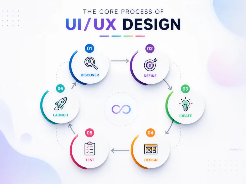
1. Full Process Overview (High-Level Flow)
Here is how the entire UI/UX design pipeline connects:
DEFINE ↓RESEARCH ↓PLAN (IA + User Flows) ↓DESIGN (Wireframes → UI) ↓PROTOTYPE ↓TEST (Usability Testing) ↓REFINE ↓Handoff to Development
Key principle:
This is not linear. It is a looping system, where testing can send you back to planning or even research.
2. The Four Core Phases (Structured Breakdown)
| Define | Align goals & scope | Project brief, KPIs | Misaligned product vision |
| Research | Understand users & market | Personas, insights | Building the wrong solution |
| Plan | Structure experience | IA, user flows, wireframes | Confusing navigation & logic |
| Design & Validate | Build & test UI | Prototypes, specs | Poor usability, dev rework |
3. Step-by-Step Premium UI/UX Process
STEP 1: DEFINE (Strategy Foundation)
The strategic framework for the entire UI/UX design process is created during the Define phase. Teams must have a thorough understanding of the product’s purpose, target market, and business objectives before producing wireframes, prototypes, or visual designs. In this phase, designers and stakeholders establish quantifiable success criteria, identify essential user groups, define the product vision, and document critical constraints, including project timelines, budgetary limits, and technological requirements. The group also decides which features will be covered later and which are part of the original scope. The Define phase minimizes uncertainty, avoids scope creep, and ensures that every design choice supports a precise, well-defined purpose by aligning corporate objectives with user needs from the outset.
Activities:
- Define product vision
- Identify target users
- Set measurable success metrics
- Document constraints (tech, budget, timeline)
- Define in-scope vs out-of-scope features
Example: Success Metrics Table
| Reduce drop-off | Checkout completion rate | +75% | Q2 |
| Improve onboarding | Completion rate | 80%+ | Launch |
| Improve usability | Task success rate | 85%+ | Pre-launch |
Output:
- Product brief
- KPI dashboard
- Scope document
STEP 2: RESEARCH (User + Market Intelligence)
The Research phase focuses on replacing assumptions with real, data-driven insights about users and the market. Designers conduct user interviews, observe behavior, identify pain points, analyze competitors, and uncover market gaps to understand what users truly need and where existing solutions fall short. This stage helps build a clear picture of user expectations and challenges, ensuring that design decisions are based on evidence rather than guesswork.
Activities:
- User interviews (5–8 users)
- Behavioral observation
- Pain point discovery
- Competitive analysis
- Market gap identification
User Interview Structure
| Context | “How do you currently complete this task?” |
| Pain | “What slows you down the most?” |
| Behavior | “What workaround do you use?” |
| Goal | “What would an ideal solution look like?” |
Research Output Flow
Raw Interviews ↓Pattern Identification ↓Insights ↓Personas ↓Journey Maps
Deliverables:
- User personas
- Journey maps
- Competitive analysis matrix
- Insight report
STEP 3: PLAN (Structure & Experience Architecture)
Turn research into structure before visuals.
3.1 Information Architecture (IA)
Define how content is organized.
Example IA Structure:
Home ├── Dashboard │ ├── Overview │ └── Analytics ├── Projects │ ├── Active Projects │ └── Archived └── Settings ├── Profile └── Security
Validation Method: Card Sorting
- Write features on cards
- Ask users to group them
- Identify natural patterns
- Refine navigation structure
3.2 User Flow Mapping
Define step-by-step user journeys.
Example Flow:
User Goal: Purchase ProductLanding Page ↓Search Product ↓Product Page ↓Add to Cart ↓Checkout ↓Payment Success
Flow Quality Check:
| Too many steps | Friction increases drop-off |
| Unclear decision points | Confuses users |
| Missing exit states | Broken UX |
Deliverables:
- Sitemap
- User flows
- Low-fidelity wireframes
STEP 4: DESIGN (Wireframes → UI System)
The Design phase transforms structured ideas into a complete visual experience. It begins with low-fidelity wireframes that focus on layout and functionality, then evolves into high-fidelity UI designs with typography, colors, spacing, and components. During this stage, a consistent design system is also created to ensure uniformity across all screens and interactions. The goal is to turn planned user flows into an intuitive, visually appealing, and fully interactive interface that is both functional and scalable.
4.1 Wireframing (Low Fidelity)
Focus:
- Layout only
- No colors
- No styling
Example:
[ Header ][ Search Bar ][ Product Grid ][ Filters ]
4.2 High-Fidelity UI Design
Now add:
- Typography system
- Color system
- Spacing rules
- Icons
- Grid system
UI System Components:
| Typography | Readability hierarchy |
| Color palette | Emotional tone |
| Spacing system | Visual consistency |
| Components | Reusable UI building blocks |
4.3 States Design (Critical Step)
Every component must include:
- Hover state
- Active state
- Loading state
- Error state
- Empty state
Missing states = broken production UX
STEP 5: PROTOTYPE (Interaction Simulation)
The Prototype phase brings the design to life by simulating real product behavior. Designers create clickable prototypes by linking screens and mapping interactions to show how users will navigate and interact with the product. This helps visualize the flow, test functionality, and identify usability issues before development begins, ensuring the experience feels natural and intuitive.
Activities:
- Clickable prototype creation
- Screen linking
- Interaction mapping
Prototype Flow Example:
Click Button → Open Modal → Confirm Action → Success Screen
STEP 6: TEST (Usability Validation)
Identify usability issues before development.
Testing Method:
- 5–8 users
- Task-based testing
- No guidance given
- Observe behavior
Issue Severity Matrix
| Critical | Task impossible | Fix immediately |
| Major | Task difficult | Fix before launch |
| Minor | Small confusion | Fix if time allows |
| Cosmetic | Visual issue | Log only |
Output:
- UX issue report
- Prioritized fixes
- Iteration list
STEP 7: REFINEMENT LOOP
After testing:
Find issues ↓Fix design ↓Retest ↓Finalize
This loop is what separates average UX from premium UX.
STEP 8: Developer Handoff
Ensure zero ambiguity in development.
Handoff Package Includes:
- Annotated UI screens
- Design system (components + tokens)
- Spacing & typography guide
- Interaction specifications
- Responsive behavior rules
Example Spec Sheet:
| Button Height | 48px |
| Border Radius | 8px |
| Primary Color | #2F6FED |
| Font | Inter / 16px base |
FINAL PREMIUM PROCESS MAP
DEFINE → RESEARCH → PLAN → DESIGN → PROTOTYPE → TEST → REFINE → HANDOFF ↖──────────────────────────────────────────────↙ (continuous improvement loop)
Premium Web Design for B2B Brands
From the list of leading B2B platforms, a few stand out for their exceptional balance of clarity, conversion focus, and user experience. These websites don’t just look good—they are strategically designed to guide users through complex buying journeys, build trust quickly, and drive action.
Below are the 5 strongest examples of B2B website design excellence, refined and analyzed for inspiration.
1. HubSpot: The Benchmark for Content-Driven B2B Design
HubSpot sets the gold standard for inbound marketing websites by combining education, trust-building, and conversion-focused UX into a seamless experience.
The website is structured around providing value first. Instead of pushing sales immediately, it offers blogs, eBooks, templates, and case studies that help users solve real problems. This positions HubSpot as an authority before any purchase decision is made.
Strategic calls-to-action guide users naturally through different stages of the funnel—from exploring free CRM tools to subscribing to newsletters and upgrading to paid solutions. The experience feels less like a sales pitch and more like a guided journey.
Why it stands out:
- Strong educational ecosystem (blogs, resources, guides)
- Clear, multi-stage conversion funnels
- Trust-building through case studies and success stories
- Seamless navigation between free and paid offerings
2. Slack: Masterclass in Pain-Point Driven Messaging
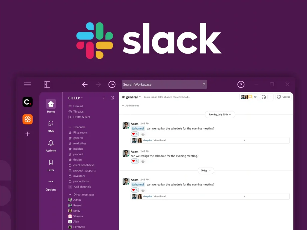
Slack’s website excels at one thing: instantly communicating value.
The messaging is direct and user-focused—“Keep your team coordinated, wherever you are.” This immediately addresses a core business pain point: fragmented communication.
The interface is clean, minimal, and distraction-free, ensuring that users focus on the product’s core benefit. Slack also reduces friction by prominently featuring free trials and sign-up actions, making it easy for teams to start without hesitation.
Why it stands out:
- Clear pain-point driven messaging
- Extremely low visual friction
- Strong conversion-focused CTAs
- Smooth onboarding pathways
3. Dropbox: Simplicity That Drives Clarity
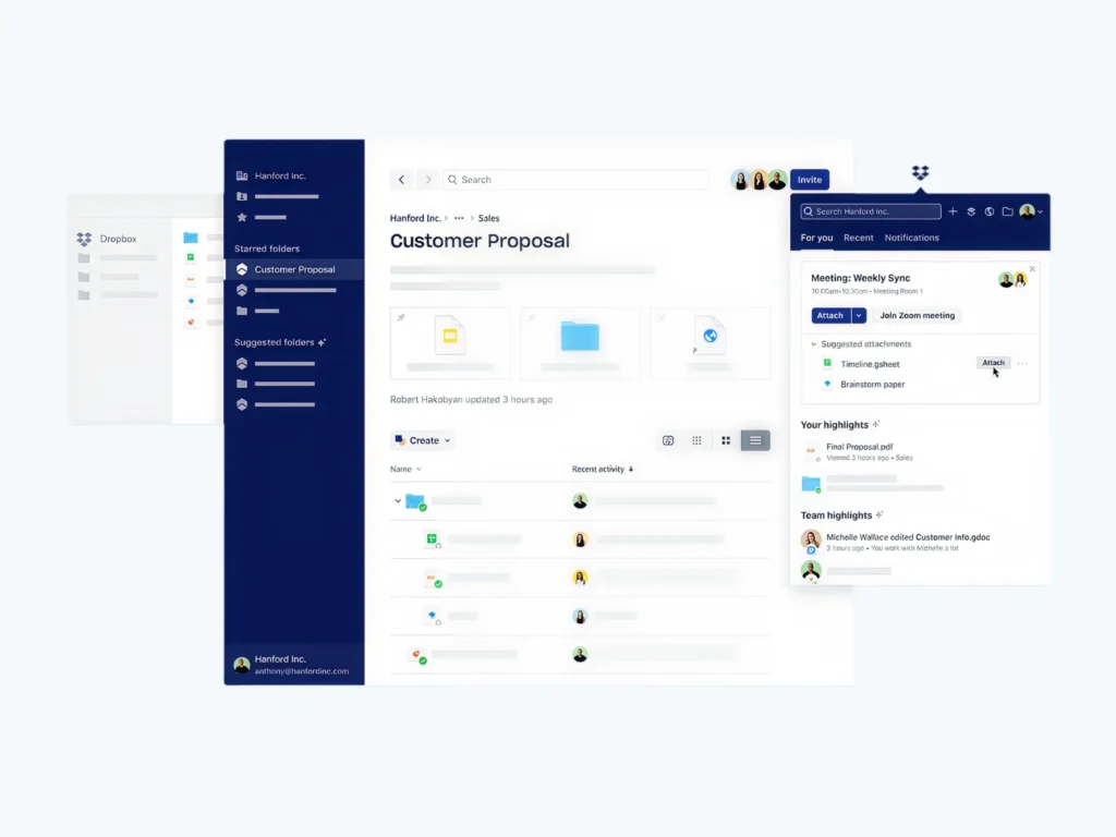
Dropbox demonstrates how powerful simplicity can be in B2B design. Instead of overwhelming users with technical details, Dropbox focuses on its core value: storing, syncing, and sharing files. The design uses minimal text, clean layouts, and intuitive visuals to communicate functionality instantly.
This approach is especially effective for B2B users who prioritize efficiency and clarity over complexity.
Why it stands out:
- Minimalist, distraction-free interface
- Clear focus on core product functionality
- Easy-to-scan content structure
- Strong visual hierarchy
4. Salesforce: Enterprise-Level UX with Deep Personalization
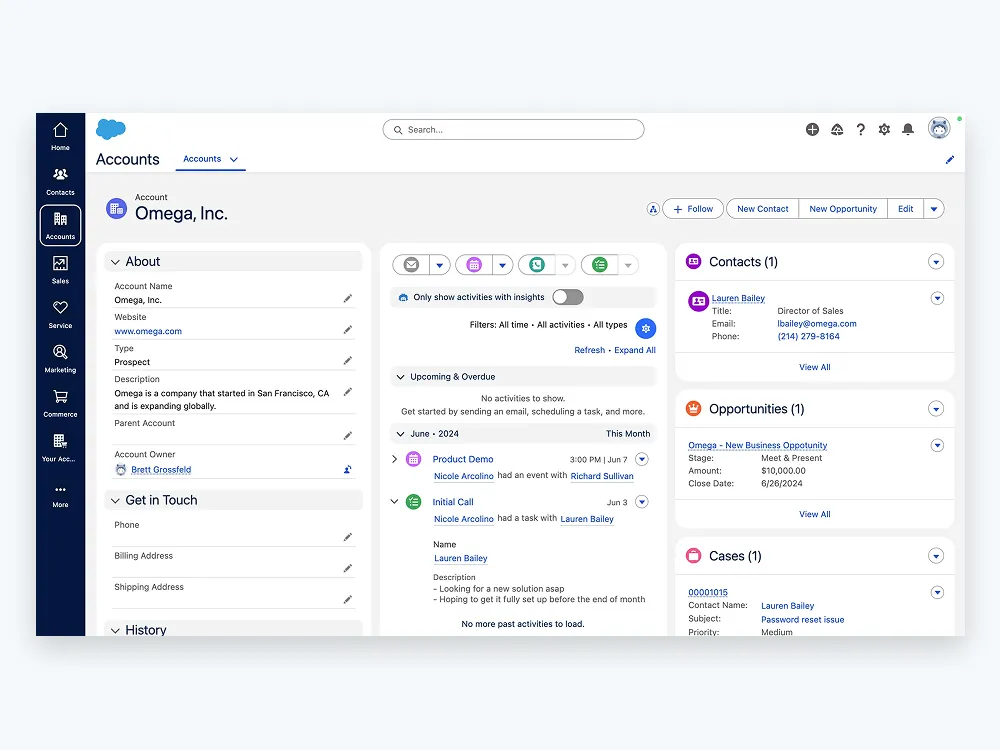
Salesforce is a powerful example of how to design for complex enterprise audiences without overwhelming them. Despite offering a vast ecosystem of CRM and enterprise solutions, the website organizes content around user needs rather than product complexity. Visitors can explore tailored solutions, request demos, and access case studies that match their industry.
Interactive elements and guided navigation help simplify decision-making for high-value buyers, making complex offerings feel accessible.
Why it stands out:
- Highly structured enterprise navigation
- Personalized solution pathways
- Strong use of demos and interactive content
- Rich ecosystem of case studies and resources
5. Webflow: Minimalism with Creative Control
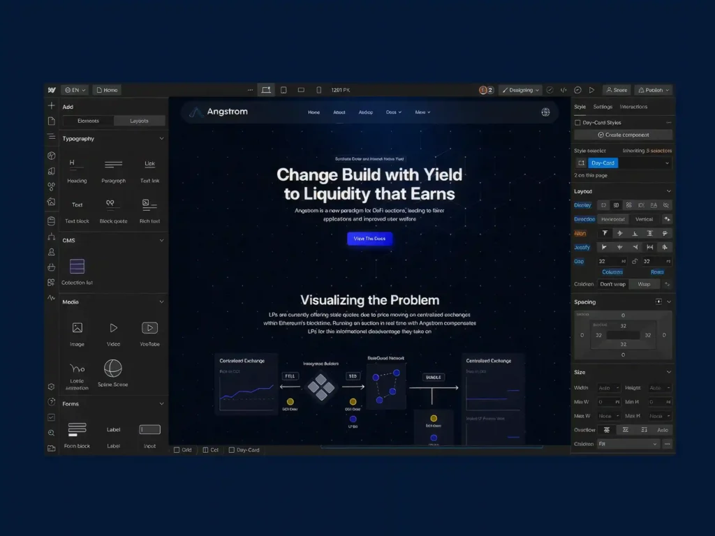
Webflow is a standout example of modern SaaS design that blends minimalism with creative empowerment.
The website uses generous white space, clean typography, and subtle motion to highlight its core promise: building websites visually without code. Instead of cluttering the interface, Webflow lets the product experience and visuals take center stage.
This design approach strongly resonates with designers, developers, and creative teams looking for flexibility and control.
Why it stands out:
- Strong use of whitespace and visual hierarchy
- Minimalist but expressive UI
- Product-led storytelling
- Clear focus on creative professionals
The impact of UI/UX on technical SEO
UI/UX design directly affects how search engines evaluate and rank a website because SEO is no longer just about keywords—it’s about user experience and behavior.
- A good UI/UX improves user engagement metrics like time on page, scroll depth, and click-through rates, while poor design increases bounce rates. These behavioral signals indirectly influence search rankings.
- Site structure and information architecture play a key role in SEO. A clean, logical navigation system helps search engines crawl and index pages efficiently while also making it easier for users to find content.
- Page speed is heavily influenced by UI/UX choices such as image optimization, layout complexity, and animations. Since Core Web Vitals are ranking factors, slow or heavy designs can negatively impact SEO performance.
- Mobile UX is critical because Google uses mobile-first indexing. If the mobile experience is poor—slow loading, hard navigation, or unreadable text—rankings will suffer even if the desktop version is strong.
- Internal linking and navigation design improve both user flow and crawlability. Well-placed links help users explore content naturally while also distributing SEO value across pages.
- Content readability and visual hierarchy also matter. Clear typography, proper spacing, and structured headings keep users engaged longer, which improves overall SEO signals.
How to balance web aesthetics with page speed
Balancing design and performance means ensuring a website is visually engaging without sacrificing speed or usability. The best modern websites achieve both through intentional design decisions and technical optimization working together.
1. Design vs Performance Trade-off
Balancing design and performance means finding the right mix between visual appeal and speed. While images, animations, and large layouts improve aesthetics, they can slow down performance if not optimized. Using lightweight assets, minimal scripts, and optimized visuals ensures a fast, smooth, and user-friendly experience without sacrificing design quality.
| High-resolution images | High | Slow loading | Compress + use WebP |
| Animations | High | Medium to High | Use micro-interactions only |
| Large hero sections | High | Medium | Optimize above-the-fold assets |
| Minimal layouts | Medium-High | Fast | Preferred approach |
| Heavy scripts | Low | Very Slow | Avoid or optimize |
2. The Ideal Balance Model
AESTHETICS ▲ │ │ Premium UX Zone │ (Balanced Design) │ │FAST ◄──────┼──────► SLOW │ │ Over-Optimized (Plain UX) │ ▼ PERFORMANCE
3. Layered Design Optimization Strategy
Layer 1: Visual Design (UI) ↓Layer 2: Asset Optimization ↓Layer 3: Frontend Performance ↓Layer 4: Delivery Optimization (CDN + Caching) ↓Final Output: Fast + Beautiful Website
4. Speed Impact Breakdown (UX Perspective)
| Page load delay (>3s) | High bounce rate | Ranking drop |
| Layout shifting | Poor experience | Core Web Vitals penalty |
| Slow interactions | Frustration | Lower engagement signals |
| Smooth rendering | Higher trust | Better retention |
5. Visual Performance Strategy
By reducing unnecessary visual clutter, the visual performance strategy aims to keep designs simple, quick, and easy to use. Content is arranged in a clear hierarchy, with optimized above-the-fold content, lazy-loaded supporting images, and simple yet significant design elements, rather than overcrowding pages with heavy features. This guarantees that the interface will remain aesthetically appealing while maintaining fast load times and seamless operation.
Above-the-Fold Priority Model
[ Hero Section ]- Fast loading headline- Optimized image- Primary CTA[ Secondary Content ]- Lazy loaded images- Supporting visuals[ Footer Content ]- Full resources- Extra media
6. Optimization Toolkit (What Actually Improves Balance)
| Images | WebP, compression | Faster load times |
| Scripts | Minification | Reduced blocking time |
| Delivery | CDN usage | Lower latency |
| Browser | Caching | Faster repeat visits |
| UI | Minimal design | Lightweight experience |
7. Continuous Improvement Loop
Design Build → Measure Speed → Identify Issues → Optimize → Test Again
UI/UX Best Practices for Headless Commerce
Headless commerce gives businesses complete freedom to create faster, more flexible, and highly personalized shopping experiences. However, this flexibility also requires a strong UX strategy to ensure customers enjoy a seamless journey from product discovery to checkout. Following the right UI/UX practices helps maximize the benefits of a headless architecture while improving engagement and conversions.
- Prioritize Performance: Optimize images, scripts, and assets to ensure fast-loading pages and smooth interactions.
- Simplify Product Discovery: Use intuitive navigation, smart search, and advanced filters to help users find products quickly.
- Adopt a Mobile-First Approach: Design responsive experiences with touch-friendly interactions and streamlined mobile checkouts.
- Maintain Design Consistency: Use a unified design system across websites, apps, and other digital touchpoints.
- Leverage Personalization: Deliver relevant product recommendations, tailored content, and personalized shopping experiences.
- Design for All States: Include loading, empty, success, and error states to provide clear user feedback.
How Core Web Vitals Impact UX Design
Core Web Vitals directly shape how users experience a website, and they have become a key link between technical performance and UX quality. Google uses these metrics not just for SEO ranking, but also as indicators of real user satisfaction.
- Largest Contentful Paint (LCP) affects how fast users see the main content. If a page loads slowly, users feel the site is unresponsive, which increases frustration and drop-offs. From a UX perspective, this pushes designers to prioritize lightweight images, optimized layouts, and fast-loading above-the-fold content.
- Interaction to Next Paint (INP) measures how quickly a page responds to user actions like clicks or taps. Poor interaction speed makes interfaces feel laggy or broken, so UX design must ensure buttons, menus, and interactive elements are responsive and not overloaded with heavy scripts or animations.
- Cumulative Layout Shift (CLS) tracks unexpected layout movement while a page loads. When elements shift suddenly, users may misclick or lose their place, creating a frustrating experience. Good UX design solves this by reserving space for images, ads, and dynamic content to maintain visual stability.
- These metrics also influence design decisions early in the process, not just development. Designers now need to consider performance when creating layouts, avoiding overly complex sections, heavy visual effects, and unnecessary UI elements that slow rendering.
- Ultimately, Core Web Vitals push UX toward a more performance-first design approach, where clarity, speed, and stability are as important as aesthetics.
Common Mistakes to Avoid
Even the most visually appealing websites can fail if fundamental UI/UX principles are overlooked. Whether you’re designing a traditional website, a headless commerce platform, or a high-performance web application, avoiding these common mistakes can significantly improve usability, engagement, and conversion rates.
1. Prioritizing Visual Design Over User Experience
Many businesses focus heavily on aesthetics while neglecting usability. While attractive visuals can capture attention, users ultimately stay for a seamless experience. Complex layouts, excessive animations, or unconventional navigation may look impressive but often create friction and confusion.
2. Ignoring Website Performance
A slow website can undermine even the best design. Large images, unoptimized videos, heavy scripts, and unnecessary design effects increase loading times and frustrate users. Performance should be considered from the start of the design process, not as an afterthought.
3. Designing Without User Research
Making design decisions based on assumptions instead of real user insights is one of the biggest UX mistakes. Without understanding user needs, behaviors, and pain points, teams risk building experiences that solve the wrong problems.
4. Creating Complicated Navigation
If users struggle to find information, they are unlikely to stay engaged. Overly complex menus, unclear labels, and poorly structured information architecture create unnecessary friction. Navigation should feel intuitive and require minimal effort to understand.
5. Neglecting Mobile Users
With mobile traffic dominating most industries, designing primarily for desktop experiences can lead to poor usability and lost conversions. Responsive layouts, touch-friendly interactions, and optimized mobile performance are essential for modern websites.
Conclusion
In a world where users can leave a website with a single click, great UI/UX design is no longer optional; it’s a competitive advantage. The most successful digital products are not just visually appealing; they are intuitive, accessible, fast, and built around real user needs.
From understanding the difference between UI and UX to implementing structured design processes, optimizing for Core Web Vitals, and creating seamless headless commerce experiences, every design decision shapes how users perceive and interact with your brand. When aesthetics, usability, and performance work together, businesses create experiences that drive engagement, increase conversions, strengthen customer loyalty, and support long-term growth.
The best digital experiences feel effortless because every detail has been carefully considered. By prioritizing user-centered design, continuous testing, and performance-focused optimization, organizations can build products that not only look exceptional but also deliver measurable business results. Ultimately, Premium UI/UX design isn’t about making interfaces aesthetic; it’s about creating meaningful experiences that help users succeed, and businesses thrive.