Introduction
Colour is one of the first elements users notice in a digital product, yet it is often treated as a visual choice rather than a strategic design tool. In many B2B applications, colour decisions are driven by branding rather than usability, thereby missing opportunities to improve navigation, clarity, and decision-making.
Unlike consumer websites, enterprise platforms support long, task-focused workflows where users interact with complex data and processes every day. In these environments, strategic colour in UI/UX helps reduce cognitive load, establish visual hierarchy, and create consistent user experiences.
This article explores how advanced colour theory in web design goes beyond basic colour psychology, why a strong B2B UI colour strategy matters, and how to apply advanced colour theory to B2B UI through scalable, user-centred colour systems.
Why Traditional Colour Theory Falls Short in Enterprise UX?
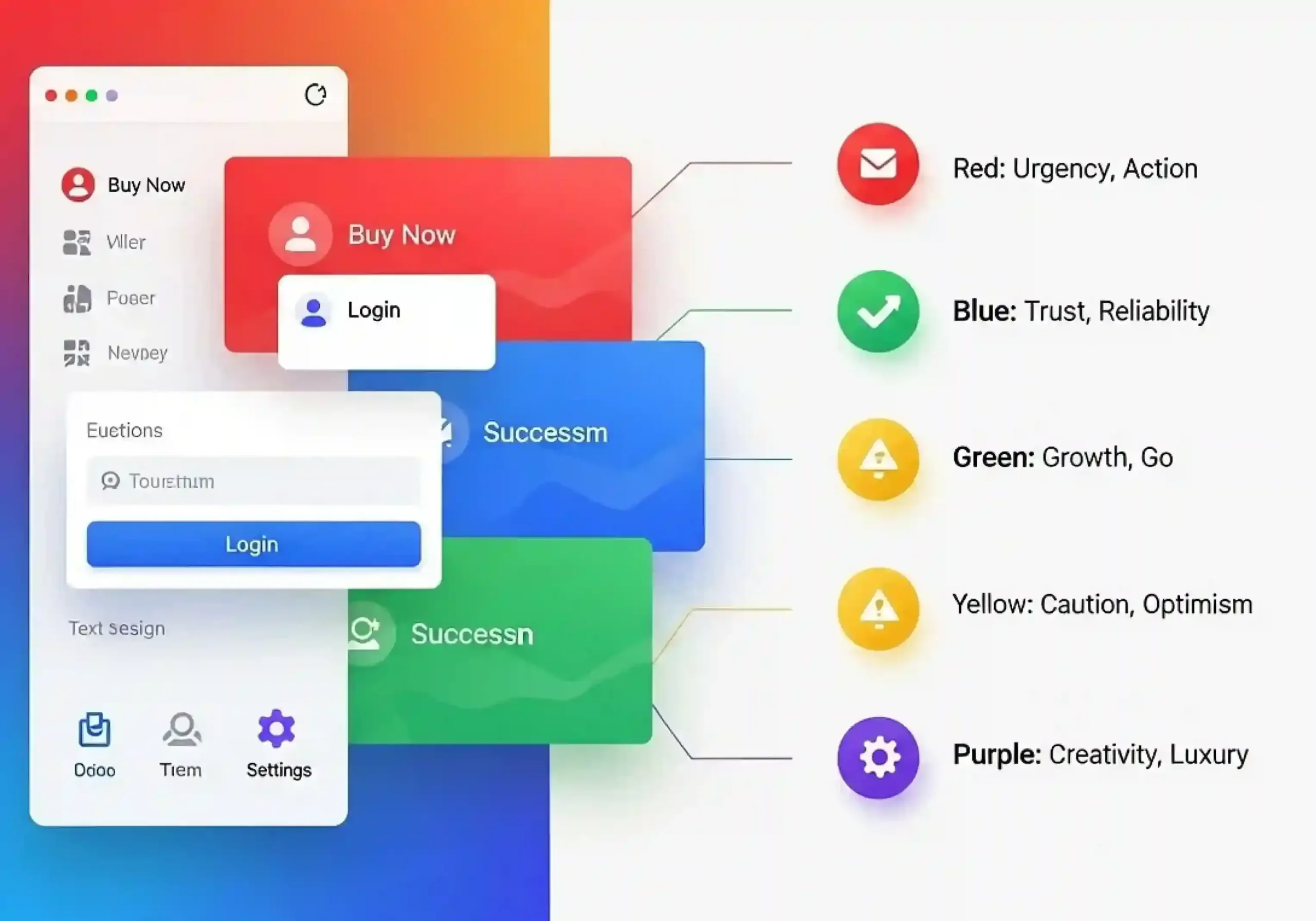
Traditional colour theory focuses on emotional associations; blue represents trust, green suggests growth, and red creates urgency. While these principles are useful in branding, they do not fully address the challenges of enterprise software, where users spend hours working with complex dashboards, workflows, and data-driven systems.
In B2B applications, colour goes beyond visual appeal. It helps users identify priorities, understand system states, and navigate tasks efficiently. Modern enterprise UX moves beyond basic colour psychology by using contextual colour, where each colour is assigned a clear functional purpose based on its role, placement, and consistency across the product.
Traditional Colour Theory vs Strategic Colour in UI/UX
| Traditional Colour Theory | Strategic Colour in UI/UX |
| Focuses primarily on visual appeal | Focuses on usability and decision-making |
| Colours are selected individually | Colours are assigned functional roles |
| Supports branding and marketing | Supports workflows and productivity |
| Based on emotional symbolism | Based on context and interaction |
| Evaluates individual screens | Considers the entire product ecosystem |
| Prioritises aesthetics | Prioritises consistency and clarity |
The difference may seem subtle, but it has a significant impact on user experience. Instead of asking whether a colour feels modern or attractive, designers begin asking whether it helps users complete their work more effectively.
What Is Strategic Colour in UI/UX?
Strategic colour in UI/UX is the practice of assigning a clear purpose to every colour within a digital product. Instead of using colours purely for decoration, designers define where and how each colour should appear to create consistent and predictable experiences. Similar to road signs, where users instantly recognise the meaning of different colours, digital products use strategic colour systems to help users understand actions, statuses, and information without extra effort.
For example, a B2B application may define specific colour roles for primary actions, success states, warnings, errors, and informational messages.
| Primary | Main actions and important buttons |
| Success | Completed actions and confirmations |
| Warning | Tasks requiring attention |
| Error | Failed processes and validation issues |
| Information | Guidance, tooltips, and educational content |
| Neutral | Backgrounds, secondary elements, and layouts |
When these roles remain consistent throughout the product, users begin relying on visual recognition instead of repeatedly interpreting the interface. This reduces cognitive effort and allows them to focus on their actual work rather than figuring out how the software behaves.
Understanding Contextual Colour: Why Meaning Depends on Placement
One of the biggest misconceptions in design is that colours have universal meanings. While cultural associations influence perception, users interpret colour based on its context, surrounding elements, and how consistently it is applied throughout an interface. For example, blue may represent a primary action button on one screen, while the same colour could indicate links, selected states, or informational content elsewhere. The colour itself remains unchanged, but its meaning shifts depending on where and how it appears.
This principle is known as contextual colour, and it plays a critical role in modern interface design. Effective colour systems ensure that every colour has a clear purpose and supports user understanding.
A strong contextual colour strategy helps designers:
- Create clear visual hierarchy between important and secondary elements.
- Guide users toward the right actions without unnecessary effort.
- Make system states easier to recognise.
- Prevent visual overload by avoiding excessive use of attention-grabbing colours.
For instance, a warning message in amber stands out when placed within a neutral interface. However, if multiple elements already use bright colours, the warning loses its impact. This is why colour should
Factors That Influence Contextual Colour:
Several factors affect how users interpret colour within an interface:
- Surrounding colours that either increase or reduce visual contrast.
- Component type, such as buttons, charts, icons, or notifications.
- Screen hierarchy, including headings, content, and navigation.
- Frequency of use, since overusing an accent colour weakens its impact.
- User expectations are developed through repeated interactions with the product.
Emotional Resonance in Enterprise Design:
Emotional design is often associated with consumer apps and lifestyle products, but enterprise users experience emotions just as strongly. Employees working with complex systems face moments of pressure, uncertainty, confidence, and relief every day.
A well-designed B2B interface uses colour to support these emotional states. It is not about adding bright visuals or unnecessary effects; it is about creating clarity and reducing friction. A confirmation message should build confidence, while an error state should guide users toward a solution without creating frustration. This is the role of emotional resonance in enterprise UX: using thoughtful design choices to create experiences that feel trustworthy, predictable, and easy to navigate.
Designing for the User's Emotional Journey
| Completing a complex workflow | Confidence | Clear success colours and calm confirmations |
| Uploading sensitive documents | Trust | Stable primary colours with minimal distractions |
| Resolving validation errors | Guidance | Distinct but non-aggressive error colours |
| Reviewing financial reports | Focus | Neutral interface with controlled emphasis |
| Receiving AI-generated recommendations | Transparency | Consistent informational colours that distinguish AI content |
The goal of emotional resonance in enterprise UX is not to create excitement but to build confidence and reduce uncertainty. As AI becomes more integrated into business applications, colour helps users distinguish system-generated information, important actions, and workflow states more easily.
Why does B2B UI/UX Colour Strategy Differs from Consumer Design?
Although good design principles apply to all digital products, consumer apps and enterprise software have different goals. Consumer products often use colour to attract attention and create emotional engagement, while B2B platforms focus on helping users complete complex tasks quickly and accurately.
In enterprise interfaces, excessive colours can create distraction and increase cognitive load. Users need clarity, consistency, and quick recognition rather than visual excitement. This is why successful B2B products use colour with greater purpose; highlighting important actions, communicating system states, and improving workflow efficiency.
| Focuses on engagement and exploration | Focuses on productivity and efficiency |
| Uses bold visuals to attract attention | Uses controlled colours for clarity |
| Prioritises emotional appeal | Prioritises usability and decision-making |
| Encourages discovery | Supports structured workflows |
Colour is only one part of creating a premium enterprise experience. A successful B2B interface also depends on typography, spacing, motion, and visual hierarchy working together as a unified system. As discussed in our guide on cinematic web design, modern digital experiences require a balance between visual storytelling and usability.
Building Strategic Colour Systems Instead of Simple Colour Palettes
A colour palette helps establish visual direction, but it cannot support the complexity of modern enterprise products on its own. As products scale, inconsistent colour usage across buttons, alerts, charts, and system states can create confusion and reduce user confidence.
A strategic colour system solves this by giving every colour a clear purpose. Instead of asking, “Which colour looks good here?” teams focus on “What role should this colour play?”
A well-structured colour system helps:
- Create consistent experiences across the product.
- Improve recognition of actions and system states.
- Reduce cognitive effort during complex workflows.
- Improve collaboration between design and development teams.
However, effective design systems go beyond colour. Typography, spacing, motion, and component consistency also shape user perception. Similar principles can be seen in The Anatomy of Premium Dark Mode guide, where we explore how structured visual decisions create interfaces that are both visually refined and easier to use.
The Role of Design Tokens in Scalable UI Design:
As enterprise products become larger, maintaining consistency manually becomes increasingly difficult. A single application may contain hundreds of interface components spread across multiple modules, making it unrealistic to update colours individually whenever branding changes or new themes are introduced.
This is where design tokens become invaluable. Rather than assigning specific hexadecimal values directly to interface elements, design tokens store colours as semantic variables that describe their purpose.
Instead of defining colours like this:
#0057FF#28A745#FFC107
Modern design systems use semantic names such as:
Primary-500Success-500Warning-400Surface-LightText-Primary
The difference may appear subtle, but it fundamentally changes how products are built and maintained. If the organisation decides to refresh its branding or introduce a dark theme, teams only need to update the token values rather than editing hundreds of individual components. Beyond technical efficiency, design tokens create stronger collaboration between designers and developers. Both teams work from the same shared language, reducing inconsistencies and ensuring that interface decisions remain aligned as the product grows.
How to Apply Advanced Colour Theory to B2B UI?
Understanding colour theory is only the beginning. The real challenge is applying those principles consistently across complex enterprise products where users complete dozens of tasks every day. An effective colour strategy isn't built around trends; it is built around behaviour.
Here are five practical ways to apply advanced colour theory web design principles within enterprise interfaces.
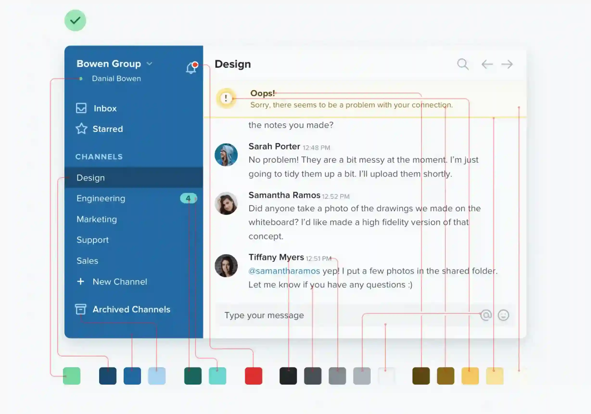
1. Define Functional Colour Roles
Every colour should communicate a single, consistent meaning. If users learn that one colour represents primary actions, that meaning should remain unchanged across the entire product. Predictable colour usage reduces hesitation because users no longer need to interpret every interface element individually.
2. Build a Clear Visual Hierarchy
Not every button or notification deserves equal attention. Colour should reinforce hierarchy by highlighting the most important actions while allowing secondary elements to remain visually supportive. When everything is emphasised, users struggle to identify where they should focus first.
3. Use Neutral Colours Intentionally
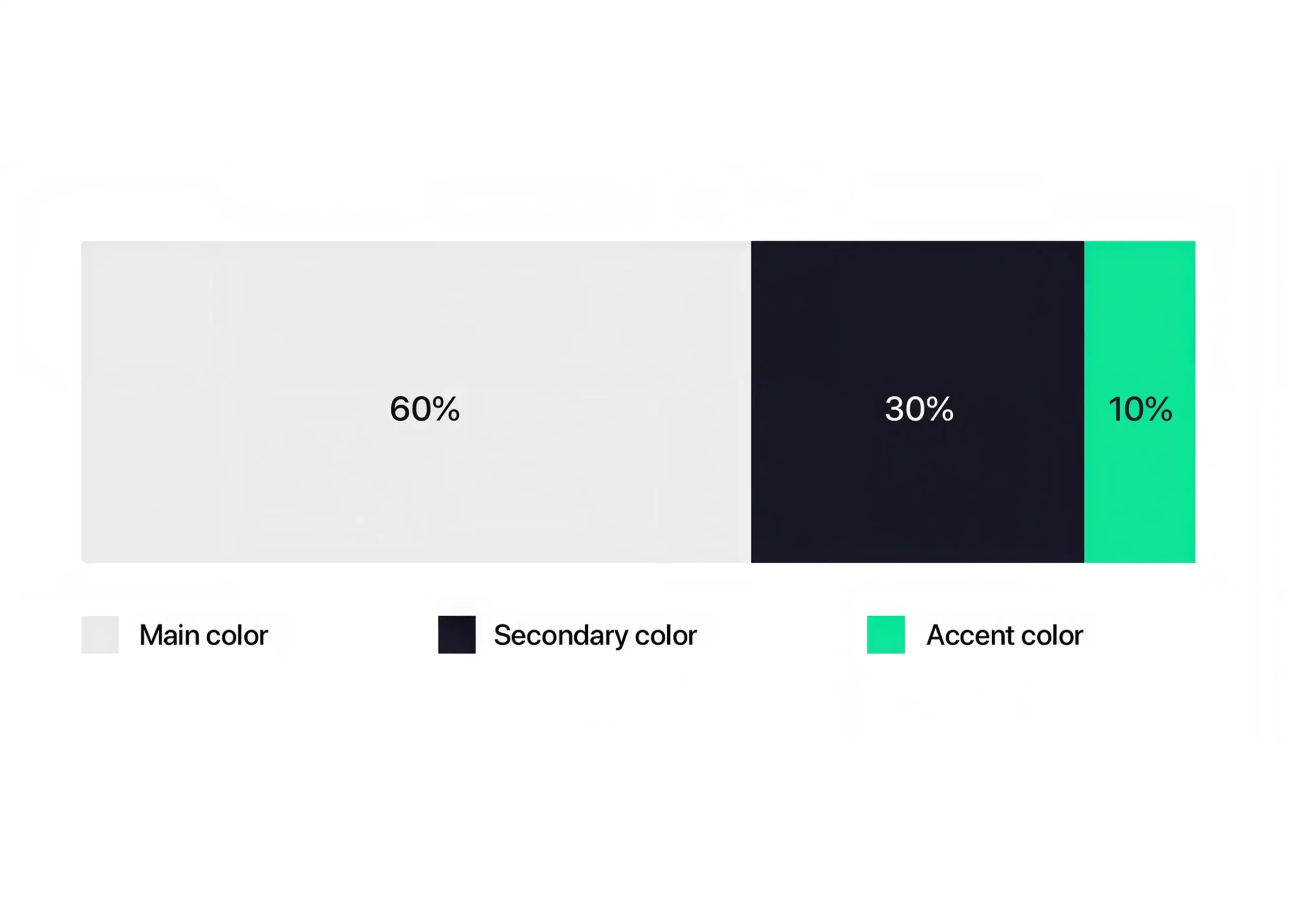
Neutral colours often receive less attention than accent colours, yet they play an equally important role in enterprise interfaces. White, grey, and subtle background tones provide visual breathing room, making important actions easier to identify. Without this balance, colourful interfaces quickly become visually exhausting.
4. Test Colours Within Complete Workflows
Colours rarely exist in isolation. A button that works perfectly on a design mock-up may become difficult to notice once surrounded by dashboards, charts, notifications, and navigation elements. Testing complete workflows helps teams understand whether colour continues to support users in realistic scenarios.
5. Maintain Consistency Across the Entire Product
Enterprise applications often contain multiple modules developed by different teams over several years. A strategic colour system ensures that users experience the same visual language regardless of where they are in the application. This consistency builds familiarity and reduces the learning curve for new features.
Accessibility: More Than a Compliance Requirement
Accessibility should be considered from the beginning of the design process, not treated as a final checklist. Thoughtful colour choices improve readability, clarity, and usability for all users, not only those with visual impairments.
An accessible colour system focuses on strong contrast, clear hierarchy, and meaningful use of colour. Designers should avoid relying on colour alone to communicate important information. For example, error messages should combine colours with icons or text labels to ensure they remain understandable.
Key practices include:
- Maintaining sufficient colour contrast.
- Using icons or labels alongside colour indicators.
- Avoiding excessive use of highly saturated colours.
- Testing designs across light and dark themes.
Accessibility strengthens the overall user experience by making interfaces clearer, more inclusive, and easier to navigate.
Common Mistakes Designers Still Make:
Even experienced design teams can create usability issues when colour decisions lack consistency. The problem is rarely the choice of colours itself; it is how those colours are applied across the product.
Some common mistakes include:
- Overusing brand colours: Applying the same brand colour to every button, card, and notification reduces visual hierarchy and makes important actions harder to identify.
- Using too many attention-grabbing colours: When every element competes for attention, users struggle to understand what matters most.
- Designing colours screen-by-screen: A colour choice that works on one page may create confusion across dashboards, reports, and workflows. Colour systems should be designed for the entire product.
- Ignoring dark mode requirements: Simply reversing colours does not create a good dark theme. A strategic system should maintain contrast, accessibility, and meaning across different modes.
Measuring Whether Your Colour Strategy Works
A successful colour strategy is not measured by personal preference or visual trends. Its effectiveness should be reflected in how efficiently users interact with the product and how confidently they complete their tasks.
Rather than asking whether an interface looks modern, organisations should evaluate whether colour improves usability and supports business goals. User testing, analytics, and usability research often reveal whether a colour system is genuinely helping users or simply making the interface more colourful.
| Task Completion Rate | Indicates whether users can complete workflows efficiently. |
| Error Rate | Shows whether colour helps prevent mistakes and improves clarity. |
| Time to Complete Tasks | Measures how effectively colour supports navigation and hierarchy. |
| User Satisfaction | Reflects users' confidence and overall experience with the interface. |
Reviewing these metrics regularly allows teams to refine their B2B UI colour strategy based on real user behaviour instead of assumptions.
Final Thoughts:
Colour is no longer just a visual element in modern enterprise applications; it is a strategic tool that shapes how users understand information, navigate workflows, and interact with digital products. By moving beyond basic colour theory and adopting contextual colour, design tokens, and consistent colour systems, businesses can create interfaces that are clearer, more accessible, and easier to scale.
A strong B2B UI colour strategy improves user confidence, supports efficient workflows, and helps teams build more consistent products. As enterprise technology continues to evolve, strategic colour in UI/UX will remain essential for creating meaningful digital experiences.

Design is not just what it looks like and feels like. Design is how it works.
This quote reminds us that successful design is not defined by appearance alone. While visual appeal matters, the true measure of great design is how effectively it solves problems, supports users, and creates a smooth, intuitive experience that feels effortless to use.
Related posts