Introduction

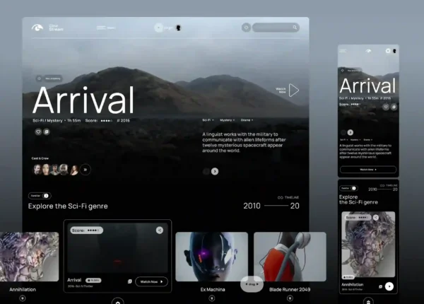
Dark mode has evolved far beyond a simple design trend. What once began as a practical option for reducing eye strain and conserving battery life has become a defining characteristic of modern digital products. From SaaS platforms and fintech dashboards to luxury brand websites and creative portfolios, dark interfaces are increasingly associated with sophistication, focus, and premium user experiences.
Yet creating an effective dark interface involves much more than switching a white background to black. Many dark websites fall into the trap of using pure black backgrounds and bright white text, resulting in flat layouts, harsh contrast, and poor visual hierarchy.
A truly premium dark mode experience is built on careful design decisions that balance contrast, depth, readability, and visual comfort. The best dark interfaces feel immersive without being overwhelming, elegant without sacrificing usability, and visually rich without becoming cluttered.
Let’s explore the principles behind premium dark mode design and how designers can create interfaces that feel polished, modern, and distinctly high-end.
Moving Beyond #000000
One of the biggest misconceptions in dark interface design is the assumption that dark mode means using pure black everywhere. In reality, many of the most admired digital products avoid absolute black as their primary background color. While pure black can look striking at first glance, it often creates excessive contrast, makes elevation difficult to communicate, and can feel visually harsh during extended use.
Instead, premium interfaces typically rely on deep charcoal tones, dark grays, or subtly tinted dark surfaces. These colors create a softer visual environment while providing room for hierarchy and depth.

For example, rather than building an interface around #000000, designers may use:
- Deep charcoal backgrounds
- Slightly lighter secondary surfaces
- Elevated cards with subtle tonal differences
- Accent colors that stand out without overpowering the interface
This approach creates a more refined aesthetic while making it easier to guide user attention through the interface. The goal is not to make the screen as dark as possible. The goal is to create an environment where content, actions, and hierarchy are immediately understandable.
The 5 Important Rules of Effective Dark Mode Design:
A great dark mode is more than just a lighter UI with darker colors. It demands close attention to color balance, contrast, and spacing. In reality, dark mode helps to focus on design shortcomings; on darker screens, problems that would go unnoticed in light mode frequently become instantly apparent.
Rule 1: Prioritize High-Contrast Text
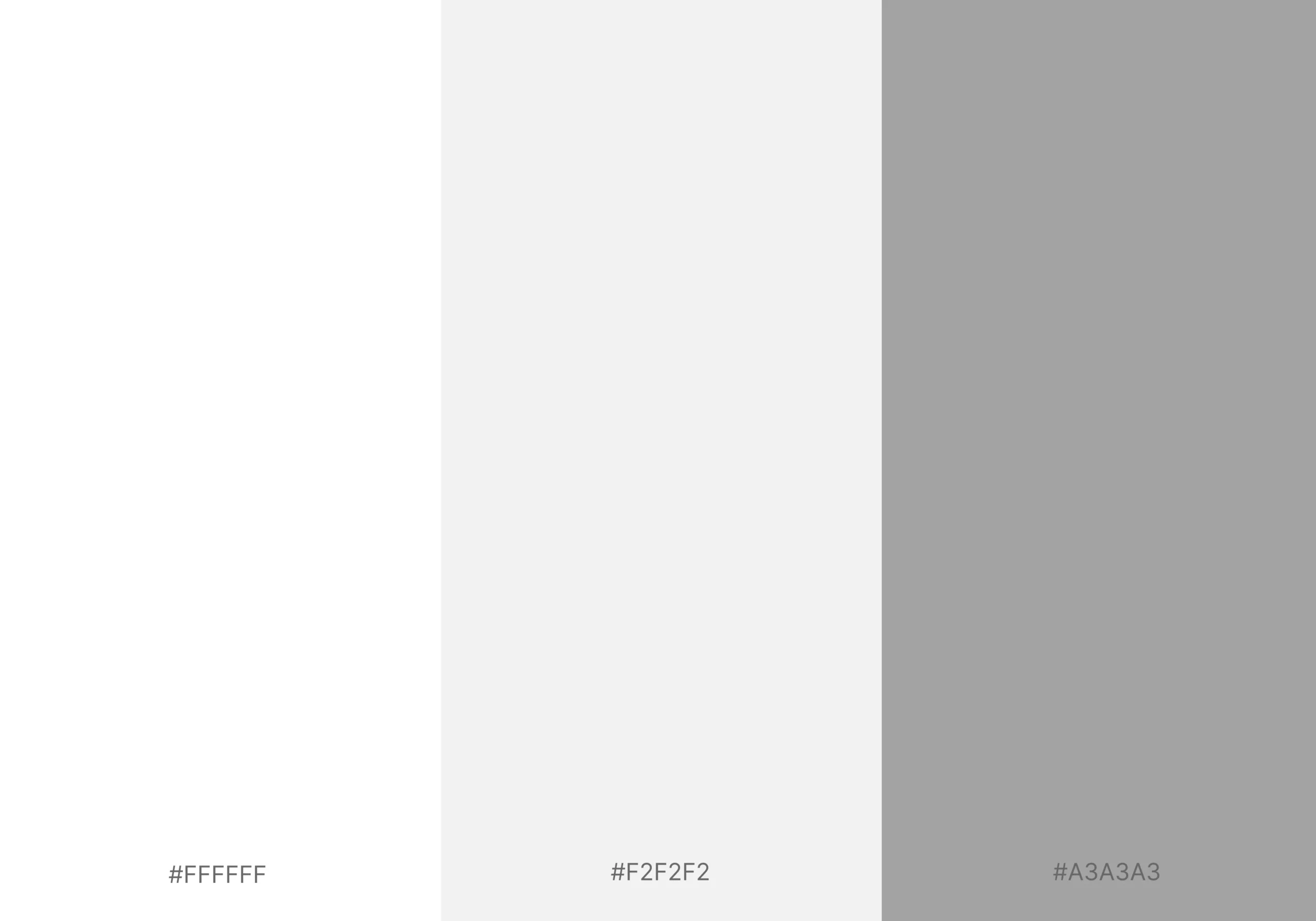
Readability should always come first. Use white (#FFFFFF) or near-white (#F2F2F2) for primary text to ensure clear, comfortable reading. Avoid using grey as your main text color on dark backgrounds, as it can appear faded and difficult to read.
Reserve lighter greys, such as #A3A3A3, for secondary elements like captions, timestamps, or supporting information.
For accessibility, aim for a minimum contrast ratio of 4.5:1 for body text and 3:1 for larger headings. High-contrast typography helps users scan content effortlessly and reduces visual fatigue.
Rule 2: Stay Away from Mid-Grey Backgrounds
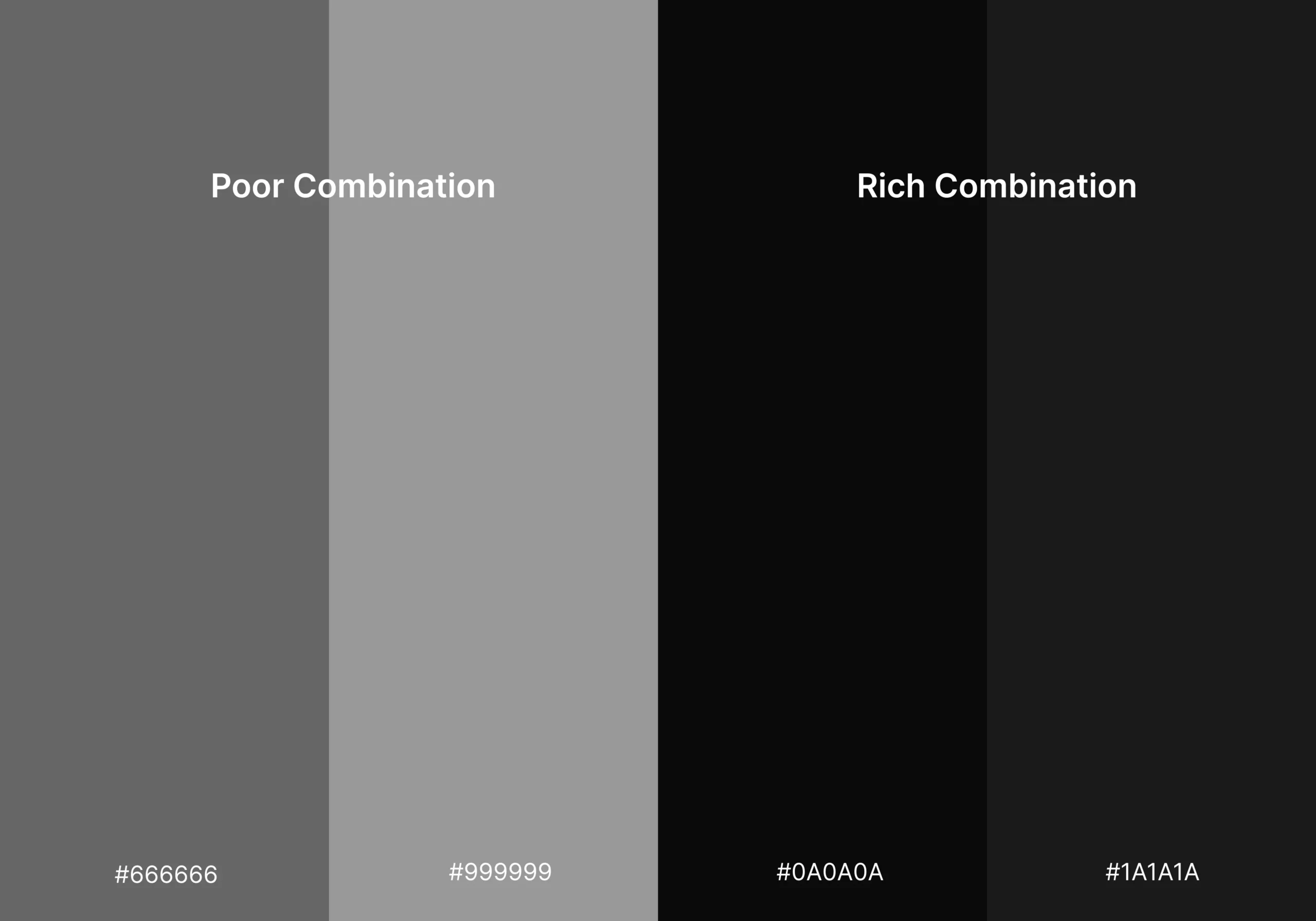
One of the most common dark mode mistakes is using medium-grey backgrounds. Colors between #666666 and #999999 often create poor contrast, making both dark and light text harder to read.
Instead, use deep shades such as #0A0A0A to #1A1A1A. These darker tones create a cleaner, more premium appearance while keeping content easy to read.
Rule 3: Make Accent Colors Stand Out
Accent colors need more visual strength in dark interfaces. Colors that look vibrant on white backgrounds can lose impact when placed on darker surfaces.
Increase saturation where necessary and choose bold, energetic colors such as bright green, electric blue, or vibrant amber. Strong accents help users quickly identify buttons, links, and key actions.
Rule 4: Keep Background Colors Subtle
Dark mode works best when backgrounds remain neutral. Highly saturated dark blues, purples, or other intense colors can feel distracting and contribute to eye strain.
Stick to blacks, charcoals, and muted dark tones. If introducing color into the background, use it sparingly and keep saturation low to maintain a modern, sophisticated look.
Rule 5: Give Elements More Space
Layouts that feel balanced in light mode can often appear crowded in dark mode. Increasing spacing between elements improves clarity and makes the interface feel more refined.
As a general guideline, consider adding 20–30% more padding and margin than you would in a light theme. Generous spacing allows content to breathe and enhances the overall user experience.
Creating Depth in Dark Environments:
One of the defining characteristics of high-end dark web design is the perception of depth.
In light interfaces, shadows naturally communicate hierarchy because darker shadows contrast well against bright surfaces. In dark environments, however, traditional shadows often disappear into the background. As a result, many dark interfaces feel flat and lifeless.
This is where dark UI depth becomes critical.
1. Building Layered Interfaces
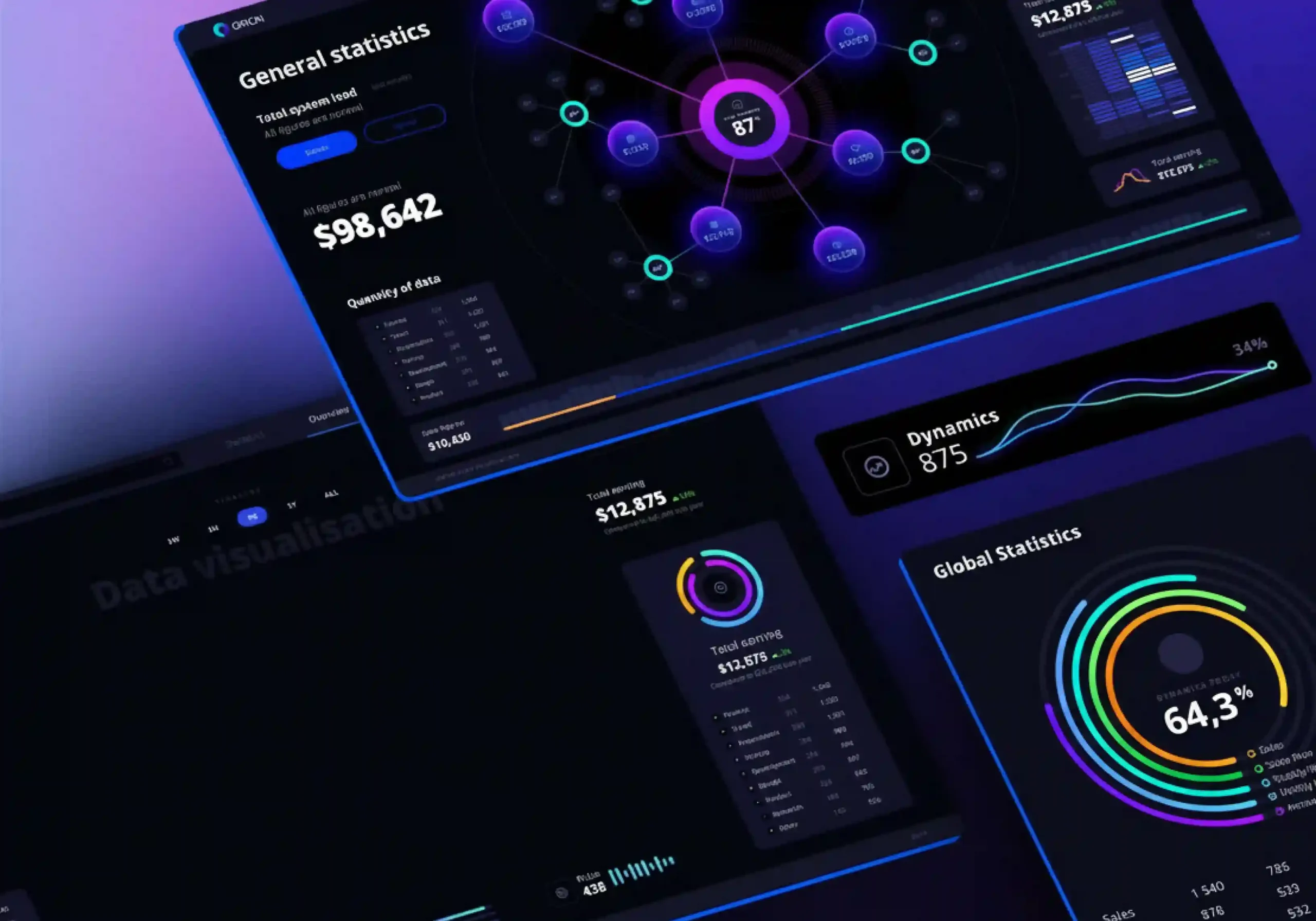
Premium dark interfaces rarely rely on a single background color. Instead, they create multiple visual layers that help users understand relationships between elements.
A typical hierarchy might include:
- Primary background
- Secondary content surfaces
- Elevated cards
- Floating panels
- Interactive controls
Each layer uses slight shifts in brightness rather than dramatic color changes. These subtle distinctions create a sense of structure without disrupting the overall visual consistency. Users may not consciously notice these layers, but they instinctively understand which elements are interactive, which sections are grouped together, and which content deserves attention.
2. Rethinking Drop Shadows in Dark Mode
Traditional shadow systems designed for light interfaces often fail in dark environments. Because dark backgrounds absorb shadows, designers must adopt a different strategy for creating elevation.
Effective drop shadows in dark mode often combine multiple techniques:
- Soft ambient shadows
- Subtle outer glows
- Edge highlights
- Background brightness adjustments
Rather than relying solely on darkness, premium interfaces use a combination of light and shadow to create separation. This approach produces interfaces that feel dimensional and tactile without appearing heavy or artificial.
3. Elevation Creates Clarity
Elevation is not just a visual effect. It is a communication tool. When users can immediately differentiate between backgrounds, containers, dialogs, and interactive elements, navigation becomes easier and cognitive load decreases.
The most successful dark interfaces use elevation strategically to support usability while enhancing aesthetics.
Color Theory for Dark Surfaces
Color behaves differently in dark environments than it does in light ones. Understanding these differences is important when designing a premium dark experience.
True Black vs Charcoal:
The discussion around true black vs charcoal is one of the most important considerations in dark mode design. True black offers maximum contrast and can create dramatic visual impact. However, it often introduces several challenges:
- Reduced perception of depth
- Harsher reading conditions
- More noticeable visual artifacts
- Greater eye fatigue over time
Charcoal surfaces solve many of these issues by introducing a small amount of brightness into the design system. The difference may appear minor numerically, but visually it has a significant impact. Charcoal backgrounds allow shadows, highlights, and layered surfaces to function more effectively while creating a softer and more sophisticated appearance.
This is why many premium applications favor deep gray tones over absolute black.
Using Color to Establish Hierarchy:
Dark interfaces should never feel monochromatic. A well-designed dark system incorporates carefully selected tonal variations that create distinction between different interface elements.
Subtle shifts in color can help communicate:
- Content hierarchy
- Interaction states
- Navigation structure
- Information grouping
Accent colors become even more important in dark environments because they naturally attract attention. When used sparingly, color can direct users toward primary actions without overwhelming the overall design.
The Psychology of Dark Mode Aesthetics

Strong dark mode aesthetics often evoke feelings of exclusivity, focus, and sophistication. Luxury brands frequently adopt dark visual systems because dark backgrounds naturally emphasize imagery, typography, and product details. Similarly, enterprise software and fintech platforms use dark interfaces to create a sense of precision and professionalism.
The emotional impact of dark design comes not from darkness itself but from the restraint and intentionality behind it. Every element must justify its presence.
Typography for Dark Backgrounds
Typography is often overlooked when designing dark interfaces, yet it plays a critical role in perceived quality and usability. Text behaves differently on dark backgrounds because bright characters appear visually heavier against darker surfaces.
As a result, typography choices that work perfectly in light mode may feel overwhelming in dark mode.
1. Avoid Pure White Text:
One of the most common mistakes in dark design is pairing pure white text with a near-black background. While technically readable, this combination often creates excessive contrast that can strain the eyes during prolonged reading sessions.
Premium interfaces typically use off-white text colors that maintain readability while reducing visual harshness. This subtle adjustment makes content feel more comfortable and polished.
2. Adjust Font Weights Carefully:
Because text appears visually heavier on dark surfaces, designers often benefit from using lighter font weights than they would in light mode. Instead of relying heavily on bold typography, hierarchy can be created through:
- Size variations
- Spacing adjustments
- Contrast differences
- Strategic placement
3. Give Content Room to Breathe:
Spacing becomes even more important in dark interfaces. Dense layouts can quickly feel overwhelming because dark environments naturally compress visual information.
Generous whitespace, thoughtful grouping, and consistent alignment help maintain clarity and readability across the interface. In fact, the relationship between typography and spacing is what often separates premium digital experiences from ordinary ones. We explored this concept in depth in our guide on The Art of Editorial UI: Leveraging Typography and Whitespace for Luxury Brands UI, where we discuss how intentional typography systems and strategic whitespace create a stronger sense of elegance, hierarchy, and user focus.
These same principles are equally valuable in dark mode design, helping interfaces feel sophisticated, readable, and visually balanced.
Best Contrast Practices for Dark Websites
Designing effective contrast requires balance. Too little contrast makes content difficult to read. Too much contrast creates visual fatigue and disrupts the premium feel of the interface.
The most effective dark websites follow several key principles:
- Use charcoal rather than pure black backgrounds.
- Create hierarchy through layered surfaces.
- Limit the use of bright accent colors.
- Avoid pure white body text.
- Use elevation to communicate structure.
- Test accessibility and contrast ratios thoroughly.
- Maintain consistency across all interface components.
These are among the best contrast practices for dark websites because they support both aesthetics and usability. A premium interface should feel effortless to navigate. Users should never struggle to understand where to look, what to click, or how information is organized.
Final Thoughts:
The difference between a basic dark interface and a truly premium dark mode experience lies in the details. Successful dark design is not about making everything black. It is about carefully balancing contrast, elevation, typography, and color to create an interface that feels sophisticated, immersive, and comfortable to use.
By moving beyond pure black backgrounds, embracing layered surfaces, refining shadows, and applying thoughtful color theory, designers can create experiences that stand out in an increasingly competitive digital landscape. At Techelix, we help businesses create intuitive, visually refined digital experiences through strategic UI/UX design and usability optimization. Whether you’re launching a new product or improving an existing one, our team focuses on creating user experiences that drive engagement, satisfaction, and growth.

“Dark mode can improve visual ergonomics by reducing eye strain in low-light conditions.”
Dark themes reduce the luminance emitted by device screens while still meeting minimum color contrast ratios. They help improve visual ergonomics by reducing eye strain and facilitating screen use in dark environments.
Related posts