Introduction
For over a decade, online stores have leaned on the same formula: a grid of thumbnail images, a filter sidebar, and a product detail page with a hero shot and a few thumbnails underneath. It works, but it no longer feels special. Shoppers have grown numb to it, and numbness is the enemy of conversion.
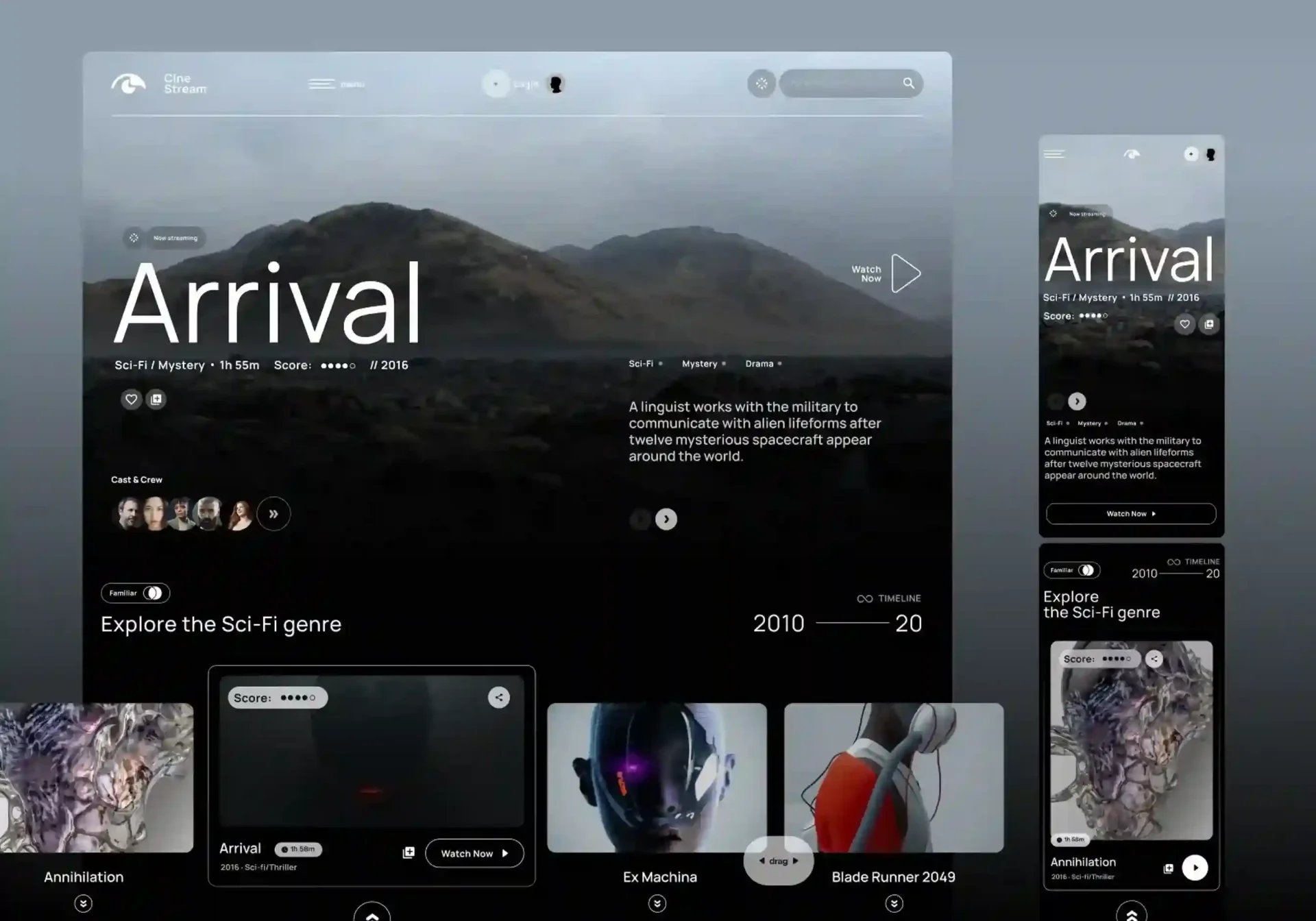
Immersive e-commerce UI flips this model. Instead of treating the storefront as a digital catalog, it treats it as a designed experience one with pacing, motion, and visual storytelling borrowed from film and interactive media. This is the essence of e-commerce cinematic design: every scroll, hover, and click is choreographed to build desire before it asks for a decision.
The shift matters because expectations have moved. Shoppers who spend their evenings on media-rich apps and games arrive at retail sites expecting the same production values. A premium shopping experience is no longer defined only by product quality it's defined by how that product is presented. This article breaks down how to build that experience in practice: from showcasing products in three dimensions, to routing between pages with cinematic transitions, to making sure all that polish still leads to a fast, frictionless purchase.
Showcases: Interactive 3D and Media-Rich Product Displays
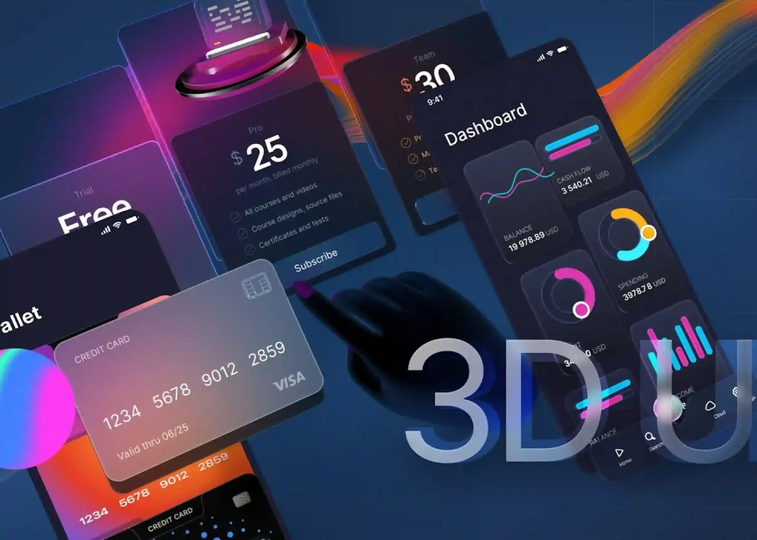
The foundation of any immersive storefront is product visualization; giving shoppers an experience that feels closer to seeing and interacting with a product in person than simply viewing a static photograph. Interactive 3D models, 360° views, videos, and high-resolution media allow customers to explore products from different angles, examine details, and better understand their size, texture, and functionality before making a purchase.
Why static images fall short?
A flat product photo answers only one question: What does this look like from one angle, in one light, at one moment? It cannot fully answer what shoppers often want to know before buying: How does the fabric move? What does the texture look like up close? How large is the product compared with everyday objects? What does it look like from the side or back? These unanswered questions create uncertainty, particularly for products where size, texture, shape, or functionality influence the buying decision. Research from Baymard Institute also highlights the importance of product imagery and image zoom during product evaluation. Baymard Institute — Product Image & Zoom Research
Static photography still has an important role, but modern storefronts can provide much richer product information by combining high-quality images with zoomable galleries, product videos, 360-degree views, interactive 3D models, and augmented reality. Each format can answer a different question: close-up images reveal texture and detail, videos demonstrate movement and functionality, while 3D models allow shoppers to explore form from multiple angles.
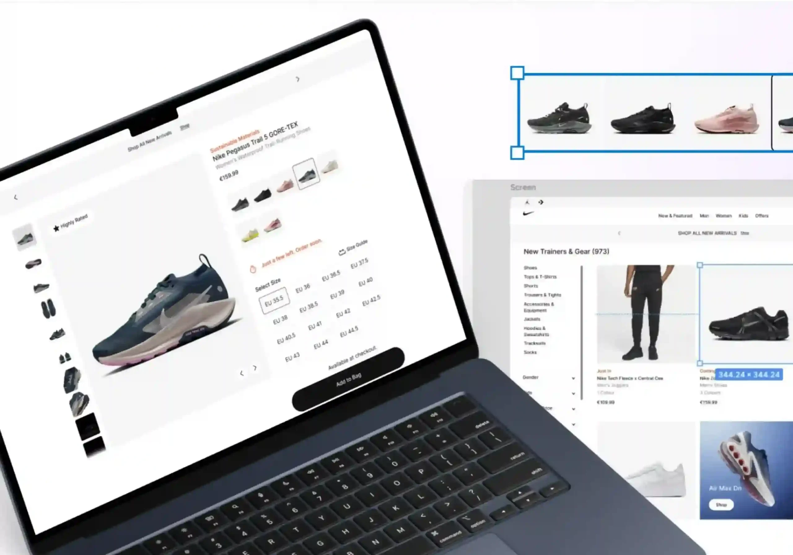
The goal isn't to replace photography with technology simply because it looks impressive. Every visual element should have a purpose: reducing uncertainty, communicating product value, or helping shoppers make a more confident decision. For a premium shopping experience, product media should therefore be treated as part of the UX rather than decoration. When combined with fast loading, effective zoom, accessible media, and relevant product information, richer visualization can make the journey from product discovery to purchase feel more natural and engaging. For more insight into creating refined digital experiences, explore The Art of Editorial UI: Leveraging Typography and Whitespace for Luxury Brands UI.
What a cinematic showcase looks like?
- Interactive 3D models that let shoppers rotate, zoom, and inspect a product from any angle, rendered in real time rather than as a pre-rendered image sequence.
- Configurable variants color, material, size, reflected instantly in the 3D view, so a shopper can "build" the product they want before adding it to cart.
- Contextual staging, placing the product in an environment (a living room, a trail, a studio) rather than on a blank background, so scale and use-case are immediately legible.
- Micro-interactions on hover and scroll; subtle parallax, depth-of-field shifts, or light changes — that reward attention without demanding it.
- Short, loopable video or cinemagraphs for products where 3D isn't practical, showing texture, movement, or function in a few seconds.
The goal isn't spectacle for its own sake. Every visual element should reduce a specific point of uncertainty that shoppers might otherwise need to resolve through additional research, guesswork, or hesitation. When each interaction serves a clear purpose, immersive design becomes more than decoration; it becomes a tool for building confidence and guiding shoppers toward a purchase.
| UI Element | Purpose | Benefit |
|---|---|---|
| 3D Models | Explore products from every angle | Builds confidence |
| Product Videos | Show movement and features | Increases engagement |
| Variant Preview | Visualize colors and materials | Simplifies decisions |
| Contextual Staging | Show products in real settings | Communicates use and scale |
| Micro-Interactions | Add subtle motion | Creates a premium feel |
Transitions: Seamless Page Routing in Headless Setups
Visual richness on a single page is only half the story. If every click between that beautiful product page and the next one triggers a jarring full-page reload, the illusion breaks immediately. This is where headless commerce architecture becomes a design tool, not just a technical one.
Why headless enables cinematic transitions?
Decoupling the frontend from the commerce backend (via platforms like Shopify's Storefront API, commercetools, or similar) means the interface is no longer at the mercy of a monolithic theme engine. The frontend becomes a standalone application typically built in a framework like Next.js, Nuxt, or SvelteKit free to manage its own routing, state, and animation layer.
This unlocks patterns that are difficult or impossible in traditional server-rendered themes:
- Shared-element transitions, where a product thumbnail on a category page visually morphs into the hero image on the product page, rather than the screen going blank and reloading.
- Persistent UI chrome navigation, cart drawer, header; that stays mounted across route changes instead of flickering and re-rendering.
- Choreographed entrance and exit animations for content blocks, timed so information appears in a deliberate sequence rather than all at once.
- Prefetching and route caching, so the perceived transition is instant even though real data is being fetched behind the scenes.
Design considerations, not just code
Cinematic UI for headless Shopify; or any headless stack should still respect a few hard rules:
- Motion should clarify hierarchy, not obscure it. If an animation makes a shopper wait to understand where they are, it has failed.
- Every transition needs an escape hatch. Reduced-motion preferences should be respected, and animations should be skippable or near-instant for repeat visitors.
- Performance budgets are non-negotiable. A transition that looks cinematic but costs 400ms of jank on a mid-range phone is a net loss.
Done well, seamless transitions make the entire storefront feel like one continuous space rather than a series of disconnected documents; which is precisely the sensation that separates a premium experience from a merely functional one.
Conversion: Keeping the Path-to-Purchase Frictionless
None of this matters if it slows shoppers down at the moment they're ready to buy. The single biggest risk of cinematic design is that its own richness becomes a new source of add-to-cart friction , heavy 3D assets that lag on load, animations that delay the "Add to Cart" button's interactivity, or transitions that make the checkout flow feel like one more scene to sit through.
Principles for frictionless conversion inside a cinematic UI
- Decouple visual weight from checkout weight. The cart drawer, quantity selectors, and checkout button should always respond instantly, even while 3D assets are still streaming in elsewhere on the page.
- Progressive loading. Show a lightweight static image or low-poly placeholder immediately, then swap in the full interactive 3D model once it's ready; never make the shopper wait to see something.
- Sticky, always-visible purchase actions. As shoppers scroll through cinematic storytelling sections, the add-to-cart control should stay accessible rather than requiring a scroll back to the top.
- Minimize state loss across transitions. Cart contents, selected variants, and scroll position should persist through cinematic route changes; nothing kills trust faster than a shopper's selections vanishing mid-journey.
- Instrument everything. Track engagement with 3D viewers, video showcases, and transitions against actual conversion and cart-abandonment rates. A visual feature that increases dwell time but decreases conversion is a liability, not a win.
The best immersive storefronts treat spectacle and speed as complementary, not competing, goals. The cinematic layer builds desire; the underlying architecture has to convert that desire the instant the shopper is ready to act.
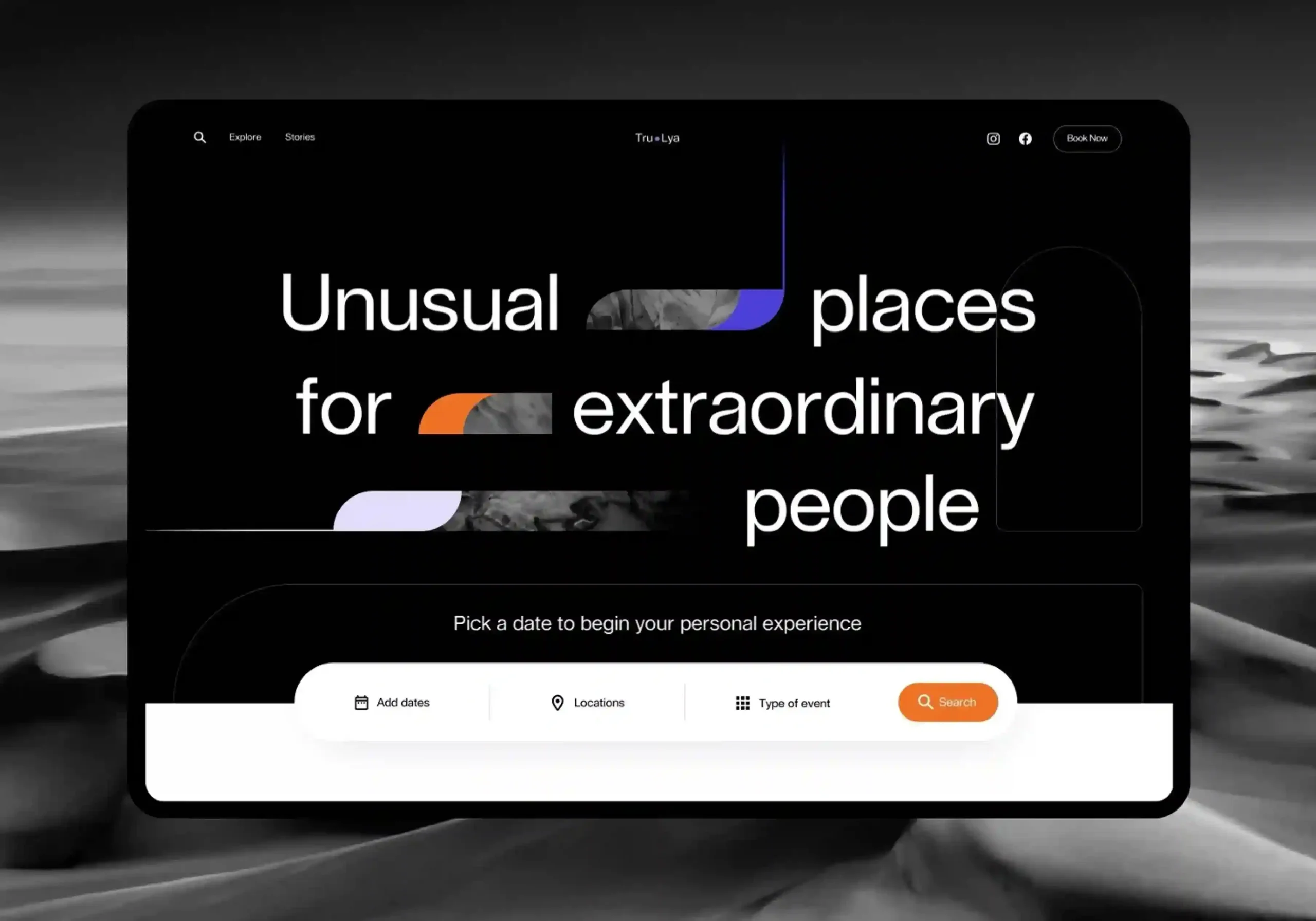
How to Design Immersive Product Pages: A Practical Starting Point?
For teams ready to move in this direction, a practical rollout looks like this:
- Start with your best-selling or highest-margin products. Immersive 3D and video assets are costly to produce — prioritize where the visualization will most directly influence revenue.
- Choose a headless frontend framework that supports fine-grained animation control and route-level transitions natively.
- Build a design system for motion, not just color and typography define standard durations, easing curves, and transition patterns so the experience feels consistent rather than assembled from one-off effects.
- Test on real devices and real networks. Cinematic UI decisions made on a designer's high-end laptop can fall apart on the mid-range phones most shoppers actually use.
- A/B test incrementally. Introduce one cinematic element at a time, a 3D viewer, then a transition pattern — and measure its effect on conversion before layering on the next.
Final Thoughts:
Immersive e-commerce UI isn't a trend to bolt onto an existing storefront it's a rethinking of what a product page is for. By combining rich product visualization, seamless transitions enabled by headless commerce, and a relentless focus on removing add-to-cart friction, brands can deliver a genuinely premium shopping experience without sacrificing the speed and clarity that drive conversion. The static grid isn't going away entirely but for brands that want to stand out, it's no longer enough.

Design is not just what it looks like and feels like. Design is how it works.
This quote reminds us that successful design is not defined by appearance alone. While visual appeal matters, the true measure of great design is how effectively it solves problems, supports users, and creates a smooth, intuitive experience that feels effortless to use.
Related posts