Introduction
A SaaS dashboard can contain everything a business needs to operate: revenue numbers, customer activity, product usage, reports, alerts, workflows, account information, system health, and dozens of other metrics. On paper, that sounds useful. In practice, it can quickly become overwhelming.
This is one of the biggest challenges in modern B2B product design. As a SaaS product grows, its dashboard usually grows with it. New features introduce new metrics. Customers request additional reports. Product teams add more filters, charts, notifications, and controls. Eventually, the dashboard becomes a collection of everything the product knows rather than a clear view of what the user actually needs
That is where good SaaS dashboard design becomes important. The objective isn't to remove valuable information or make the interface look artificially minimal. The objective is to organize information so users can understand it quickly and act on it confidently. A successful dashboard should answer a few basic questions almost immediately: What is happening? What has changed? What requires my attention? And what should I do next? When the interface can answer those questions without making users search through multiple screens, data density becomes an advantage rather than a usability problem.
1. Why Most B2B SaaS Dashboards Become Too Complicated?
The biggest mistake in dashboard design is treating every piece of information as equally important. A revenue figure, a critical system alert, a secondary usage statistic, and a rarely used configuration setting should not compete for the same visual attention. Yet this is exactly what happens when dashboards are built by continuously adding components without revisiting the overall information architecture.
The result is usually a screen filled with cards, charts, tables, filters, buttons, badges, and notifications. Nothing is necessarily wrong with any individual component, but together they create excessive cognitive load. Users have to spend mental effort figuring out where to look before they can even begin doing their actual work. Nielsen Norman Group recommends using predictable placement, clear visual hierarchy, and progressive disclosure to prevent users from becoming overwhelmed in complex applications.
This is particularly important for B2B products because users are rarely visiting a dashboard simply to browse. They usually arrive with a task in mind. A sales manager may want to identify deals that are at risk. An operations manager may need to find exceptions. An administrator may need to investigate an account problem. An executive may simply want to know whether the business is moving in the right direction. That means a dashboard should be designed around user decisions rather than available data. Instead of asking, “What information can we put on this screen?”, the better question is, “What does this user need to understand to complete their job?”
| Dashboard Element | User's Question | Design Priority |
|---|---|---|
| Primary KPI | How are we performing? | Very high |
| Trend | What is changing? | High |
| Alerts | What needs attention? | Very high |
| Supporting metrics | Why is it changing? | Medium |
| Detailed table | Which records are involved? | Medium |
| Advanced filters | Can I investigate further? | Lower / contextual |
| Technical settings | Can I configure the system? | Separate workflow |
This approach creates a natural information hierarchy. The most important information appears first, supporting information explains it, and detailed information becomes available when users need to investigate further.A good dashboard therefore doesn't necessarily contain less information. It simply creates a better relationship between importance, visibility, and interaction.
Another important principle is progressive disclosure. Instead of showing every advanced option immediately, secondary controls can appear when users need them. For example, a dashboard might initially show revenue, growth, and customer activity. Clicking into a metric could then reveal segmentation, historical comparisons, individual accounts, and advanced filters. Nielsen Norman Group describes progressive disclosure as a way to defer secondary or advanced options so users can focus on primary tasks first. This is especially useful for enterprise SaaS products where simplicity for new users and depth for experienced users must coexist.
2. Designing the Interface for Clarity, Scannability, and Action
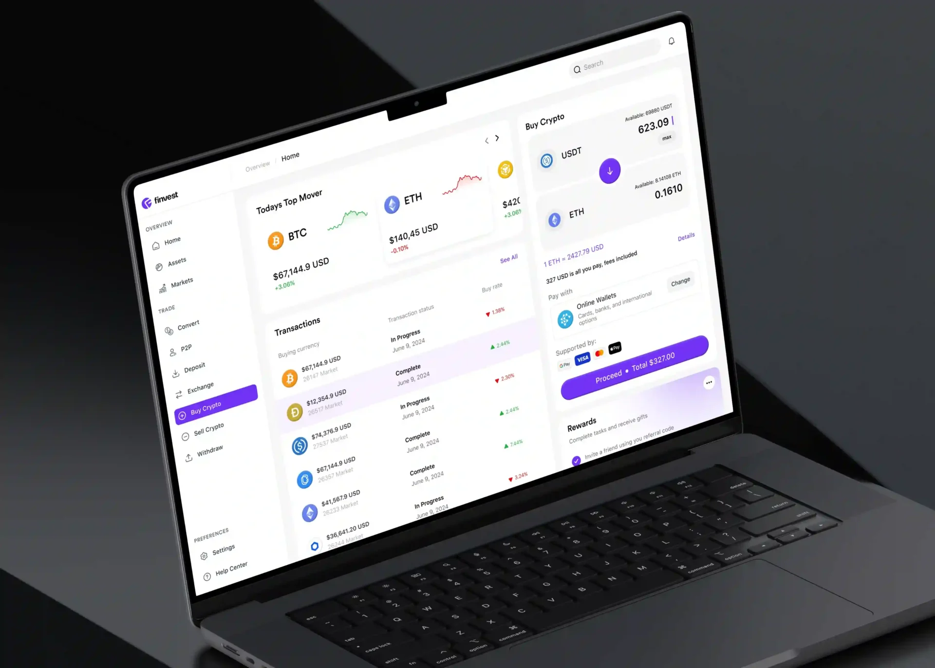
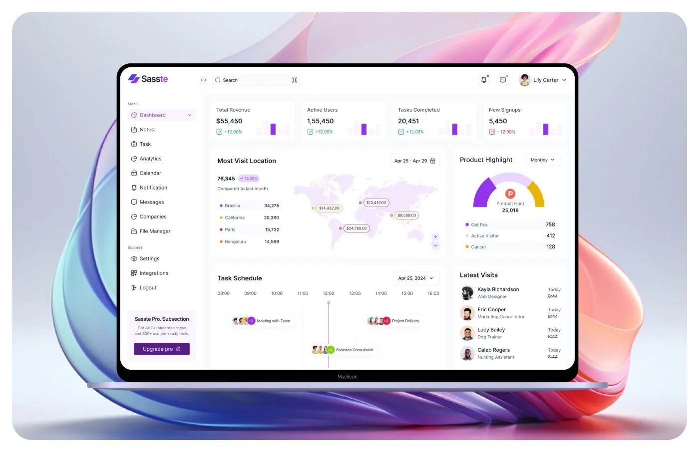
Once the information has been prioritized, the next challenge is turning it into an interface that users can understand quickly. This is where B2B dashboard UX, visual hierarchy, and data visualization UI come together. Users rarely read dashboards from top to bottom like an article. They scan for numbers, changes, warnings, trends, and actions. This makes scannability one of the most important characteristics of a successful dashboard.
A strong layout should give users an obvious starting point. Primary KPIs can sit near the top, followed by the trends or explanations that give those numbers meaning. More detailed tables and secondary analytics can appear further down the page or behind contextual interactions.
For example, simply showing:
Revenue: $248,000
doesn't tell the user whether that number is good or bad. A more useful presentation might show:
Revenue
$248,000
↑ 12% compared with last month
Above monthly target
The second version requires less interpretation because the dashboard provides context alongside the number.
This principle applies to charts as well. A dashboard should never use a visualization simply because it makes the interface look more sophisticated. Every chart should help answer a specific question. A line chart may be appropriate when users need to understand a trend over time, while a bar chart is generally more useful for comparing categories. A table is often better when users need to examine exact records.
| User Need | Suitable UI | Primary Benefit |
|---|---|---|
| Monitor an important metric | KPI card | Fast recognition |
| Understand change over time | Line chart | Trend visibility |
| Compare categories | Bar chart | Easy comparison |
| Review individual records | Data table | Precision |
| Identify urgent problems | Alert/status panel | Immediate attention |
| Explore detailed information | Drill-down view | Deeper analysis |
| Configure complex settings | Dedicated admin interface | Reduced dashboard clutter |
This is also where admin panel design needs to be handled carefully. Administrative interfaces often contain large amounts of information, but that doesn't mean everything should appear on the main dashboard. User management, permissions, billing configuration, integrations, audit logs, and system settings can live within dedicated workflows while the dashboard provides a high-level overview.
The same principle applies to filters. A common dashboard mistake is placing every possible filter at the top of the page. A better approach is to display the filters most users need regularly and place advanced filtering behind an additional control. This keeps the default experience clean without taking functionality away from experienced users.
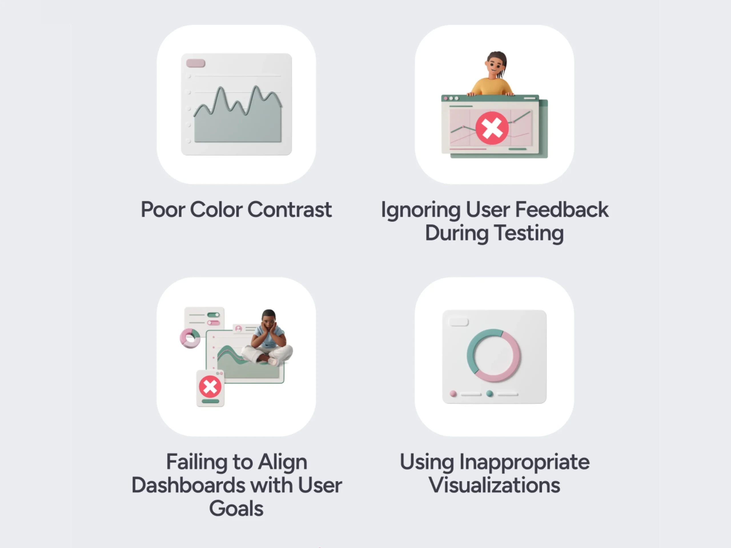
Color also needs to have a purpose. If everything is brightly colored, nothing feels important. Use visual emphasis for meaningful states such as critical alerts, positive or negative changes, selected items, or important actions. And don't rely on color alone to communicate status. W3C accessibility guidance specifically recommends providing additional visual cues when color conveys information.
For example, instead of displaying only a red indicator, use:
Critical — Payment integration failed
This makes the meaning clear even when the user cannot distinguish the color.
Accessibility should also be considered as part of the dashboard rather than treated as a final-stage check. WCAG provides accessibility guidance for web applications, including requirements and recommendations related to contrast, keyboard interaction, focus, responsive layouts, and other aspects of usable interfaces.
The same thinking should extend to responsive behavior and performance. A complex dashboard that takes several seconds to load or becomes unusable on smaller screens creates friction even if its visual design is excellent. Important information should load first, secondary content can load progressively, and large datasets should use techniques such as pagination, filtering, aggregation, or virtualization where appropriate.
Ultimately, every component should justify its presence by helping the user understand something, find something, or do something.
3. How to Design a SaaS Dashboard That Users Don't Abandon
The question behind every dashboard redesign is simple: How do you design a SaaS dashboard that users don't abandon? The answer is not to make the dashboard as minimal as possible. It is to make the dashboard immediately useful.
A user should be able to open the product and understand its purpose without having to learn the entire interface first. That starts with identifying the primary user and the decisions they make most frequently. A dashboard for a CEO should not look the same as one designed for a support manager, sales representative, or system administrator.
Role-based experiences can therefore make a significant difference. An executive might need revenue, growth, retention, and overall business health. A sales manager may care more about pipeline, conversion, deal velocity, and accounts at risk. An administrator may need user activity, system status, permissions, and integration health. The underlying product data can remain the same, but the information hierarchy should reflect the user's job.
A useful way to approach the design is to divide information into three levels:
- Must see: Information required for the user's primary decision.
- Useful: Supporting information that helps explain what is happening.
- Deep dive: Detailed information required for investigation or advanced workflows.
The first level should be immediately visible. The second should be easy to access without overwhelming the screen. The third can be available through drill-downs, expandable sections, detailed tables, or dedicated pages. This structure is particularly effective because it respects different levels of expertise. A new user can understand the product without being confronted by every advanced feature, while an experienced user can still access the depth they need.
The dashboard should also connect insights with actions. If the system tells a customer that churn has increased, the next step should not be left entirely to the user. Where appropriate, the interface should provide a path such as View affected customers, Investigate accounts, or Open retention report. That small connection between information and action can completely change how useful a dashboard feels.
The same principle applies to empty, loading, and error states. A dashboard should not only look good when every API returns perfect data. If there is no information available, explain why. If data is loading, provide feedback. If something fails, tell the user what happened and what they can do next.
For example, instead of:
No data
use:
No customer activity yet. Activity data will appear here once customers begin using the platform.
This gives the user context instead of making the product appear broken.
Finally, dashboard design should be validated with real users rather than judged only from a Figma file. Give users realistic tasks such as finding an account with declining usage, identifying a failed integration, comparing monthly revenue, or locating a specific transaction. Watch where they hesitate, what they overlook, and which controls they struggle to understand.
A practical dashboard review checklist
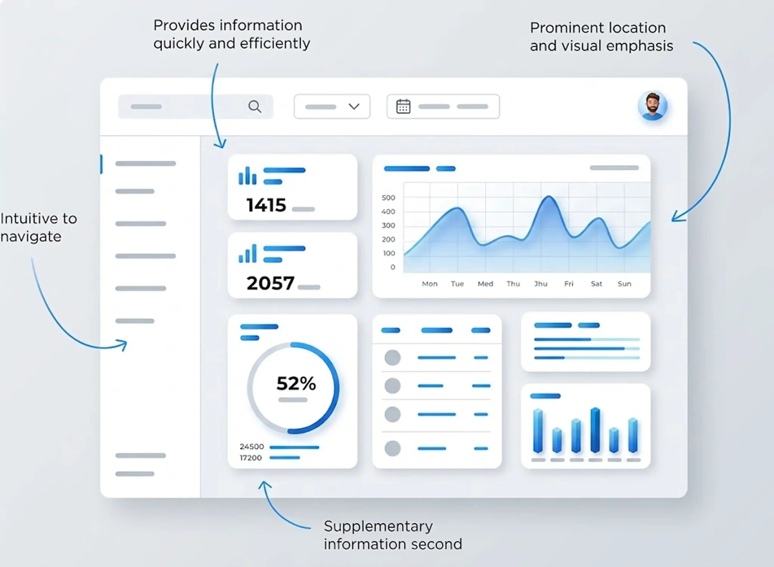
Before shipping a B2B SaaS dashboard, ask:
- Is the purpose of the dashboard immediately clear?
- Can users identify the most important information without searching?
- Does every KPI have enough context to be meaningful?
- Are charts being used because they improve understanding rather than decoration?
- Is advanced functionality hidden through sensible progressive disclosure?
- Can users move from an insight to the relevant action?
- Are different user roles seeing the information most relevant to them?
- Are empty, loading, and error states properly designed?
- Does the interface remain usable across screen sizes?
- Can users understand important information without relying only on color?
- Has the dashboard been tested with real users performing real tasks?
The best SaaS dashboard design ultimately comes down to one idea: clarity beats completeness. A dashboard doesn't become valuable because it contains every metric, every chart, and every possible control. It becomes valuable when users can quickly understand what matters and confidently decide what to do next.
For B2B SaaS companies, that distinction is critical. Users are not opening dashboards because they want to admire a beautiful interface. They are opening them because they need answers. The job of great dashboard UX is to make those answers easier to find. When information hierarchy, cognitive load, progressive discloser.
Final Thoughts:
The best SaaS dashboard design is not about showing users everything your product can measure. It is about helping them understand what matters without unnecessary effort. For B2B products, that means creating a clear information hierarchy, reducing cognitive load, improving scannability, and using progressive disclosure to keep complexity under control. A well-designed dashboard gives users context, highlights important changes, and connects insights with meaningful actions. When data visualization, responsive design, accessibility, and performance are treated as part of the user experience rather than afterthoughts, even complex platforms can feel intuitive. Ultimately, users don't abandon dashboards because they contain too much data; they abandon them when that data becomes difficult to understand. The goal isn't to display more information it is to make the right information easier to act on.

Design is not just what it looks like and feels like. Design is how it works.
This quote reminds us that successful design is not defined by appearance alone. While visual appeal matters, the true measure of great design is how effectively it solves problems, supports users, and creates a smooth, intuitive experience that feels effortless to use.
Related posts