Introduction
Dark mode has gone from being a "nice-to-have" feature to an expectation. Whether it's a SaaS dashboard, a mobile app, or an eCommerce website, users now assume they'll have the option to switch to a darker interface. But here's the catch. Just because your product has a dark mode doesn't mean it looks premium.
You've probably experienced it yourself. You open two different apps using dark mode. One instantly feels sleek, luxurious, and comfortable to use for hours. The other somehow feels cheap, cluttered, and strangely difficult on the eyes, even though both use the same dark color palette.
So what makes the difference?
The answer lies in the subtle design decisions that most teams overlook. The biggest dark mode UI mistakes aren't obvious bugs or broken layouts. They're hidden in the colors you choose, the contrast you create, and the way your interface guides the user's eyes. If you've ever searched "Why does my dark mode look bad?" or wondered "How do I fix a cheap-looking dark UI?", you're asking the right questions.
The Biggest Myth About Dark Mode
One of the most common misconceptions in UI design is that creating dark mode is as simple as turning every white background black. It sounds logical. If light mode uses white, dark mode should use black. Unfortunately, that's exactly where many interfaces start to lose their professional appearance.
Dark mode isn't about making everything darker; it's about creating balance. A successful dark interface carefully manages contrast, color, depth, and hierarchy so users feel comfortable rather than overwhelmed.
When those elements are ignored, even a beautifully designed product can suddenly feel unfinished. Let's look at the mistakes that cause this.
Mistake #1: Using Pure Black Backgrounds
This is easily the most common reason dark interfaces look inexpensive. Many designers choose #000000 because they assume darker equals better. In reality, pure black creates problems that are immediately noticeable, even if users can't explain why.
The first issue is readability. Bright white text placed against a completely black background creates extremely high contrast. While the text may technically be easier to read, the constant contrast forces the eyes to work harder. During extended use, especially at night, this contributes to eye strain, making the interface feel less comfortable than intended.
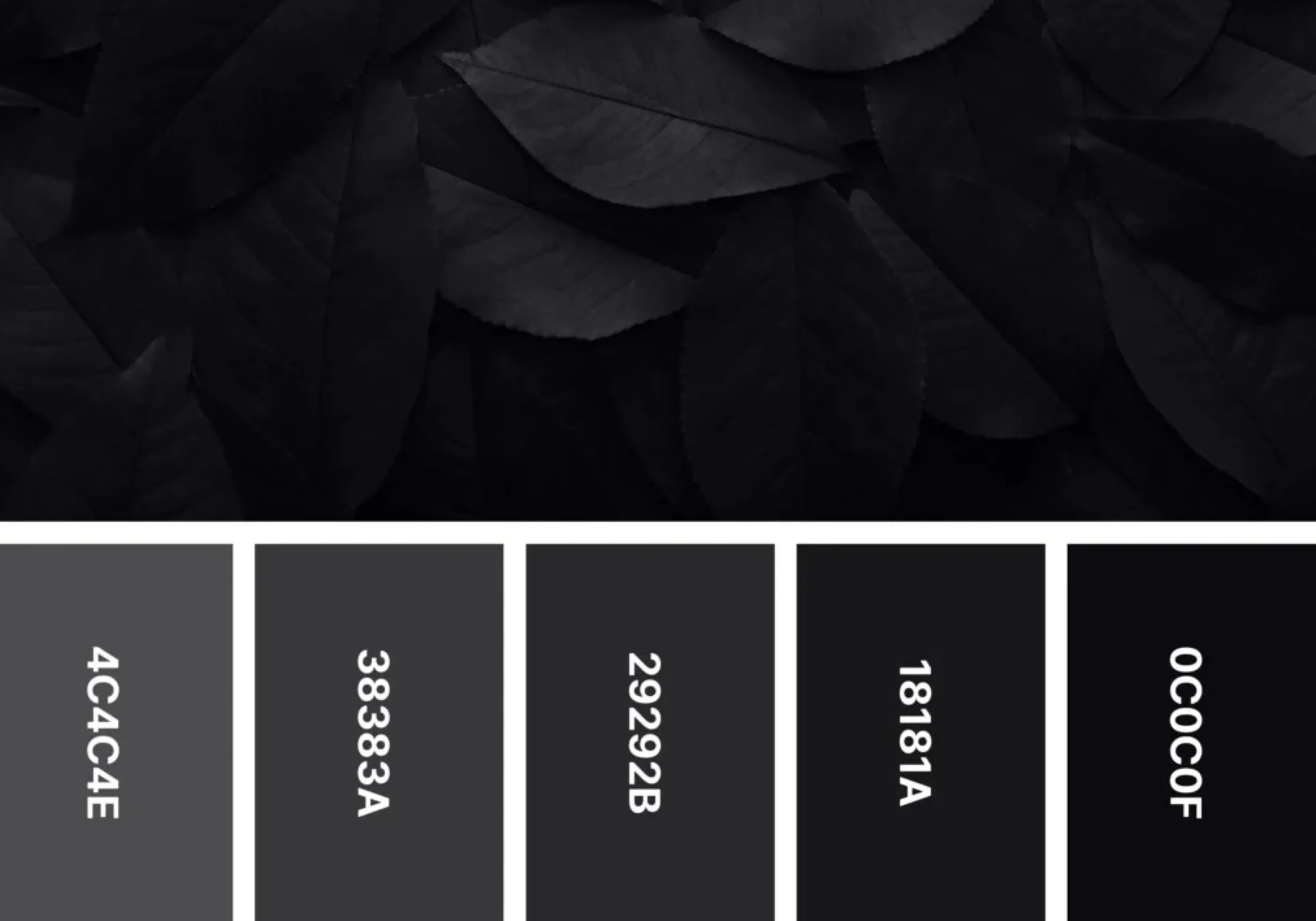
The second problem is depth. Premium interfaces rarely rely on a single flat background. When everything sits on pure black, cards, navigation menus, and content sections begin to blend together. The design loses its visual layers, making the interface appear flat and lifeless. Think about luxury materials like matte black metal, polished stone, or high-end automotive interiors. None of them are truly black. They contain subtle variations that create richness and dimension.
Your UI should do the same. Instead of using #000000, choose deep charcoal shades like #121212, #181818, or #1E1E1E. These colors preserve the elegance of dark mode while introducing just enough softness to make the entire interface feel more sophisticated.
Sometimes, changing a single background color is enough to make an application look dramatically more expensive.
Mistake #2: Treating Accent Colors Like Highlighters

Another reason many dark themes feel overwhelming is the misuse of color. Designers often compensate for dark backgrounds by using extremely bright blues, neon greens, vivid reds, or glowing purples. While these colors certainly grab attention, they also create visual chaos.
Accent colors are supposed to guide users, not dominate the experience.
When every button glows, every icon is brightly colored, and every notification demands attention, users quickly become exhausted. Nothing feels important because everything is competing for attention at once. This is where many brands unintentionally create brand dilution. Luxury brands rarely shout. They communicate confidence through restraint.
The same principle applies to interface design.
Instead of choosing the brightest possible blue, consider a deeper sapphire tone. Replace neon green with muted emerald. Use warmer gold accents sparingly to highlight important actions. Reducing saturated colors doesn't make the interface boring; it makes every important interaction feel intentional.
Mistake #3: Forgetting That Dark Mode Still Needs Hierarchy
Many designers assume that because the interface is dark, every surface should use nearly identical shades of gray. The result:
- Everything starts blending.
- Cards disappear into the background.
- Buttons become harder to identify.
- Navigation loses clarity.
Users shouldn't have to search for important actions. Professional interfaces create hierarchy through subtle differences in brightness rather than dramatic color changes. A slightly lighter card instantly separates itself from the background. A brighter primary button naturally attracts attention. Softer secondary buttons remain visible without distracting from the main task.
Mistake #4: Designing Flat Interfaces Without Depth
A common dark mode UI mistake is creating an interface where everything looks like it's on the same layer. Imagine walking into a room where the walls, furniture, and floor are all painted the same color. Nothing stands out, and the space feels dull. The same happens in digital products. When backgrounds, cards, navigation, and content all share similar shades without any separation, the interface feels flat and difficult to navigate.
A premium dark mode design creates depth through subtle visual hierarchy, not flashy effects. Small design details can make a huge difference, such as:
- Use layered surfaces with slightly different shades for backgrounds, cards, and modals.
- Add soft shadows to give components a subtle sense of elevation.
- Use thin borders to separate sections without adding visual clutter.
- Maintain consistent spacing to improve structure and readability.
- Highlight interactive elements using contrast instead of overly bright colors.
These subtle refinements make your interface feel more organized, intuitive, and sophisticated. Instead of looking flat, your design gains the depth and elegance that define a royal dark UI.
How to Create a Royal Dark UI?
Creating a royal dark UI isn't about adding flashy animations or expensive visual effects. It's about building a thoughtful design system where every color, surface, and interaction works together to create a premium experience. Follow these five steps to elevate your dark mode from ordinary to exceptional.
Step 1: Replace Pure Black with Layered Charcoal Tones
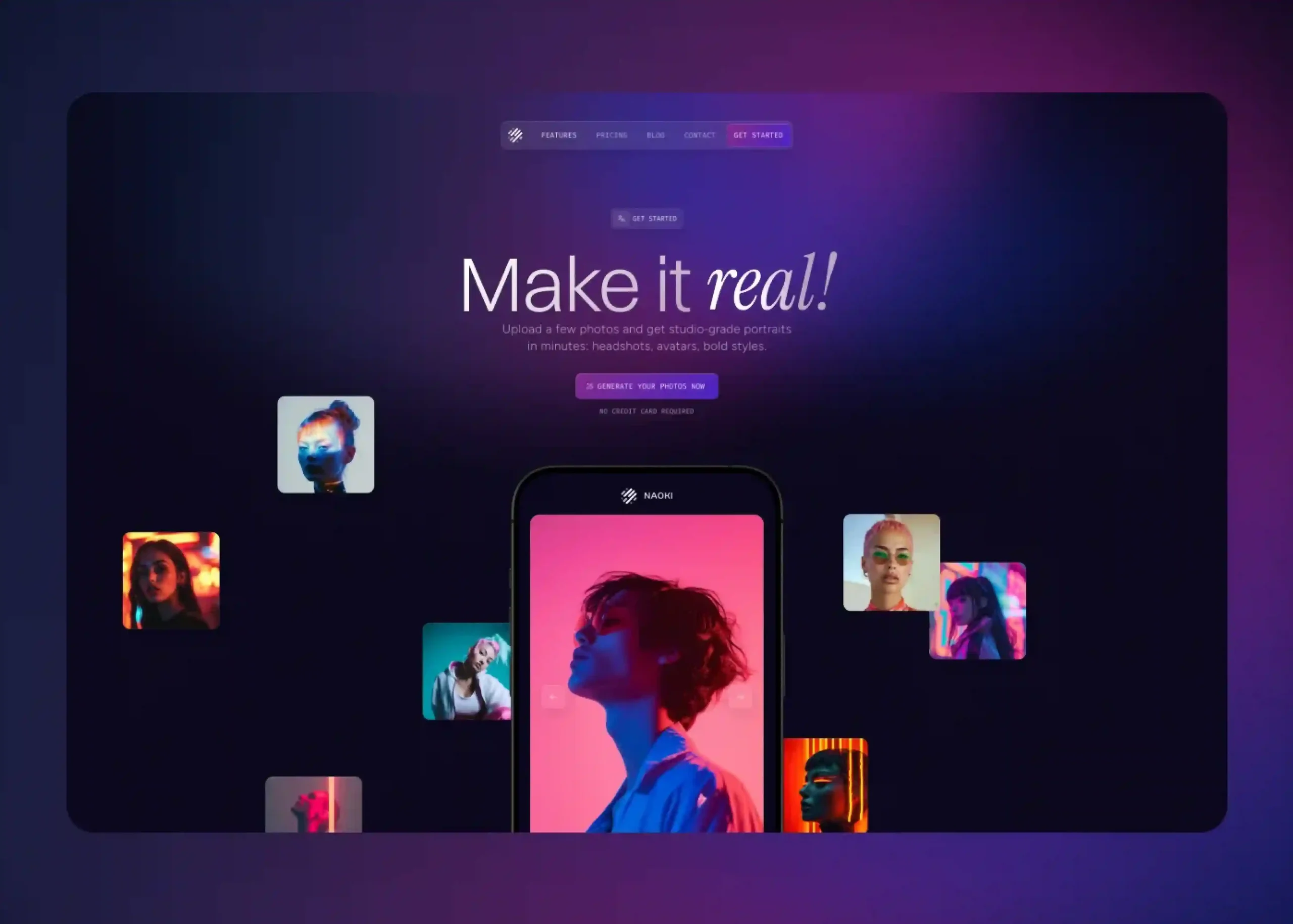
The foundation of a premium dark interface starts with the background. Instead of using pure black (#000000), opt for deep charcoal shades like #121212 or #1E1E1E. Layer slightly lighter tones for cards, sidebars, and modals to create natural depth and improve visual hierarchy.
Step 2: Choose One Primary Accent Color
Avoid filling your interface with multiple bright colors. Select one primary accent color that reflects your brand and use it consistently for buttons, links, active states, and important actions. A restrained color palette creates a cleaner and more sophisticated look.
Step 3: Improve Readability with Softer Text Colors
Bright white text can feel harsh against dark backgrounds and contribute to eye strain. Instead, use off-white for primary text, light gray for secondary text, and muted gray for less important information. This creates comfortable contrast while maintaining readability.
Step 4: Add Depth with Layered Surfaces
A premium interface should never feel flat. Differentiate backgrounds, cards, navigation panels, and modals using subtle variations in color, soft shadows, thin borders, and generous spacing. These small details help users understand the interface at a glance.
Step 5: Keep the Design Minimal and Purposeful
The hallmark of a premium dark mode design is restraint. Avoid unnecessary glows, oversized shadows, or overly saturated colors. Every element should have a clear purpose, ensuring the interface feels calm, elegant, and easy to navigate.
Why Premium Dark Mode Matters?
A premium dark mode isn't just about aesthetics; it shapes how users experience your product. Here's why it matters:
- Increases perceived product value, helping your interface feel modern and premium.
- Creates a strong first impression by making your product look polished and professional.
- Strengthens your brand identity with a consistent and refined visual style.
- Reduces eye strain through balanced contrast and comfortable color choices.
- Improves readability by creating a clear visual hierarchy.
- Enhances usability by making navigation and key actions easier to identify.
Final Thoughts:
A great dark mode isn't defined by how dark it is; it's defined by how it makes people feel. When users open your app or website, they should immediately feel that it's clean, polished, and effortless to use. That level of quality doesn't come from flashy effects or trendy colors. It comes from thoughtful design decisions.
If your dark theme feels cheap, don't rush into a complete redesign. Start by fixing the fundamentals: replace pure black backgrounds with layered charcoal tones, tone down saturated colors, create a clear visual hierarchy, and add subtle depth where it matters. These small improvements can completely change how users perceive your product.
At the end of the day, a premium dark mode design is about creating an experience that looks as good as it feels. By avoiding common dark mode UI mistakes and embracing the principles of a royal dark UI, you can build an interface that's not only visually appealing but also comfortable, memorable, and worthy of your brand.

Design is not just what it looks like and feels like. Design is how it works.
This quote reminds us that successful design is not defined by appearance alone. While visual appeal matters, the true measure of great design is how effectively it solves problems, supports users, and creates a smooth, intuitive experience that feels effortless to use.
Related posts