Introduction
In today's world, websites are not evaluated only on their content and features anymore. Website users demand immersive web experiences, which include smooth scrolling, layered parallax effect, attractive transitions, and micro-interactions, allowing brands to engage emotionally with their audience.
Nevertheless, an excess of animations, JavaScript, and heavy media can have an adverse effect on the website's speed and performance. Today, it is not enough to build a website with good visuals; the performance metrics of the webpages are becoming equally important. Fortunately, there is no need to choose between good design and outstanding performance.How do you manage to develop such cinematic interfaces without sacrificing performance?
This guide will be dedicated to building web animations in high performance using the optimisation of Core Web Vitals, hardware acceleration, layout stability techniques, efficient scrolling effects, and modern frameworks like Next.js and headless architecture.
Why do Beautiful Animations Sometimes Become a Performance Problem?
Animations themselves are not the performance enemies; rather, the problem comes from the way they are executed.
There are many visually stunning websites created by layering one animation upon another without taking into account the computational work done in the background by the browser. The homepage can be loaded with autoplaying background videos, animations triggered by scrolling, oversized hero images, animated text, floating illustrations, and countless interactions powered by JavaScript. In isolation, each effect seems innocent enough. But when combined together, they could noticeably prolong loading time and hinder responsiveness.
Every animation creates work for the browser in terms of updating visuals. Based on how the animation is done, the browser will have to do layout calculations, repaint big chunks of the interface, or run complicated JavaScript for every animation frame. And all that requires computational power, which is even more restricted in mobile devices.
Thus, a website that may look stunning on a desktop computer will have problems running on average laptops and smartphones. It will load slowly, interact poorly, lag on scrolling, or shift its content unpredictably. Such problems may significantly influence user experience and even search engines’ ranking. However, instead of wondering whether to use any animation at all, developers need to pose another question: How to create animations that will have a cinematic feel while still being lightweight and performance-efficient? Let’s look at how Google evaluates user experience with Core Web Vitals.
Understanding the Connection Between High-Performance Animations and Core Web Vitals
Google developed Core Web Vitals to measure the real user experience rather than just technical metrics. Core Web Vitals pay attention to the perception that users have about the website while it is loading and interacting.

There are three main metrics:
| Largest Contentful Paint (LCP) | How quickly the largest visible element loads | Under 2.5 seconds |
| Cumulative Layout Shift (CLS) | How visually stable the page remains during loading | Less than 0.1 |
| Interaction to Next Paint (INP) | How quickly the website responds to user interactions | Under 200 milliseconds |
Any of these metrics can be affected by animation choices.
For instance, having a large-sized video in the background or a hero image taking up most of the screen space will cause the slow loading of the most significant visual component of the page and will increase the Largest Contentful Paint metric. Similarly, changing the dimensions or positions of elements using animation during the loading process can make the layout shift unexpectedly, producing bad results for the CLS metric.
The same goes for responsiveness. Having too many animations, depending on heavy use of JavaScript, can slow down the browser's main thread and cause lags with buttons, menus, and forms working improperly. In turn, this negatively affects INP. Website designers who prefer a story-based approach have to focus on improving these metrics. A page that is optimised in terms of speed and performance provides a much better user experience compared to a page stuffed with animations that ruin all usability.
Building Stable Interfaces: Preventing Layout Shifts Without Sacrificing Design
Large visual elements such as hero images, videos, and animated sections often play a major role in cinematic web design. However, these elements should be optimised carefully to avoid disrupting the user experience.
A few key practices include:
- Reserve space before loading: Giving media elements fixed dimensions allows the browser to create a stable layout from the beginning.
- Optimize font loading: Proper font strategies prevent sudden text resizing and maintain visual consistency.
- Design for dynamic content: Components that load after the initial render should have predefined spaces to avoid pushing other elements.
- Separate intentional motion from unexpected movement: Animations should happen only when triggered by user actions, scrolling, or planned interactions.
A stable layout also improves scroll-based storytelling. When each section remains in its expected position, users can focus on the visual journey instead of being distracted by sudden shifts.
Smooth Motion Starts with the Browser
Creating visually appealing animations is only one part of the process. To build smooth and high-performing experiences, developers also need to understand how browsers render each animation frame.
Every frame displayed on a screen goes through multiple rendering steps:
- Style calculation: The browser determines how each element should look based on CSS rules.
- Layout processing: It calculates the size and position of elements on the page.
- Painting: It converts visual elements, colors, and effects into pixels.
- Compositing: It combines all rendered layers to create the final image users see.
When these processes become too complex, browsers struggle to maintain the ideal 60 frames per second (FPS), leading to delayed responses, visual lag, and uneven animations. This is why two animations that look identical can have very different performance outcomes. The way an element is moved determines how much work the browser needs to perform.
For example:
- Using top or left properties: Moving an element by changing its position with top or left forces the browser to recalculate layouts repeatedly. This increases rendering work because surrounding elements may also need to be adjusted.
- Using CSS transforms: Moving elements with properties like translate, scale, or rotate allows the browser to update only the visual layer without triggering expensive layout recalculations.
This difference becomes especially important for m
Why Hardware-Accelerated Animations Matter?
Modern browsers use graphics processing units (GPUs) to handle visual tasks more efficiently than traditional CPUs. By animating GPU-friendly properties like transform and opacity, developers can create smoother motion without forcing browsers to repeatedly recalculate layouts or repaint entire sections of a webpage. This process, known as hardware acceleration, improves animation performance, reduces CPU usage, and helps conserve battery life on mobile devices.
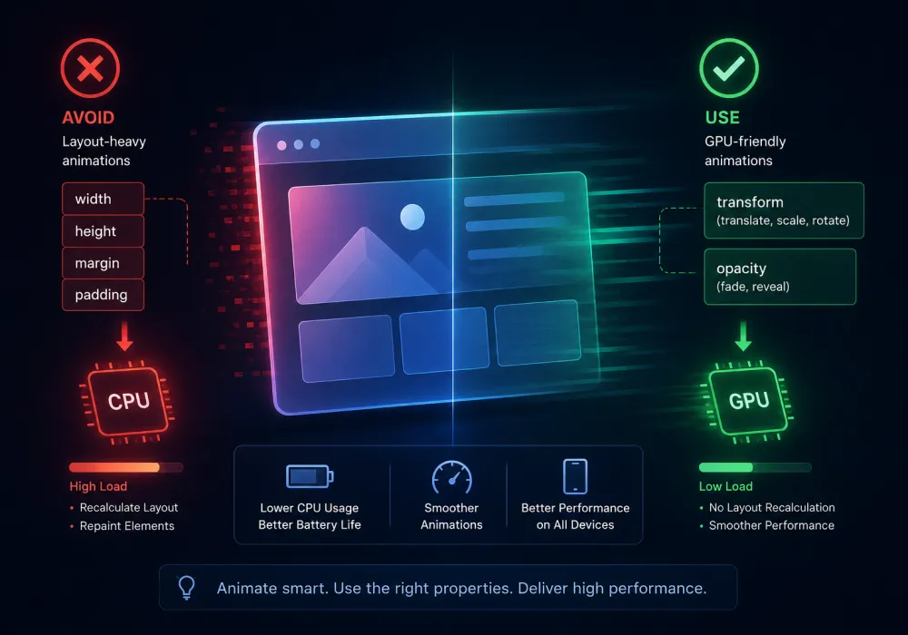
For high-performance websites, developers avoid animating layout-heavy properties such as width, height, margin, and padding because they require more browser processing. Instead, modern animation systems rely on:
- Transform properties like translate, scale, and rotate for movement and visual effects.
- Opacity changes for smooth fades and content reveals.
- Optimized animation triggers to prevent unnecessary rendering work.
This methodology becomes even more critical in cases where animated websites employ several types of scroll-based animations and interactions. Nevertheless, one should keep in mind that successful animation is not about animating everything, but about animating the appropriate things at the proper time. Consequently, with the help of appropriate animation
How to Optimise Scroll Animations for Page Speed?
Scroll-triggered animations are one of the defining features of modern websites. They help guide users through content, making pages feel more interactive and engaging. However, if every animation runs continuously or relies on heavy JavaScript calculations, scrolling can quickly become sluggish, especially on mobile devices.
The goal is not to reduce animations but to make them smarter. Instead of loading every effect when the page first opens, trigger animations only when users are about to see them. Browser APIs like Intersection Observer make this possible by detecting when an element enters the viewport without constantly monitoring scroll events.
Another effective technique is lazy loading. Images, videos, and animation assets that appear below the fold should load only when needed. This reduces the amount of data downloaded during the initial page load and helps improve Largest Contentful Paint (LCP).
To optimise scroll animations for page speed:
- Animate elements only when they enter the viewport.
- Use Intersection Observer instead of heavy scroll event listeners.
- Lazy-load images, videos, and animation assets below the fold.
- Avoid running multiple animations simultaneously.
- Keep animation timelines simple and purposeful.
- Load animation libraries only on pages that require them.
By focusing on efficiency instead of quantity, developers can create smooth storytelling experiences without sacrificing performance
Fast Cinematic Web Design Starts with Better Architecture
Even the best-optimized animations cannot compensate for a slow website architecture. Performance begins with the foundation of the application. Making a fast website doesn't only mean animating everything but also means being able to know which animations to use and when to use them. Techniques like scroll-triggered reveals, parallax effects, and subtle micro-interactions can create an immersive experience for users. If you'd like to explore the design side of these techniques, check out our guide on Cinematic Web Design: Storytelling Through Scroll-Triggered Micro-Animations
Frameworks like Next.js are designed to improve loading speed through features such as Server-Side Rendering (SSR), Static Site Generation (SSG), automatic image optimization, and code splitting. These capabilities reduce the amount of JavaScript sent to the browser, allowing pages to render much faster.
Pairing Next.js with a headless frontend provides even greater flexibility. Since the frontend is separated from the content management system, developers can optimize images, cache content efficiently, and load interactive components only when required. This approach is ideal for websites that rely on rich visuals while maintaining excellent Core Web Vitals UI scores.
Final Thoughts:
It is also important to emphasize that beautiful design and great performance of the website no longer go hand in hand exclusively. The secret of using animation properly consists in its ability to show users the way, to bring attention to something, or simply to create a remarkable user experience through animation. To do this, one needs to use such optimized techniques as hardware acceleration for animations, scroll effects, lazy loading, a headless framework such as Next.js, and others.
The future of web design belongs to experiences where creativity and performance work together, proving that the best animations are not the most noticeable ones, but the ones that make every interaction feel natural and meaningful.

Design is not just what it looks like and feels like. Design is how it works.
This quote reminds us that successful design is not defined by appearance alone. While visual appeal matters, the true measure of great design is how effectively it solves problems, supports users, and creates a smooth, intuitive experience that feels effortless to use.
Related posts