Introduction
SaaS teams spend enormous effort designing the screens where everything goes right polished dashboards, intuitive workflows, detailed reports, and seamless interactions. But the real product experience extends far beyond the happy path. Users also encounter blank dashboards, slow-loading content, failed integrations, permission restrictions, and searches that return nothing.
These moments are often treated as edge cases, yet they can strongly influence activation, trust, task completion, and retention. A confusing empty screen can leave a new user unsure where to begin, while a vague error message can turn a temporary problem into a lost customer.
That is why empty state design, loading feedback, and error state UI deserve deliberate attention. When designed well, these states reduce uncertainty, improve perceived performance, provide user reassurance, and create clear recovery paths throughout the SaaS experience.
Why the Unhappy Paths Cost You Activation?
Activation is rarely a single moment. A user may sign up successfully but still fail to reach the point where they experience the product's value. They may enter the application, see an empty dashboard, feel unsure about the next step, and leave. Or they may attempt an action, encounter a generic error, and assume the product is unreliable.
From the product team's perspective, these can look like different problems: onboarding, performance, search, permissions, or technical errors.
From the user's perspective, however, the experience is much simpler:
“Can I understand what is happening, and can I continue?”
That is why state design deserves more attention.
Nielsen Norman Group's usability heuristics emphasize both visibility of system status and helping users recognize, diagnose, and recover from errors. These principles are especially relevant in SaaS applications because users frequently interact with asynchronous systems, integrations, permissions, data imports, and complex configurations.
Consider a typical B2B SaaS onboarding flow:
- A user creates an account.
- They enter the product.
- Their dashboard contains no data.
- They connect a data source.
- The connection takes time to process.
- An import partially fails.
- Some reports remain unavailable.
- The user encounters a permissions restriction.
Every one of those steps needs a state. If the interface only looks polished after the system has data, completed processing, and avoided all failures, then the product has been designed around the company's ideal conditions rather than the user's act
The four questions every system state should answer
| User question | What the interface should communicate | Design outcome |
|---|---|---|
| What is this? | Explain the current state clearly | Reduces confusion |
| Why am I seeing this? | Provide useful context | Builds understanding |
| Is the system working? | Show progress or status honestly | Creates user reassurance |
| What should I do next? | Provide a relevant action or recovery path | Keeps users moving |
This framework applies to an empty dashboard, a loading report, a failed API request, or a permission restriction. The goal is not to decorate every state with an illustration and a button. The goal is to remove uncertainty. A blank screen creates questions. A well-designed state answers them.
1. Empty State Design: Turn Blank Screens Into Guided Progress
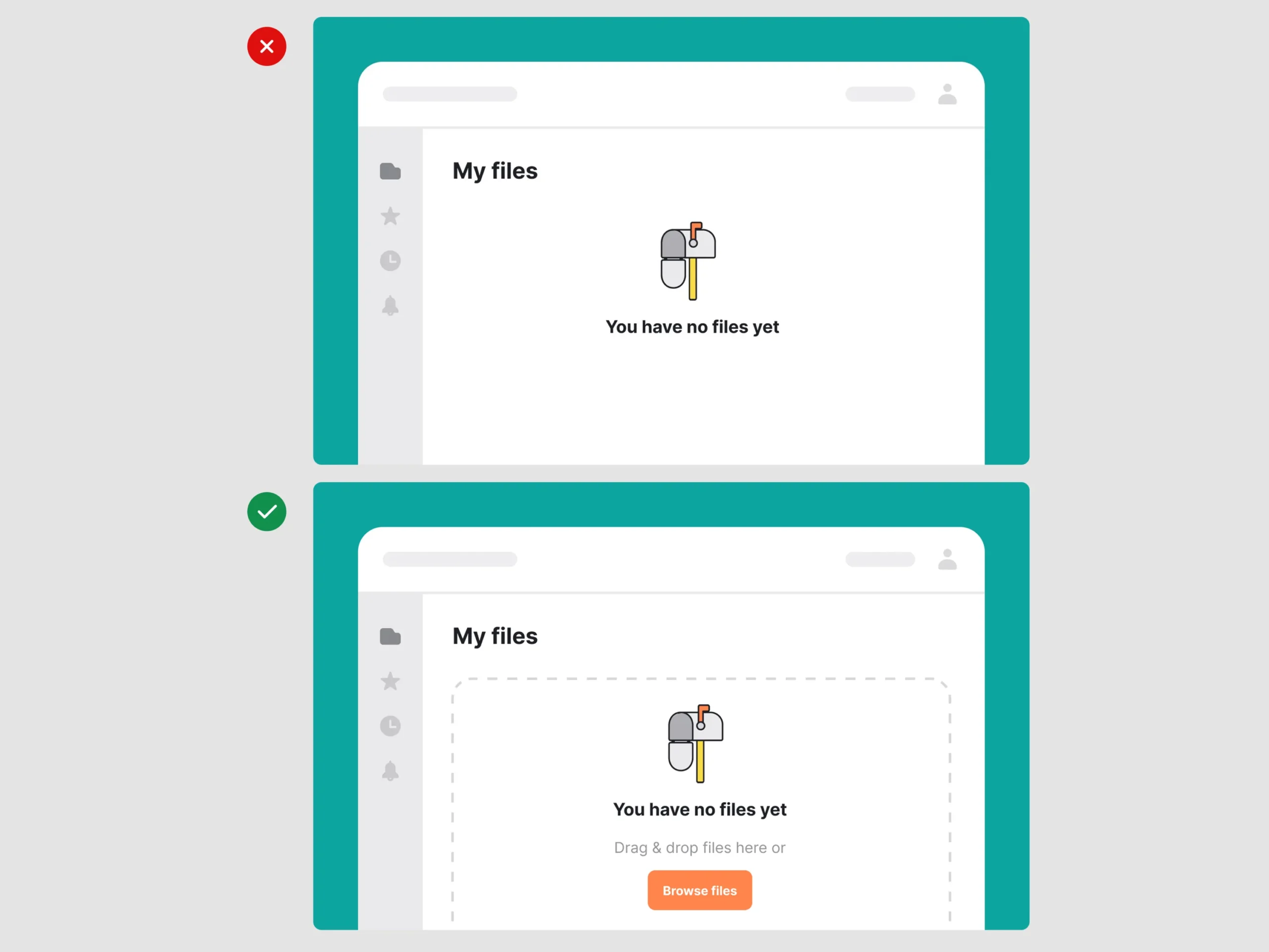
An empty state is any part of the interface where expected content is absent. Many teams mistakenly treat all empty states as the same thing. But a dashboard with no data because the user is new is fundamentally different from a search page with no matching results. Likewise, a panel that is empty because the user lacks permission is not really an empty state at all it is a restricted-access state that requires explanation.
This distinction matters because the appropriate next action changes. NN/G notes that empty containers can create uncertainty because users may not know whether the system has finished processing, whether content is still loading, whether an error occurred, or whether there genuinely is nothing to display.
For effective empty state design, the interface must identify the reason for the absence of content before deciding what to display. This is particularly important in B2B SaaS dashboards, where users often need to scan large amounts of information. Designing for clarity starts with understanding how information density affects the overall dashboard experience, from visual hierarchy to prioritization and scannability. Our B2B SaaS Dashboard Design Playbook covers these principles in greater detail.
A practical taxonomy of SaaS empty and unavailable states
1. First-use empty states
This is one of the most important states for SaaS onboarding UX. The user has arrived at a feature for the first time, but there is nothing to display yet. A CRM may have no contacts. A project management tool may have no projects. An analytics platform may not have received data. An automation product may contain no workflows.
The wrong approach is:
No data available.
The message is technically accurate but strategically useless.
The user still does not know what the feature is for or how to populate it.
A stronger first-run experience should explain the purpose of the area and connect it to an action. For example:
Create your first workflow
Build an automated process to connect your tools and reduce repetitive work.
[Create workflow]
The empty state becomes a lightweight onboarding layer.
This is particularly valuable in complex B2B software because users may not understand every feature simply from navigation labels. The first-use state can teach the product at the exact moment that information is relevant.
2. No-results states
A no-results state occurs when content exists somewhere in the system, but the user's query or filters do not return anything. This requires a different response from first-use onboarding. The user has already expressed intent and has searched for something. The interface should help them modify that search rather than simply announcing failure.
Useful recovery paths might include:
- Removing filters
- Checking spelling
- Broadening a date range
- Clearing a search query
- Suggesting related results
- Creating the item if it genuinely does not exist
For example:
No invoices match these filters
Try expanding the date range or clearing one or more filters.
[Clear filters]
The primary action should address the most likely reason for the empty result.
3. Permission and restricted-access states
Permission states are often badly designed because they get presented as technical failures.
A user might see:
Error 403.
That message explains the system's internal response but does not help the user accomplish anything.
A better state might say:
You don't have access to this report
This report is available to workspace administrators. Request access from an administrator to continue.
[Request access]
This distinction is important: the system is not broken, the data is not missing, and the page is not empty. The user simply cannot access it.
Clear language prevents users from wasting time refreshing, troubleshooting, or contacting support with the wrong assumption.
4. Error and unavailable states
Sometimes content cannot be displayed because something has actually failed. For example, a data request may fail, a third-party integration may be unavailable, or a processing job may stop unexpectedly. In this case, presenting the screen as a normal empty state can be misleading. Users need to know that the absence of content is temporary or caused by a failure.
The interface should clearly separate:
There is no data from We could not load the data.
| State type | What it means | Recommended response |
|---|---|---|
| First-use | Nothing exists yet | Explain value and guide setup |
| No results | Query found nothing | Help refine or reset the query |
| Permission | Content exists but access is restricted | Explain access requirements and offer a path |
| Error | Content could not be retrieved | Explain the issue and offer recovery |
| Loading | Content is still being retrieved | Show progress and preserve context |
This taxonomy is essential for the best empty state examples for B2B SaaS apps because it prevents one generic component from being used for five entirely different user situations.
What every strong empty state should contain?
A good empty state does not necessarily need a large illustration or extensive copy. In dense SaaS applications, clarity is usually more valuable than decoration.
The strongest pattern typically contains three elements:
- A clear status: What is absent or unavailable?
- Relevant context: Why is the user seeing this?
- A next step: What can they do now?
That next step should be specific. If a user has no projects, “Get started” is vague. “Create your first project” is clearer. The state should reduce the distance between confusion and action.
- Creative problem-solving.
- Future-focused thinking.
- Premium expertise.
- Advanced technologies and AI innovation.
2. Loading States and Skeleton Screens: Designing for Perceived Performance
Loading is not simply a technical delay. It is an interaction state. When users click Generate report, apply a filter, open a customer profile, or navigate to a dashboard, they expect evidence that the system received their action. If nothing changes, even a relatively short delay can feel broken.
This is where perceived performance becomes critical.
Google's web performance guidance highlights that technical milestones do not always match the user's perception of whether a page is useful. Metrics such as Largest Contentful Paint focus on when meaningful content becomes visible because that is much closer to how users experience loading. A fast, useful initial experience can also provide reassurance that the application is functioning correctly.
The lesson for SaaS products is straightforward:
Do not only optimize how long users wait. Design what they experience while waiting.
Choosing between spinners, skeleton screens, and progress indicators
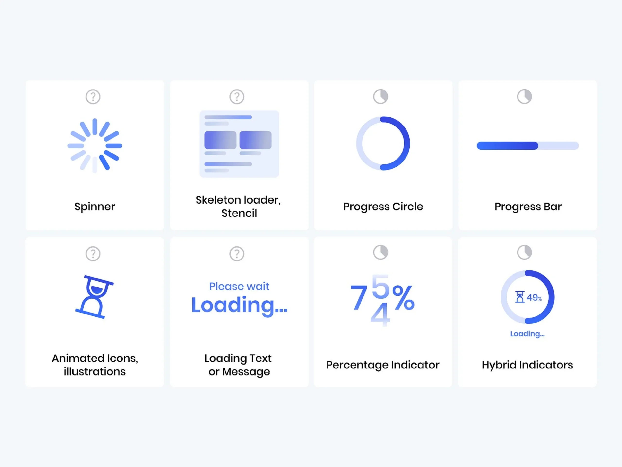
Not every delay should use the same loading pattern. A spinner is useful when the user needs to wait for an unpredictable or small piece of work. But a full dashboard covered by one spinning icon provides very little information about what is coming next.
Skeleton screens work better when the incoming content has a predictable structure.
For example, if a dashboard will contain KPI cards, a chart, and a table, placeholders can reserve those spaces while the actual data loads. This creates continuity between the loading state and the completed state.
| Loading pattern | Best use case | What it communicates |
|---|---|---|
| Spinner | Short or localized processing | “Something is happening” |
| Skeleton screen | Predictable page or content layout | “Your content is loading here” |
| Progress indicator | Longer measurable process | “The process is moving forward” |
| Inline loading state | One section updates independently | “This area is refreshing” |
| Optimistic feedback | Low-risk actions with predictable success | “Your action has been applied” |
A skeleton should resemble the structure of the content expected to appear. A progress bar should represent meaningful progress rather than an animation that reaches 95% and stays there indefinitely.
Similarly, an endless spinner without context eventually stops reassuring the user.
Skeleton screens should preserve orientation
The main advantage of skeleton screens is not simply that they make the interface look active. They preserve spatial context. Users can see where information will appear. The dashboard does not suddenly shift from a blank canvas into a dense interface. Instead, the basic structure is visible from the beginning. Furthermore, this can also reduce disruptive layout changes.
For SaaS interfaces, this means skeleton layouts should closely match the eventual structure of:
- Tables
- Metric cards
- Side panels
- Activity feeds
- Profile sections
- Charts
- Form fields
If the final page looks completely different from the placeh
Do not show loading feedback too aggressively
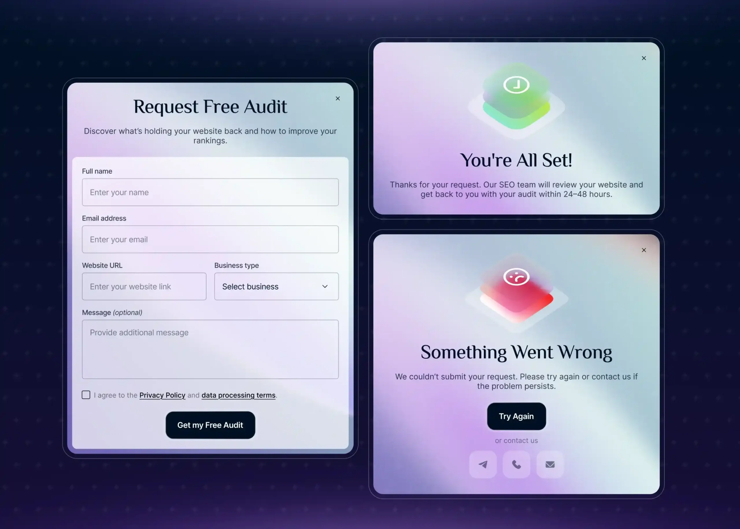
There is also a point where loading indicators become unnecessary. For very fast interactions, flashing a skeleton or spinner can make the interface feel more unstable rather than more responsive. Users do not need a theatrical loading sequence for every interaction. The state should match the expected duration and scope of the delay.
For example:
- Refreshing one table should not freeze the entire dashboard.
- Loading a new tab should not necessarily block navigation.
- Processing a large file may require persistent progress and background status.
- Generating an AI report may need an explanation of what the system is doing, especially if the wait is longer than a typical page transition.
A good loading experience communicates enough to maintain confidence without constantly demanding attention
Design for the transition after loading fails
One of the most overlooked parts of loading design is what happens next.
Too many interfaces follow this sequence:
Spinner → Spinner → Spinner → Generic error
A better experience plans the complete state transition:
Loading → Success
Loading → Partial success
Loading → Recoverable error
Loading → Timeout with retry
Loading → Background completion notification
This is why loading, empty, and error states should be designed together rather than as separate components added late in development.
3. Error State UI: Failure Is a Conversation, Not a Dead End
Every SaaS product will encounter failure. APIs fail. Networks disconnect. Users enter invalid information. Permissions change. Imports contain incorrect data. Third-party services become unavailable. The quality of the product is not determined by whether these events happen. It is also determined by what happens after they do.
Nielsen Norman Group recommends that error messages be visible, constructive, understandable, and respectful of the user's effort. Importantly, users should receive enough information to understand the problem and recover from it rather than being shown generic technical messages.
That principle should guide every error state UI.
The anatomy of an effective error state
A useful error state answers four questions.
- What happened?
Describe the issue clearly. - Why did it happen?
Provide context when it is known and useful. - What happened to my work?
Reassure users whether their data or progress was preserved. - What happened to my work?
Reassure users whether their data or progress was preserved. - What can I do next?
Offer a specific recovery path.
For example, compare these two messages:
Error: Request failed.
The user has almost no useful information.
Now consider:
We couldn't save your changes
Your connection was interrupted before the update was completed. Your changes are still available in this form. Check your connection and try again.
[Try again]
The second version reduces uncertaint
Tone matters most when the product fails
Error copy is where a product's personality is tested. A playful tone may work well in a successful onboarding moment but become frustrating when users are blocked from completing an important task. For B2B products, especially those involving financial data, operations, healthcare workflows, or business-critical processes, clarity should generally take priority over cleverness.
Avoid messages that blame the user:
You entered this incorrectly.
Prefer neutral language:
Enter a valid company email address.
Avoid vague language:
Something went wrong.
Prefer useful language:
We couldn't connect to your data source. Check the API credentials and try again.
Tone should therefore be:
- Calm rather than alarming
- Specific rather than generic
- Human rather than overly technical
- Helpful rather than judgmental
- Honest rather than falsely reassuring
Preserve user effort whenever possible
Few experiences are more frustrating than spending several minutes completing a form only to encounter an error that clears everything. Error recovery should protect the work users have already done.
Depending on the workflow, this can include:
- Preserving form input
- Saving drafts automatically
- Allowing users to retry without starting over
- Supporting undo for reversible actions
- Keeping successfully completed portions of a multi-step workflow intact
- Clearly identifying only the fields that need correction
A Practical Framework for Designing Recovery Paths
Not every error requires the same response. A good error state UI should help users understand what went wrong, determine whether they can fix it themselves, and provide a clear next step. Instead of treating every failure as a generic system message, designers should consider the user’s situation and identify the most appropriate recovery action.
| Error scenario: | What users need: | Effective recovery path |
|---|---|---|
| Invalid form input | Understand what needs correction | Highlight the field and explain the requirement |
| Network interruption | Reassurance and continuity | Preserve work and provide retry |
| Temporary server failure | Clear status without blame | Retry or notify the user when restored |
| Permission restriction | Explanation of access requirements | Request access or contact an administrator |
| Failed integration | Context about the failed connection | Reconnect, update credentials, or view setup instructions |
| Partial import failure | Visibility into what succeeded and failed | Show failed records and allow targeted correction |
| Irreversible action risk | Prevention before commitment | Confirm the action and explain consequences |
The key is to make the recovery path specific to the problem. If a form field is incorrect, the interface should point directly to the field instead of displaying a generic alert. If a network request fails, the product should preserve the user's work and offer a retry option. For permission-related issues, users need to know why access is restricted and who can resolve it.
This approach turns errors into opportunities to guide users forward rather than stopping the workflow completely. A useful recovery experience should answer three simple questions: What happened? Why did it happen? What can I do next?
A user clicking “OK” may dismiss the message, but that does not mean they have recovered. Effective recovery paths keep users moving toward their goal instead of leaving them at a dead end.
A Better Design Process for the “Other 30%”
The easiest way to improve SaaS state design is to stop treating empty, loading, and error states as edge cases. They should be mapped alongside the main user journey from the beginning.
A simple framework is to define what happens at each stage:
Default → Loading → Success → Empty → Error → Recovery
For every important workflow, ask:
- What does the user see? Define the state clearly.
- What should they understand? Explain what happened and why.
- What can they do next? Provide one clear action.
- Is their work protected? Preserve inputs, drafts, and progress when something fails.
Then test the transitions between states, not just the individual screens. Measure where users abandon the workflow, how often they retry, and whether recovery succeeds.
This approach helps product, design, engineering, and QA teams work from the same expect
Conclusion:
A polished dashboard may impress users, but the real quality of a SaaS product is often revealed when things do not go as planned. Empty screens shape the first-run experience, loading states influence perceived performance, and thoughtful error messages can turn frustration into confidence. These moments are not minor details; they directly affect usability, trust, and product adoption.
That is why empty state design, loading states, and error handling should be part of the core UX strategy, not added at the end. The best SaaS products design for success and uncertainty alike, helping users understand what is happening, what went wrong, and what to do next. Because every state is part of the user journey.

Design is not just what it looks like and feels like. Design is how it works.
This quote reminds us that successful design is not defined by appearance alone. While visual appeal matters, the true measure of great design is how effectively it solves problems, supports users, and creates a smooth, intuitive experience that feels effortless to use.
Related posts