Introduction
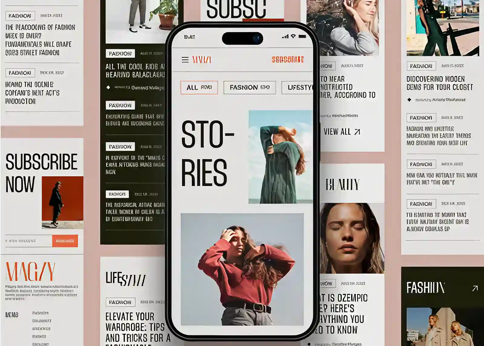
Great websites don’t just show content; they tell a story that pulls people in. Editorial UI design helps websites feel premium, trustworthy, and engaging by borrowing principles from luxury magazines and publications. It uses strong typography, generous white space, visual hierarchy, storytelling, and curated imagery to create “editorial gravity” that naturally captures and holds user attention. Rather than overwhelming visitors with clutter, editorial design guides them through a structured narrative, improving readability, trust, and engagement. Key techniques include strategic use of scale, contrast, grids, asymmetry, and storytelling to highlight important content. Ultimately, editorial websites prioritize experience over promotion, helping brands build credibility, emotional connections, and memorable digital experiences that often lead to stronger conversions.
Why Magazine-Inspired Websites Feel More Valuable?
Some websites immediately feel expensive. Before visitors read a single word, they sense quality, authority, and sophistication. The layout feels intentional. Images breathe. Typography commands attention. Every section appears curated rather than assembled. This effect is not accidental.
It stems from a design philosophy often called editorial UI design, an approach inspired by luxury magazines, premium publications, and high-end print media. Instead of overwhelming users with visual noise, editorial design creates a sense of focus, elegance, and trust. Brands are competing not only on products and services but also on perception. A thoughtfully designed website can elevate a company's credibility before any interaction.
This phenomenon is what many designers call editorial gravity: the ability of a website to hold attention through structure, visual storytelling, and refined design choices.
Whether you're building a luxury brand, creative agency, consulting firm, or premium SaaS platform, understanding editorial principles can transform how visitors experience your digital presence.
What Is Editorial UI Design?
Think about your favorite magazine for a moment. The reason it feels enjoyable to read isn't just the content, it's the way everything is presented. The headlines grab your attention, the images support the story, and the layout naturally guides your eyes from one section to the next. That's the essence of editorial UI design.
Traditionally, editorial design was used in magazines, newspapers, and books to organize content in a way that was both visually appealing and easy to understand. Today, those same principles have found a home in digital experiences, shaping how modern websites communicate with their audiences.
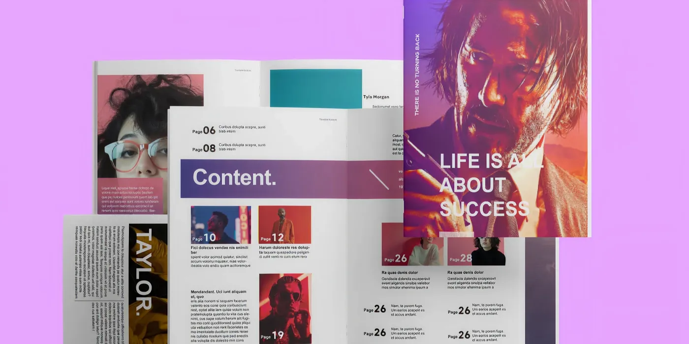
In web design, editorial UI design is about creating a thoughtful balance between content and visuals. It uses typography, imagery, white space, visual hierarchy, and structured layouts to help users navigate information effortlessly. Instead of overwhelming visitors with cluttered pages and competing elements, editorial design creates a sense of flow, making content feel curated, engaging, and easy to consume.
More importantly, editorial design helps establish a strong brand identity. Every design choice from the size of a headline to the spacing between sections contributes to how users perceive a brand. When done well, a website feels less like a collection of pages and more like a carefully crafted publication, encouraging visitors to stay longer, explore deeper, and connect with the story behind the brand.
Key characteristics include:
- Strong visual hierarchy
- Sophisticated typography
- Intentional use of white space
- Grid-based layouts
- Large editorial imagery
- Story-driven content presentation
- Minimal distractions
- Consistent design systems
The Psychology Behind Editorial Gravity
A great website doesn't fight for attention; it earns it. Good websites are not packed with flashing banners, endless pop-ups, or overwhelming animations. Instead, their content flows naturally, the visuals capture your interest, and every section appears exactly when you need it. That's the power of editorial gravity.
At its core, editorial gravity is the ability of a design to attract, hold, and guide attention. It combines visual hierarchy, storytelling, typography, and strategic spacing to create an experience that feels effortless to explore. The reason it works so well comes down to one thing: human psychology.
1.The Brain Craves Both Structure and Surprise
Our brains are constantly searching for patterns. When a website feels organized and easy to navigate, we instantly feel more comfortable using it. Clear layouts, strong typography, and thoughtful white space reduce mental effort and foster trust. But attention isn't sustained by order alone.
The brain also loves surprise. An unexpected headline, a striking image, or a fresh perspective can interrupt autopilot thinking and pull readers deeper into the experience. Editorial websites master this balance between familiarity and discovery, keeping users engaged without overwhelming them.
2. Curiosity Keeps People Exploring
Humans naturally want to fill gaps in their knowledge. When a website presents information in a way that sparks curiosity, visitors are more likely to continue reading, clicking, and exploring.
This is why editorial-style websites often use compelling headlines, featured content sections, and narrative-driven layouts. Each section creates a reason to keep moving forward, much like turning the pages of a magazine to discover what comes next.
3. Emotion Drives Attention
People don't connect with information; they connect with experiences. Facts and features are important, but emotion is what makes content memorable. Editorial design creates space for storytelling, powerful visuals, and meaningful messaging that resonate with readers on a deeper level.
Whether it's inspiration, aspiration, excitement, or trust, emotional engagement keeps visitors invested in the content and strengthens their connection to the brand.
4. Visual Hierarchy Reduces Decision Fatigue
One of the biggest reasons users leave websites is simple: too much information competing for attention. Editorial design solves this problem through strong visual hierarchy. Headlines stand out, supporting content follows naturally, and key messages are given room to breathe.
In a digital world filled with distractions, attention has become one of the most valuable. Editorial gravity helps brands capture that attention by combining psychology, storytelling, and thoughtful design into a seamless experience. A website that feels like a carefully curated publication doesn't just look better, it feels more valuable. And when users perceive value, they are far more likely to trust the brand, engage with its content, and remember it long after they've left the page.
Why Premium Design Feels More Trustworthy?
Luxury magazines have spent decades perfecting the art of visual communication. Their layouts feel polished because every element serves a purpose. The same principle applies to digital experiences.
When users encounter a website with a strong editorial structure, they often perceive the brand as:
- More trustworthy
- More established
- More premium
- More detail-oriented
- More authoritative
These perceptions influence everything from engagement and credibility to conversion rates and purchasing decisions.
The Design Principles That Make Websites Feel Expensive
Before a visitor reads a single word, they form an impression of your brand. Editorial websites achieve their premium feel through a combination of typography, spacing, hierarchy, and storytelling that instantly communicates quality.
1. Typography: The Art of Making Words Do the Heavy Lifting:
The true hallmark of great editorial design is typography. In magazine-inspired layouts, words are not simply containers for information; they are a visual design element in their own right.
Typography influences how content is perceived, how easily it can be consumed, and how visitors feel while interacting with a website. The right typographic choices create rhythm, establish authority, and transform ordinary content into an engaging reading experience. In many cases, typography is what separates a website that feels generic from one that feels refined, credible, and unmistakably premium.
2. Create a Visual Hierarchy That Guides the Reader:
One of the primary goals of editorial UI design is to make content effortless to navigate. Readers should immediately understand where to look first, what information is most important, and how different pieces of content relate to one another.
A strong typographic hierarchy creates this structure through variations in size, weight, spacing, and placement. Large headlines capture attention, subheadings introduce new ideas, body text delivers information, and supporting elements provide context without competing for focus.
An effective hierarchy helps readers:
- Scan content quickly
- Identify key messages instantly
- Navigate long-form content with ease
- Maintain focus throughout the reading journey
- Understand content relationships at a glance
When typography establishes a clear path through the page, users spend less time figuring out where to look and more ti
3. Choose Typefaces That Reinforce Brand Identity:
Every font communicates something before a single word is read. Just as photography and color influence perception, typography shapes how audiences interpret a brand's personality. Different typefaces evoke different emotions and associations, making font selection a critical part of the overall design strategy.
For example:
- Serif fonts often communicate sophistication, heritage, and authority.
- Sans-serif fonts feel modern, clean, and approachable.
- Display fonts add character, creativity, and visual impact.
- Monospaced fonts create a technical, experimental, or contemporary feel.
The most successful editorial websites use typography intentionally, selecting font combinations that align with their brand voice and audience expectations. Consistent typography helps build recognition and creates a more cohesive, memorable user experience.
4. Design for Readability, Not Just Aesthetics:
Editorial design prioritizes readability because content is only effective when it can be consumed comfortably. A well-designed reading experience encourages users to stay longer, explore further, and engage more deeply with the message.
Key readability considerations include:
- Comfortable line heights that prevent text from feeling cramped
- Appropriate letter spacing for improved legibility
- Optimal paragraph widths that reduce eye strain
- Strong contrast between text and background
- Responsive typography that adapts seamlessly across devices
When readability becomes a design priority, content feels effortless to consume and significantly more enjoyable to explore.
5. Use Typography to Create Rhythm and Flow:
Great editorial design feels almost musical in how it guides readers through the content. Large headlines create moments of emphasis, subheadings provide natural pauses, and body copy establishes a comfortable reading pace.
This rhythm prevents long pages from feeling overwhelming and encourages users to continue scrolling. By strategically varying typography, designers can create moments of impact, anticipation, and reflection that keep readers engaged from beginning to end.
The Power of White Space: Why Less Often Feels Like More
One of the biggest misconceptions in web design is that every available space needs to be filled. In reality, some of the most elegant and memorable websites achieve their impact through what they choose to leave out.
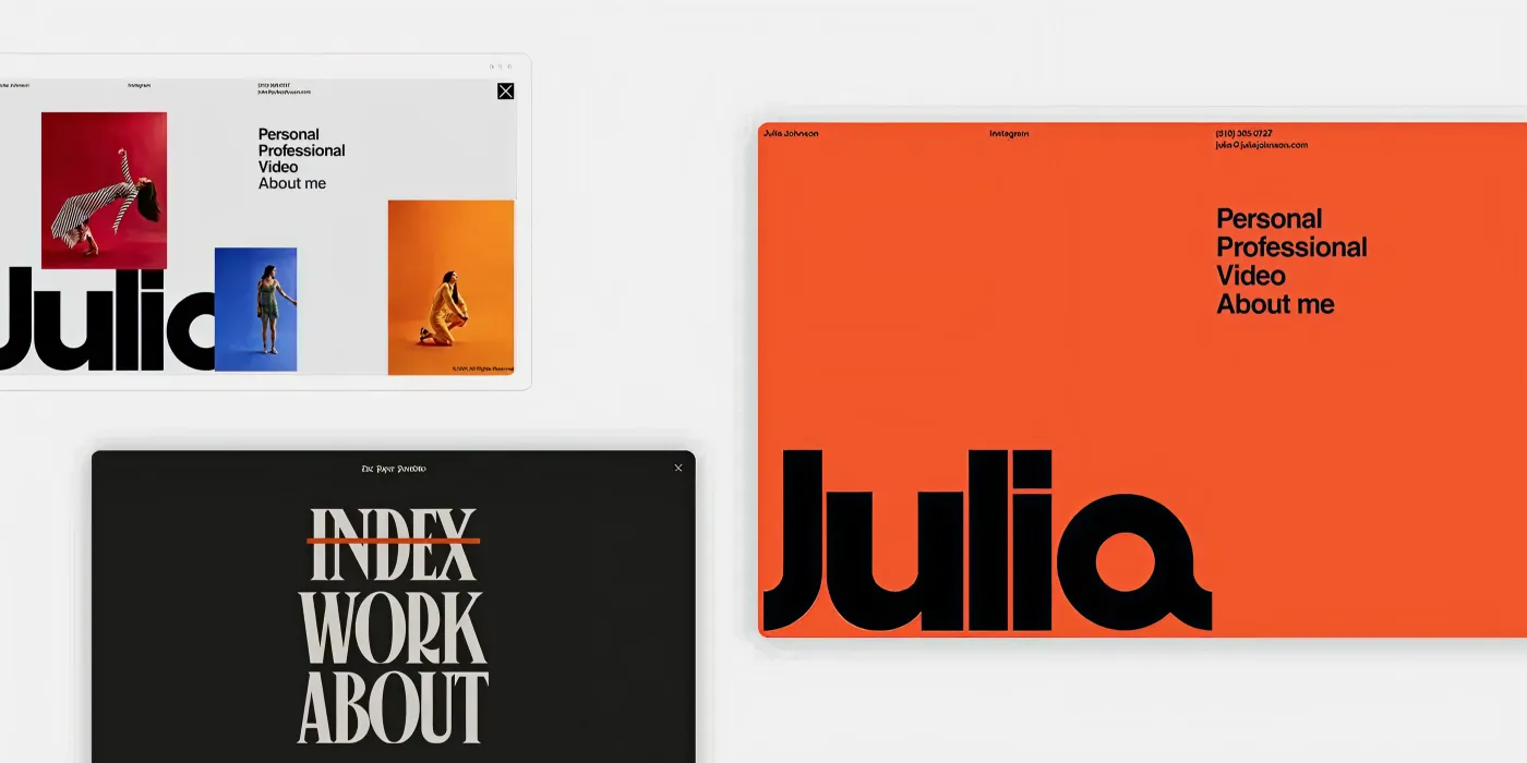
Luxury magazines have long understood this principle. Rather than cramming pages with content, they use generous spacing to create balance, direct attention, and enhance the reading experience. The same approach applies to editorial UI design. White space, often called negative space, isn't empty or wasted space. It's a strategic design element that helps content stand out and gives users room to think, absorb, and engage.
1. Use White Space Effectively
White space helps important content stand out, improves readability, and gives websites a clean, premium look. It allows users to focus on key messages without distractions.
2. Create a Strong Visual Hierarchy
Using different sizes, weights, and layouts helps guide users through content naturally. Larger headlines and featured elements immediately draw attention to the most important information.
3. Improve Readability and User Experience
Well-spaced content, clear headings, and organized sections make information easier to scan and understand, encouraging visitors to stay longer on the website.
4. Use Contrast and Imagery to Capture Attention
Bold typography, visual contrast, and high-quality imagery help create focus, strengthen storytelling, and make content more engaging and memorable.
5. Design a Natural Content Flow
A well-structured layout guides users smoothly from one section to the next. Consistent alignment, spacing, and visual cues create an effortless browsing experience.
Think Like an Editor, Not a Marketer
Most websites are built like brochures. They focus on selling as quickly as possible, placing features, benefits, testimonials, and calls to action into separate sections. While this approach can communicate information, it often feels fragmented and transactional.
Editorial websites take a different approach. Instead of treating visitors like leads moving through a funnel, they treat them like readers embarking on a journey. Every section serves a purpose, every piece of content builds on the last, and every design choice contributes to a larger narrative. The result is an experience that feels immersive, intentional, and far more engaging.
Like a great magazine article, an editorial website doesn't simply tell people what a brand does; it helps them understand why it matters.
1. Start With Context Before Selling Solutions
One of the most common mistakes in web design is jumping directly into products, services, or features before establishing context.
Editors understand that readers need a reason to care before they are ready to engage. That's why editorial content often begins by exploring a problem, introducing an idea, or highlighting a challenge before presenting a solution.
The same principle applies to websites. Before asking visitors to take action, help them understand:
- What problem exists
- Why it matters
- Who it affects
- What opportunities are being missed
- How your brand approaches the issue differently
When visitors feel understood, they become far more receptive to your mes
2. Create a Narrative Flow That Keeps Readers Moving
Every great story has momentum. Editorial websites use this principle to guide users through content in a logical and engaging sequence. Rather than presenting isolated sections, they build a narrative that gradually unfolds as visitors scroll.
A typical editorial flow might include:
- The Challenge → Introducing the problem or opportunity.
- The Insight → Providing perspective, expertise, or a fresh viewpoint.
- The Solution → Presenting products, services, or ideas.
- The Proof → Demonstrating credibility through case studies, results, or testimonials.
- The Action → Encouraging the next step.
This storytelling structure creates a sense of progression that keeps users engaged and naturally leads them toward conversion
3. Turn Information into an Experience
People don't remember lists of features. They remember experiences. Editorial design transforms information into something that feels more immersive and meaningful.
Through thoughtful layouts, compelling visuals, strong typography, and carefully paced content, readers become active participants rather than passive consumers.
Instead of overwhelming visitors with information, editorial websites reveal it gradually, creating moments of discovery along the way.
This approach helps:
- Increase engagement
- Improve content retention
- Strengthen emotional connection
- Encourage deeper exploration
- Make brands more memorable
4. Give Your Best Services the Visibility They Deserve
Not every service contributes equally to your business goals. Editorial websites recognize this and strategically prioritize the offerings that provide the greatest value, differentiation, or impact. Instead of presenting every service with equal weight, they create a visual hierarchy that naturally draws attention to flagship offerings.
This can be achieved through:
- Dedicated feature sections
- Larger imagery and headlines
- Priority placement on the page
- Supporting success stories
- Enhanced visual treatment
By emphasizing what makes your brand unique, you help visitors quickly understand your greatest strengths.
5. Use Featured Content to Establish Authority
Editorial publications don't bury their best stories; they showcase them. Your website should do the same. Featured content provides an opportunity to demonstrate expertise, build credibility, and communicate value before visitors ever reach a contact form or sales page. By elevating your strongest content, you position your brand as a trusted source of knowledge and insight.
Consider highlighting:
- In-depth case studies
- Industry research and reports
- Thought leadership articles
- Award-winning projects
- Expert insights and resources
Breaking the Grid Without Creating Chaos
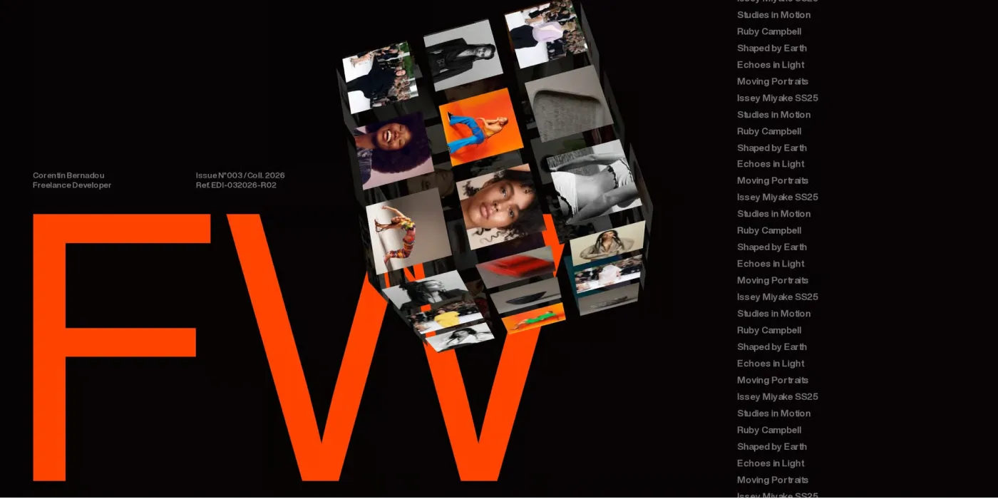
The best editorial websites understand an important design principle: structure creates order, but variation creates interest. While grids provide the foundation for a clean, organized layout, the most memorable digital experiences know when to break the rules. Editorial designers frequently introduce controlled asymmetry, unexpected compositions, and dynamic layouts to create movement and keep readers engaged.
The keyword is controlled.
Random placement and visual inconsistency can quickly make a website feel confusing. But when asymmetry is used intentionally, it adds personality, sophistication, and a sense of creativity without sacrificing usability. Much like a premium magazine spread, the goal is to create layouts that feel curated rather than rigid structured enough to guide readers, yet flexible enough to surprise them.
Why Perfect Symmetry Can Feel Predictable
Symmetrical layouts are naturally balanced and easy to understand, which is why they are commonly used across the web. However, when every section follows the exact same pattern, the experience can start to feel repetitive. Visitors quickly learn what to expect, and once everything becomes predictable, engagement often declines.
Editorial design introduces variation to create moments of visual discovery. A larger image, an unexpected text alignment, or an unconventional content arrangement can interrupt scrolling patterns and encourage users to pay closer attention. This doesn't mean abandoning structure altogether. It means introducing enough variation to keep the experience feeling dynamic and alive.
Benefits of controlled asymmetry include:
- Increased visual interest
- Greater content engagement
- Enhanced storytelling opportunities
- Stronger brand personality
- A more premium and creative aesthetic
Case Studies: Luxury Brands and High-end Services
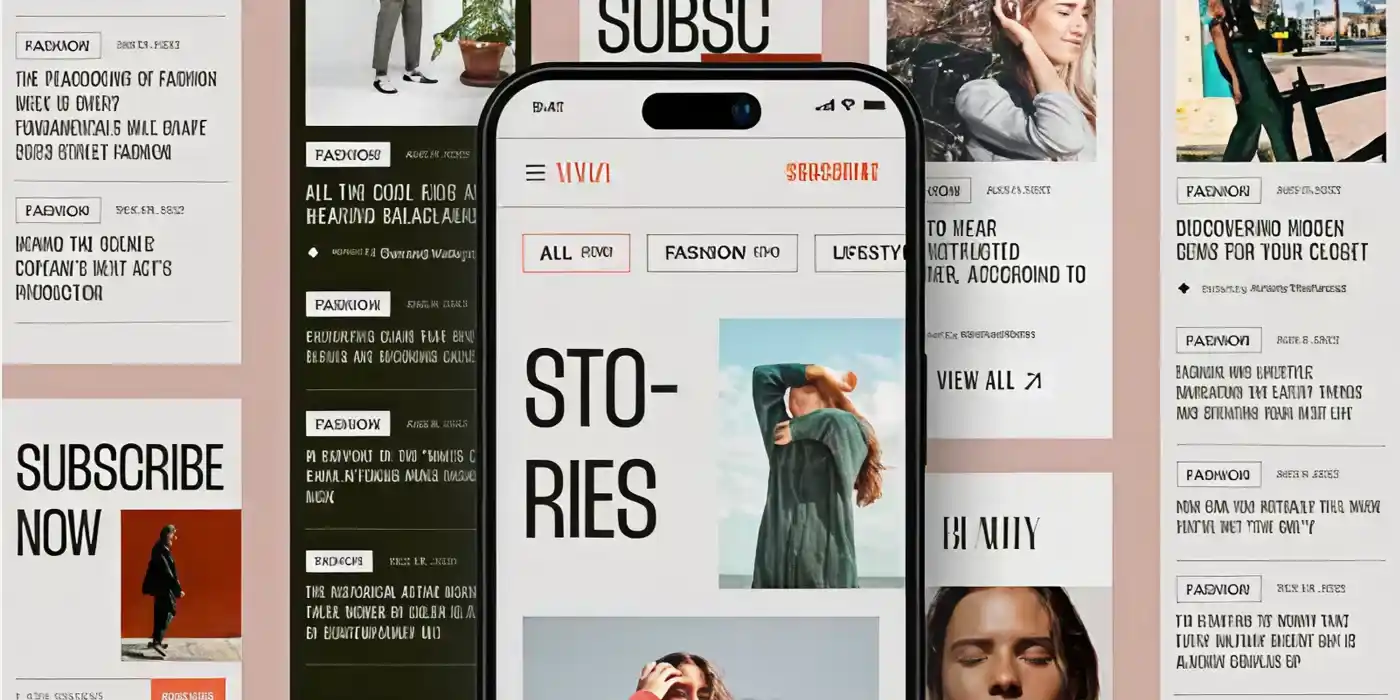
The principles of editorial UI design are not limited to magazines and publishing platforms. Some of the world's most successful luxury brands, creative studios, and high-end service providers use editorial design to create immersive digital experiences that feel more like curated publications than traditional websites. What makes these websites stand out is their ability to balance storytelling, visual sophistication, and strategic content presentation. Rather than overwhelming visitors with sales messages, they use typography, imagery, layout, and narrative flow to create memorable brand experiences.
The following examples demonstrate how editorial design can transform complex ideas, premium products, and professional services into compelling digital stories.
Kove® Interactions: Minimalism as a Luxury Statement
Luxury brands often understand that sophistication comes from restraint rather than excess.
The Kove® Interactions website embraces this philosophy through a minimalist editorial approach. Large-format photography, generous white space, and a refined black-and-white color palette create an experience that feels elegant, intentional, and premium. Rather than competing for attention with flashy effects, the website allows imagery and typography to take center stage. Every photograph is given room to breathe, creating a gallery-like experience that encourages visitors to slow down and engage with the content.
This approach reflects a core principle of editorial design: when every element is carefully curated, it communicates more.
Editorial lessons from Kove® Interactions:
- Uses white space to create a premium aesthetic
- Relies on photography as a primary storytelling tool
- Maintains visual consistency across every section
- Creates a calm, focused user experience
- Demonstrates the power of minimalist editorial design
Cole Haan: Blending Commerce with Editorial Storytelling
Many e-commerce websites prioritize products over storytelling. Cole Haan takes a different approach by combining editorial design principles with a strong commercial strategy. The website uses bold visual compositions, vibrant backgrounds, striking imagery, and contemporary typography to create an experience that feels dynamic and engaging. Rather than simply displaying products, it presents them within a broader narrative around craftsmanship, design, and limited-edition collaborations.
This editorial approach transforms product discovery into an experience rather than a transaction.
Visitors are not just browsing products they are exploring stories, collections, and brand values that deepen their connection with the brand.
Editorial lessons from Cole Haan:
- Uses storytelling to enhance product presentation
- Combines bold visuals with clear content hierarchy
- Creates immersive campaign-driven experiences
- Makes shopping feel like content exploration
- Demonstrates how editorial design can support conversion goals
FinFlo: Making Complex Financial Services Engaging
Financial services websites are often associated with dense information and corporate design. FinFlo challenges this convention by applying editorial principles to a highly technical industry. The website uses vibrant visuals, modern typography, interactive content, and a clean information architecture to convey concepts in private equity and investment technology. Rather than overwhelming users with financial jargon, information is organized into digestible sections supported by a strong visual hierarchy.
This approach makes sophisticated topics easier to understand while reinforcing the company's innovative and forward-thinking positioning.
Editorial lessons from FinFlo:
- Simplifies complex information through visual storytelling
- Uses editorial layouts to improve content accessibility
- Creates a modern and innovative brand perception
- Balances educational content with business objectives
- Demonstrates how editorial design can enhance trust and credibility
Final Thought:
The websites people remember aren't always the loudest, flashiest, or most complex; they're the ones that make every interaction feel intentional. Editorial UI design brings that sense of intention to the web. It transforms websites from collections of pages into curated experiences that inspire, and engage.
The lesson is simple: don't just design for clicks, design for connection. Think like an editor. Prioritize clarity over clutter, storytelling over selling, and experience over information overload. When visitors enjoy the journey, trust grows naturally, engagement deepens, and your brand becomes far more memorable.

Design is not just what it looks like and feels like. Design is how it works.
This quote reminds us that successful design is not defined by appearance alone. While visual appeal matters, the true measure of great design is how effectively it solves problems, supports users, and creates a smooth, intuitive experience that feels effortless to use.
Related posts