Introduction
A website’s design creates an impression before users read a single word. In enterprise software, where trust influences complex buying decisions, color plays a critical role in shaping how customers perceive credibility, reliability, and professionalism.
Enterprise color palettes do more than define brand identity they improve readability, create visual hierarchy, guide user actions, and reduce friction throughout the buyer journey. Poor color choices can create confusion, while a strategic color system builds confidence and encourages engagement.
Leading SaaS companies and technology providers use carefully designed color systems to strengthen B2B conversion design and deliver seamless enterprise UX. This article explores how color choices influence trust, conversions, accessibility, and user decision-making.
Why Enterprise Trust Starts With Visual Perception?
The feeling of trust is developed not when users start to analyze your functionalities and price, it happens much earlier; when they get their very first visual impression of you. In a matter of seconds, people decide whether your brand seems professional and reliable. The cleaner your interface is with uniform colors, the more trustful it seems. Cluttered interface, bad contrast and inconsistency will cause users' distrust, no matter how good your product is.
In B2B environment, where buyers analyze risk thoroughly, the role of design is critical. Users tend to trust designs that they perceive as cognitively fluent; simple and easy-to-use. A well-developed color palette, hierarchy of visual information, and consistency of interactions are some elements of fluent design. This is how the trust-building interface should be designed.
| Design Element | How Users Interpret It | Business Impact |
|---|---|---|
| Consistent color palette | Professional and established brand | Builds confidence during evaluation |
| High text contrast | Easy to read and accessible | Improves engagement and usability |
| Clear visual hierarchy | Information is organized logically | Helps users make decisions faster |
| Consistent CTA colors | Predictable interactions | Increases click-through rates |
| Neutral backgrounds | Clean and distraction-free interface | Keeps attention on key actions |
These seemingly small design choices work together to reduce friction throughout the customer journey. Instead of wondering where to click or how to navigate, users can focus on understanding your product and evaluating its value. For enterprise organizations, w
The Psychology Behind Enterprise Color Palettes
Color psychology is often misunderstood. While colors like blue are commonly associated with trust and green with growth, effective enterprise color palettes are built on more than symbolism. Their real strength lies in consistency, context, and meeting user expectations.
Enterprise users spend hours navigating dashboards, CRMs, and business applications, making them familiar with certain visual patterns. For example, blue is widely used in enterprise software not just because it represents trust, but because leading technology companies have consistently used it to communicate stability, security, and reliability. Over time, users naturally associate these design patterns with professional, dependable products.
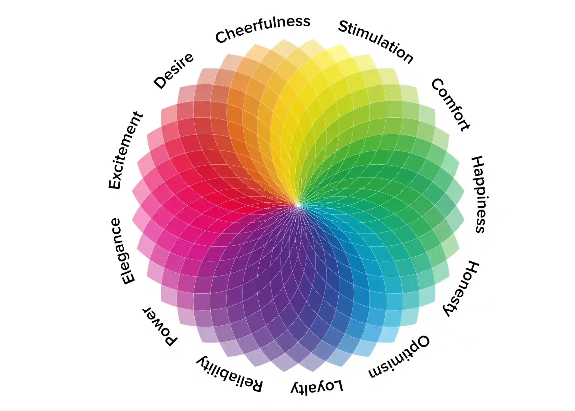
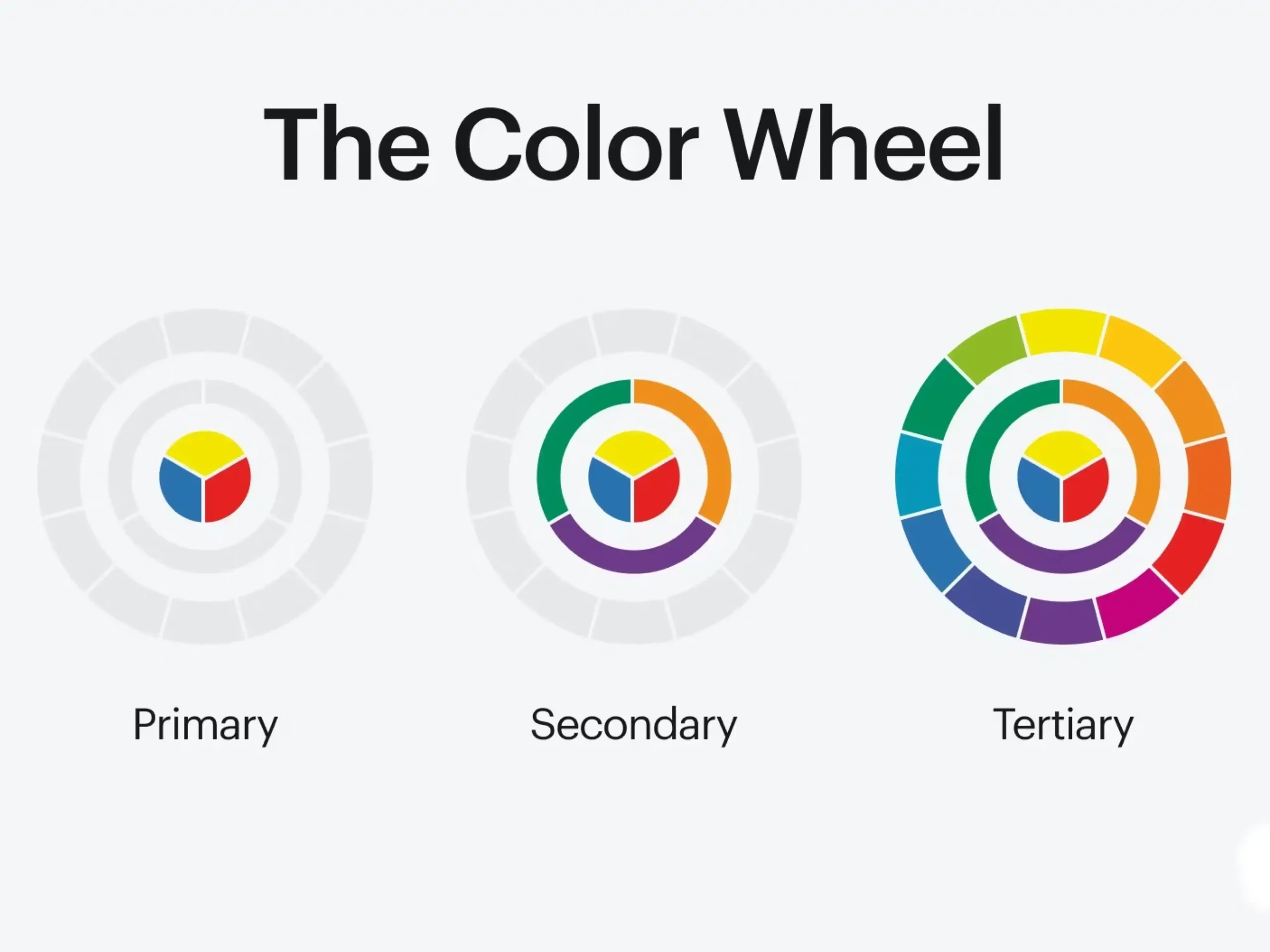
The most effective color systems don't rely on a single color. Instead, they combine primary, neutral, semantic, and accent colors to create a clear visual hierarchy that improves usability, strengthens brand identity, and guides users through the interface with confidence.
| Color | Primary Purpose in Enterprise UX | Common Applications |
|---|---|---|
| Blue | Trust, reliability, professionalism | Navigation, headers, primary branding |
| Green | Success, progress, positive outcomes | Confirmation messages, completed tasks |
| Gray | Balance and neutrality | Backgrounds, cards, borders, dashboards |
| White | Clarity and readability | Page backgrounds and spacing |
| Accent colors | Guide user attention | Primary buttons and important actions |
Enterprise interfaces should use colors to create clarity, not competition. This principle becomes especially important when designing premium interfaces, where contrast, depth, and color balance influence both.
Building Enterprise Color Palettes That Scale
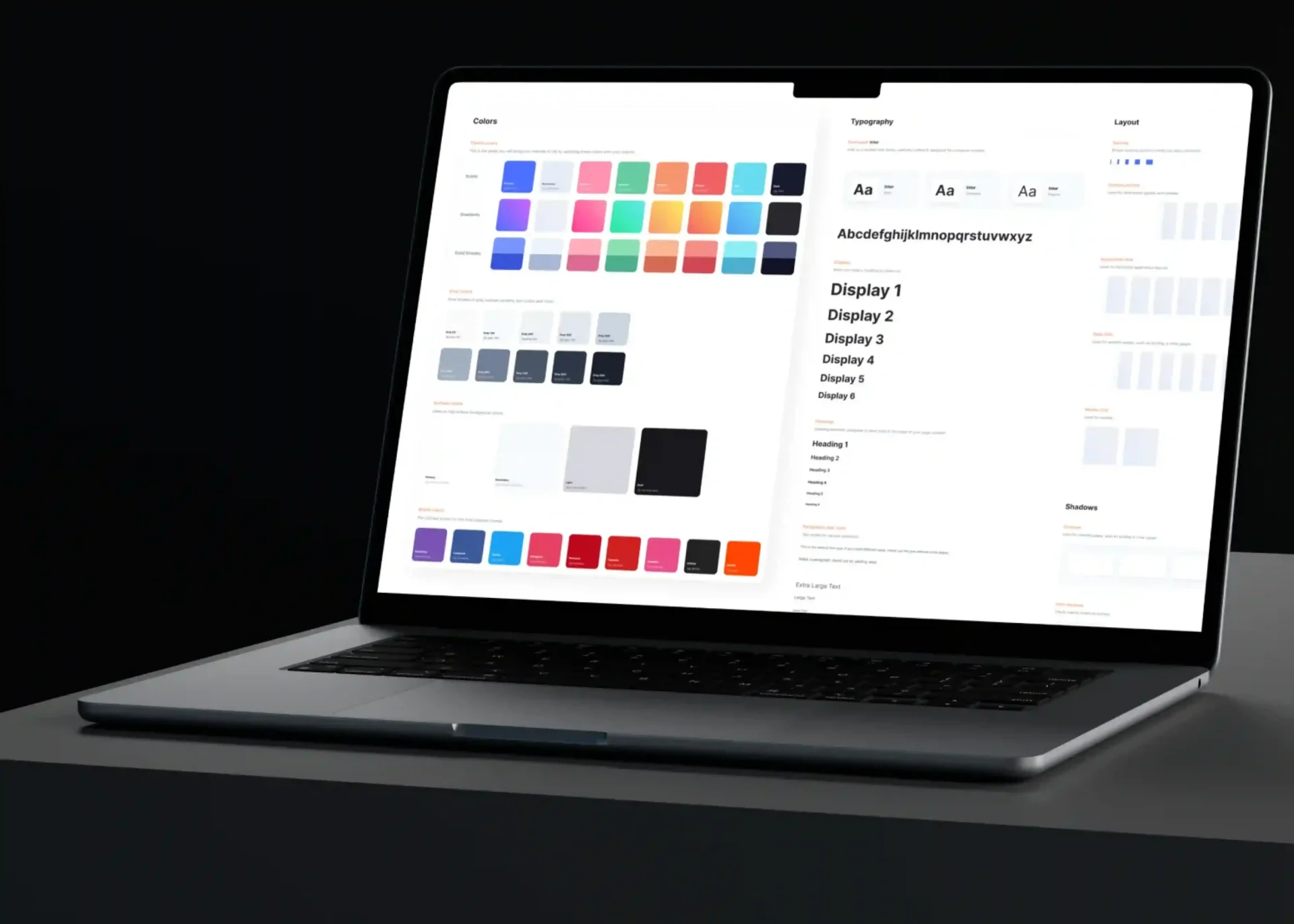
Choosing colors for an enterprise product requires more than selecting visually appealing shades. Unlike small websites, enterprise businesses operate across multiple touch points, including websites, dashboards, mobile apps, and customer portals. Each experience needs to feel consistent and connected.
A scalable color system provides clear guidelines for the use of colors across products, ensuring brand consistency, usability, and accessibility. Instead of choosing colors page by page, designers create a structured framework that supports future growth. A strong enterprise palette typically includes five key layers:
| Palette Layer | Purpose | Typical Usage |
|---|---|---|
| Primary Colors | Represent the brand identity | Logo, navigation, headers |
| Secondary Colors | Support content without dominating | Cards, illustrations, tabs |
| Neutral Colors | Improve readability and reduce visual noise | Backgrounds, tables, forms |
| Semantic Colors | Communicate system status | Success, warnings, errors, notifications |
| Accent Colors | Drive user actions | Primary CTAs, active states |
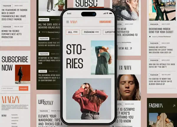
Beyond color selection, elements like typography, spacing, and layout structure also play a major role in shaping perceived quality and user trust. Editorial UI principles show how thoughtful typography and whitespace can create more refined and engaging digital experiences.
This structured approach separates enterprise-grade design systems from inconsistent interfaces. Instead of choosing colors based on preference, every shade has a clear role; improving usability, reinforcing identity, and guiding users toward meaningful interactions.
How Color Affects B2B Conversion Rates?
Enterprise buyers don't make quick decisions. They evaluate solutions carefully, often involving multiple stakeholders and comparing factors like reliability, security, and long-term value. In this process, a website must do more than showcase features, it must build confidence.
Color plays an important role in this journey by guiding attention, reducing friction, and helping users understand the next step. Combined with motion, storytelling, and intentional interactions, it can become part of a larger experience cinematic design strategy. A cluttered interface with inconsistent colors can create confusion, while a structured color system provides a smoother experience, making important information and primary actions stand out naturally.
For enterprise websites, effective color choices act as a conversion tool. They help users navigate product pages, pricing sections, and demo forms with confidence, making it easier for potential customers to move from interest to action.
| Stage of the Buyer Journey | How Color Supports Conversion |
|---|---|
| Landing Page | Builds credibility through a clean and professional appearance |
| Product Pages | Highlights key features and product benefits |
| Case Studies | Draws attention to measurable results and customer success |
| Pricing Page | Reduces decision fatigue by emphasizing the primary plan or CTA |
| Demo or Contact Form | Guides users toward completing the desired action |
| Thank You Page | Reinforces confidence with positive feedback and confirmation messages |
This doesn't mean changing colors at every stage. Instead, it means using a consistent palette that helps users navigate naturally from one decision to the next.
Ultimately, B2B conversion design is about reducing uncertainty. The less effort users spend understanding the interface, the more attention they can devote to evaluating your solution.
Using Call-to-Action Colors Strategically
Every enterprise website has a primary conversion goal, whether it's booking a demo, requesting a consultation, or starting a free trial. However, many websites reduce their effectiveness by giving equal visual importance to every button, creating confusion instead of encouraging action.
A stronger approach is to use call to action colors strategically. By reserving a single accent color for the primary action and using subtle styles for secondary options, businesses can create a clear visual hierarchy. This helps users quickly understand the next step, reduces decision fatigue, and creates a smoother path toward conversion.
| CTA Type | Purpose | Recommended Styling |
|---|---|---|
| Primary CTA | Main business objective (Book Demo, Contact Sales) | High-contrast accent color |
| Secondary CTA | Supporting actions (Learn More, View Pricing) | Outline button or neutral fill |
| Tertiary CTA | Low-priority actions | Text link with subtle emphasis |
Consistency is just as important as visibility when designing effective CTAs. Using different colors for the same action across pages can confuse users and weaken recognition. A consistent accent color helps create familiarity and improves navigation.
However, call to action colors work best when supported by strong layout and spacing. A well-positioned button with enough visual breathing room attracts attention naturally. The goal is not to highlight every action; it is to guide users toward the right one.
Accessibility: The Foundation of Enterprise UX
Accessibility is a core requirement for modern enterprise products, helping businesses create inclusive experiences while meeting compliance standards. Color choices play a major role, as poor contrast and color-only communication can make interfaces difficult to use for many users.
By using accessible color combinations, clear labels, icons, and consistent design patterns, organizations can reduce friction, improve usability, and create enterprise experiences that are easier and more reliable for everyone.
A practical accessibility checklist includes the following:
| Accessibility Practice | Why It Matters |
|---|---|
| Maintain strong text contrast | Improves readability across devices |
| Don't rely on color alone | Ensures information is accessible to all users |
| Use consistent interactive states | Builds confidence and predictability |
| Test with different screen sizes | Maintains usability across devices |
| Validate against WCAG guidelines | Supports compliance and inclusive design |
Designing for accessibility doesn't restrict creativity. Instead, it encourages designers to create interfaces that are clearer, more inclusive, and ultimately more effective for every user.
Common Mistakes That Weaken Enterprise Trust
Even organizations with strong branding can unintentionally undermine trust through poor color decisions. These issues often seem minor in isolation, but together they create a confusing user experience that increases friction throughout the buying journey.
1. Prioritizing Branding Over Usability
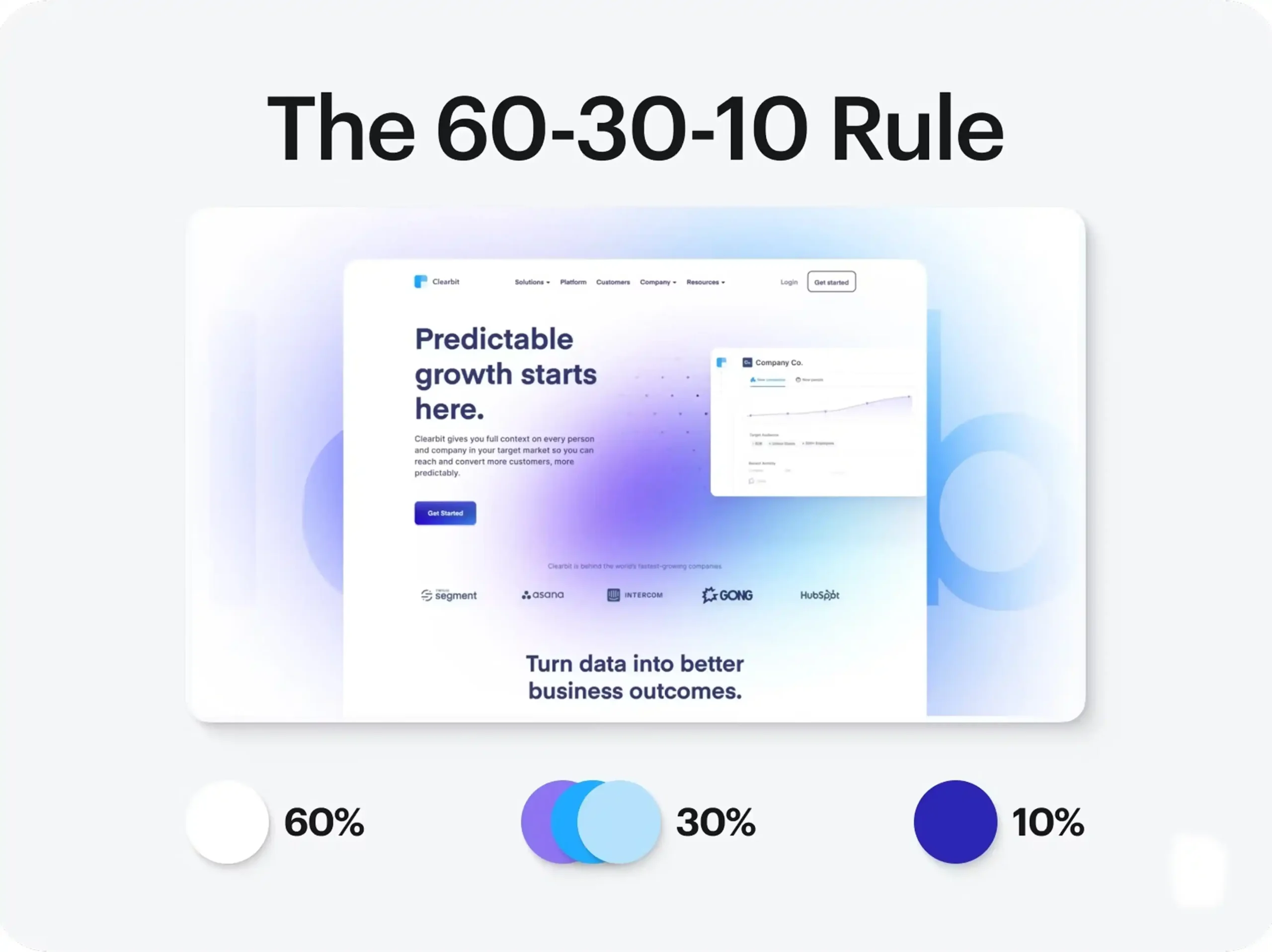
Many companies insist on using their brand colors everywhere, regardless of readability or functionality. While brand consistency is important, an interface should never sacrifice usability to showcase a color palette. If every section is saturated with strong brand colors, users struggle to identify what's actually important.
2. Using Too Many Accent Colors
Accent colors should guide attention, not compete for it. When multiple bright colors appear throughout a page, users lose a clear sense of priority. Restricting accent colors to key actions creates a stronger visual hierarchy and makes important interactions easier to recognize.
3. Ignoring Neutral Space
Whitespace and neutral backgrounds are often underestimated. They provide visual breathing room, reduce cognitive load, and make content easier to scan. Overcrowded layouts filled with colorful panels can make even the best products feel overwhelming.
4. Inconsistent CTA Styling
Changing button colors or styles from one page to another disrupts familiarity. Users shouldn't have to relearn how your interface works as they move through the website. Consistency reinforces confidence and improves navigation.
5. Neglecting Accessibility
Low-contrast text, unclear status messages, and inaccessible color combinations exclude users and create unnecessary frustration. Accessibility should be integrated into the design process from the beginning rather than treated as a final checklist item.
Avoiding these mistakes doesn't require a complete redesign. Often, small improvements in consistency and hierarchy can significantly enhance the overall user experience.
Measuring Whether Your Color Palette Is Working
The success of a color palette shouldn't be judged by personal preference or internal opinions. It should be evaluated using real user behavior and measurable business outcomes.
Modern analytics tools make it possible to understand how visitors interact with a website. Heatmaps reveal where users focus their attention, session recordings highlight points of confusion, and A/B testing allows teams to compare different interface variations objectively. Rather than asking whether users "like" a color, organizations should examine how that color influences behavior.
Some of the most valuable metrics include:
| Metric | What It Reveals |
|---|---|
| CTA Click-Through Rate | Whether primary actions are visually clear |
| Form Completion Rate | Ease of completing key tasks |
| Bounce Rate | First impressions and perceived trust |
| Session Duration | Overall engagement with content |
| Scroll Depth | Effectiveness of visual hierarchy |
| Demo Requests | Influence on conversion goals |
These metrics provide a much clearer picture of design performance than subjective opinions alone. By regularly reviewing user data and testing incremental improvements, organizations can refine their enterprise color palettes based on evidence rather than assumptions.
Final Thoughts:
Color in enterprise design is more than a visual choice; it is a strategic tool that influences trust, usability, and conversions. The best enterprise color palettes are not the brightest or most complex; they are the ones that create clarity, consistency, and confidence throughout the user journey.
By combining thoughtful visual hierarchy, accessible contrast, and purposeful call to action colors, businesses can guide users toward meaningful actions while creating a more intuitive experience. A structured color system helps organizations strengthen credibility, simplify decision-making, and build stronger customer relationships.
In competitive B2B markets, where trust plays a major role in purchasing decisions, well-planned color choices can make a measurable difference. When design feels effortless and predictable, users are more likely to engage, trust the brand, and take the next step.

Design is not just what it looks like and feels like. Design is how it works.
This quote reminds us that successful design is not defined by appearance alone. While visual appeal matters, the true measure of great design is how effectively it solves problems, supports users, and creates a smooth, intuitive experience that feels effortless to use.
Related posts